2011年10月27日 星期四

為了記憶的博物館Memory is essential to architecture, says Daniel Libeskind

Architecture | 24.10.2011

Memory is essential to architecture, says Daniel Libeskind

Without memory, we wouldn't know who we are or where we're going, architect Daniel Libeskind tells DW as his Jewish Museum in Berlin celebrates its 10th anniversary and his restored Military Museum in Dresden reopens.

Deutsche Welle: Mr. Libeskind, you're building, or you've built the addition to the Military Museum in Dresden. Your family suffered from the Nazis. How does that go together?

Daniel Libeskind: Well, I think the story of the Military History Museum in Dresden is a story of change - change of Germany. This armory, which was renovated and where a new structure had been inserted, really tells a story of the transformation of the armory, which was also a Saxon museum, a Nazi museum, a Soviet museum, an East German museum - and of course, in a democracy, the military is very important.

A military museum is important in a democracy because every citizen has the responsibility to understand what is going on. So it's not just a museum of conflicts, of weaponry, of the hardware, but it's a reflection on violence and reflection on the city of Dresden, which itself suffered in World War II. So it's a major new encounter with military history and, just as the new wedge-like form pushes through the opacity and the darkness and the rigidity of the armory to the outside, so does Germany push through its old regimes, its autocratic regimes, totalitarian regimes towards a new window of freedom and democracy of a united Germany.

How did you try to have the building fit together with what's inside the museum?
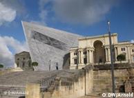
Military History Museum in DresdenLibeskind's Dresden design depicts an interrupted chronology in the history of warI worked very closely with the exhibition designers from the very beginning. But there are two aspects. I restored the armory. It was very run-down and it was very abused when it was the East German kind of military museum. So I restored it lovingly (…) but I also cut through it a completely new space, which is a new totally unprecedented space. It's not a space just for more of the same. It's a space which deliberately interrupts that chronology that ended at World War II and presents questions to a democratic society, to the republic, to families, to children: What do these conflicts means? How can we steer them to a better place? How can we avoid wars? And what do they mean for society in a democracy?

It's more an anti-war museum than a military museum, the way you're explaining it now?

I don't think it's an anti-war museum - of course, who's insane enough to be for a war? No one. But, military history is ongoing. We see that Germany, the United States, other countries are participating in conflicts around the world. So we have to understand what these conflicts mean in a democracy. These are no longer decisions made behind big walls, like in the old times, behind the walls of the armory, but they are really made in front of the public. And it is in the public interest and public importance to be participants in the decisions of an open and free government. And that's not really an anti-war museum, it's a museum that will inform the public, educate the public, create a continuity of what are the possibilities that prevent the kind of violence that we have seen all too often coming out of Germany in the 20th century.

The opening of the edition to the military museum in Dresden coincides with the 10-year anniversary of the Jewish Museum in Berlin. Many people feel that the building itself is more important than what's in it. How do you feel about that building today? Does it work the way you were hoping it should work back then?

I think museums have to work for their exhibitions. Now, when I was working at the Jewish Museum, of course, there were many changes. The museum changed its program, even its name, many times across time until it became the Jewish Museum Berlin. It's very different in the Military History Museum in Dresden because I worked from the very beginning on a very profound idea of what the museum should contain, what objects should be there, what stories are to be told. So they are two very different spaces. They address two very different programs, and, of course, they are very different buildings for the public.
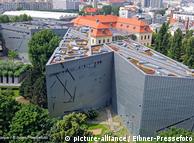
Aerial view of the Jewish Museum in BerlinThe Jewish Museum in Berlin is celebrating its 10th anniversary

You do a lot of museums about remembering, which museums are usually about. But how do you translate remembering into architecture?

Well, I think without memory we would not know where we are going or who we are. So memory's not just a little sideline for architecture, it's the fundamental way to orient the mind, the emotions, the soul. And, of course, how to engage that memory through the visceral experience, not just the intellectual experience, but to the full emotional experience of a human being. That's what architecture is and that can be done through light, through proportions, through acoustics, through materials, through the language of architecture.

Do you like working in Germany?

I do like working [in Germany], very much.

Why?

I think Germany is a very progressive country. It has a youthful spirit. It has a difficult history which will never go away. But Germany is a country that has also faced how difficult history is and hasn't just put it under a carpet but is dealing with it and I think that's something very admirable. Not everyone would be able to face those horrors and yet see that there's a hope, see that there's a new generation, that there's something to be learned from it, something never to be repeated again, and to extend the possibilities of human beings.

Interview: Max Hofmann, DW-TV, New York

Editor: Kate Bowen

2011年10月19日 星期三

Jonathan Ive (Apple Inc.)

有了史蒂夫﹒喬布斯(Steve Jobs),蘋果公司(Apple Inc.)的投資者和客戶提出了一個重大問題:失去了這位聯合創始人和設計大師後,蘋果還能夠繼續推出創新產品嗎?

Associated Press
蘋果公司首席設計師埃維已掌管公司的設計團隊長達15年。圖片攝於2008年。
這個問題的答案可能系於喬納森﹒埃維(Jonathan Ive)。埃維是蘋果公司的主管之一,在科技界之外鮮有人知。

作為蘋果公司的首席設計師,埃維自1996年接掌公司設計團隊以來,就一直和他的同事們負責打造蘋果產品的外觀和質感,並成功地幫助蘋果從競爭對手中脫穎而出。

隨著喬布斯的去世,人們對埃維可能會有更高的要求。蘋果僅僅依靠4個產品系列──電腦、音樂播放器、智能手機和平板電腦──來獲得本財年預計超過1,000億美元的大部分收入,這意味著蘋果的產品需要頻繁地更新換代來引發人們的購買興趣。

如 今,埃維典雅的設計風格已經幫助蘋果產品成為了消費者身份的象征。埃維設計的iPad──鋁制機身加上簡單的玻璃面板──已經成為了平板電腦市場的標桿。 今年第三財季,最新一代的iPad佔據了全球平板電腦出貨量的68%,超過了Research in Motion等競爭對手推出的同類產品。

得益於出色的市場營銷,埃維的設計為蘋果公司注入了強大的增長動力,使其成為了享譽全球的科技公司。

時尚的iPhone已經成為蘋果公司最主要的收入來源,而Mac系列是個人電腦市場增長最為迅速的產品。至於標志著蘋果再度崛起的iPod,自2001年首次上市以來已經使數字音樂在消費市場中普及開來。

埃維在蘋果公司的地位舉足輕重,因而直接向首席執行長匯報工作。這種安排體現了蘋果在喬布斯的領導下對設計和美感的重視。

蘋果公司拒絕由埃維對本文置評。埃維也未回應要求置評的電子郵件。

埃維1967年出生於倫敦,畢業於諾森比亞大學(Northumbria University)設計專業。他曾在英國設計公司Tangerine工作,蘋果在上世紀90年代初是該公司的客戶。1992年,埃維加入了蘋果,並且很快成為了工業設計部門的負責人。

埃維自加入蘋果公司以來一直在幕後工作,而喬布斯和其他主管們則經常代表公司拋頭露面。埃維的設計團隊讓一度以灰色和淺褐色機身為主的蘋果產品迎來了新生,其中最引人注目的產品包括糖果色的iMac電腦和玻璃面板加鋁制機身的 iPhone。

埃維的同事表示,埃維聰慧過人,而且溫和平靜。埃維與其他設計師常常尋求打造屬於自己的品牌不同,他總是盡力避開人們的注意。

“在設計界,他因屢次獲獎卻不出席領獎而聞名,”唐﹒諾曼(Don Norman)說。“在他身上,你看不到絲毫的自以為是。”

但是,埃維帶來的影響卻非常深遠。

分 析人士認為,埃維注重細節的做法使得蘋果從競爭者中脫穎而出。市場研究機構Forrester Research的分析師查爾斯﹒戈爾文(Charles Golvin)一直關注消費領域科技的發展,他說,Macbook的懸浮式鍵盤設計讓輸入變得更為舒適,就是注重細節的體現。

“這一點看似簡單,”戈爾文說,“但這就是我認為埃維設計的典雅之處。”

埃維的設計常常會被拿來和德國工業設計師迪特﹒拉姆斯(Dieter Rams)的作品相比較。拉姆斯在上世紀60年代為博朗公司(Braun)設計了計算器和收音機等產品。

那些產品正如埃維在蘋果公司的設計一樣,因為簡約、典雅和方便使用而聞名於世。

IDC公司移動設備及科技分析師威廉﹒斯托夫加(William Stofega)說,他們有著相同的設計理念,即不過度裝飾,保持簡約。

作家蘇菲﹒洛弗爾(Sophie Lovell)說,大多數人認為設計就是使事物看起來漂亮,但實際上卻遠不止此,喬布斯和埃維都明白這一點。洛弗爾說,當她去年為了一篇雜志文章採訪埃維時,發現他對設計充滿了激情。

埃維的努力已經將蘋果電腦和手機提升到了藝術品的范疇。根據現代藝術博物館(Museum of Modern Art)網站上的介紹,該館收藏的埃維的設計作品有六件 ,如蘋果公司的第一代 iPod等。

JOHN LETZING / ANDREW MORSE

2011年10月17日 星期一

Project Japan, Metabolism Talks…/ Japanese architecture's days of future past

Japanese architecture's days of future past

BY SOPHIE KNIGHT STAFF WRITER

2011/10/16


photoThe DNA double helix-shaped project created by Kisho Kurokawa, foreground, and computer-enhanced images of Arata Isozaki's tree-like structures draw the attention of visitors to an exhibition on the Metabolism movement. (The Asahi Shimbun)

In a country that lies on the volatile Pacific Ring of Fire, designing buildings that can withstand earthquakes has always topped the list of priorities for Japanese architects.

Yet, although most structures near the northeast coastline of Japan withstood the violent rumblings of the Great East Japan Earthquake, many did not survive the devastating power of the subsequent tsunami. As people wonder what would happen if a similarly large wave hit again, faith in Japan's model for urban planning and construction has been deeply shaken.

The architects in charge of reconstructing the Tohoku region must now not only plan disaster-resistant and energy-efficient settlements, but also find a way to serve the needs of the existing community as well as enticing others to move in and revitalize what was already an ailing region.

To do so, they might find some inspiration in the Metabolism school of architecture, which emerged during Japan's last large-scale reconstruction project in the postwar period. The movement is currently being explored in an exhibition at the Mori Art Museum in Roppongi, Tokyo, through Jan. 15.

Like the architects currently working on projects in Tohoku, the Metabolists were faced with the challenge of rebuilding from scratch. They determined that traditional urban models, comprised of clusters of discrete buildings, were not up to the task. Instead, they envisioned self-regulatory, cooperative and integrated structures that functioned like an ant colony or cells and organic systems of the human body.

According to architecture critic Noboru Kawazoe, the central members of the movement--which included Kenzo Tange, Kisho Kurokawa and Kiyonori Kikutake--believed that buildings and settlements should grow and adapt to their environment, letting the old be replaced by the new. In nature this process is known as "metabolism," hence the name of the movement.

"Life forms are different from everything else because they keep growing as they are replaced," Kawazoe said. "Humans are just another life form on earth--and the cities we build are just the same as anthills."

Taking their inspiration from cells, honeycombs and fractals, the Metabolists produced dazzlingly futuristic designs that mimicked the function and form of organic structures.

For example, Kurokawa designed towers in the shape of the DNA double helix, with elevators contained in the tubular spirals. Arata Isozaki, meanwhile, dreamed up the "Arai House," a 4.8-meter diameter sphere sheathed in a thin, flexible membrane that flooded the interior with diffused light.

Kenji Ekuan, who later went on to found the furniture company GK, took his inspiration from plants, imagining a "Chandelier City" in which cell-like polyhedrons dangled from stalks rooted in the ground.

While many of these designs seem straight out of science fiction, they were actually quite practical and borrowed heavily from traditional Japanese architecture.

For example, aggregative buildings such as Kurokawa's Nakagin, which is comprised of discrete "capsules" to be added or removed at will, were inspired by the modular system of tatami mats and sliding doors in traditional Japanese houses that allow for endless room configurations.

In Metabolism, these traditional aesthetics were merged with modern concerns: the movement's members were prescient in identifying the importance of renewable energy, with many of the large-scale developments powered entirely by solar or wave power units.

Japan's vulnerability to natural disasters was also carefully considered. For example, Kikutake's "Koto Project," a city of towers located on a grid of artificial ground in a sea-level district, was designed to be flood-proof.

The movement caught on quickly in Japan, with the World Design Conference in 1960 and the Osaka Expo in 1970 allowing Metabolist ideas to reach other countries.

Although some of their plans bewildered foreign architects--Kawazoe recalls one American calling Kikutake's plans "caricatures"--others were impressed and Metabolism's influence began to spread.

In 1968, Kikutake led a team of 20 architects to build a new kind of low-cost social housing in Peru at the behest of the Peruvian government and the United Nations. The houses they built are still standing, having been extended and altered by their inhabitants in accordance with the architects' wishes.

More recently, Kurokawa's plans for the world's first "ring city" were realized in 2004 in the central business district of Zhengdong, in Zhengzhou China. The circular development allows for a symbiotic relationship between nature and the city, with both skyscrapers and parks visible from all angles.

Tange, who was known for his ability to blend respect for tradition with modern design, has received countless commissions around the world, including rebuilding the capital of Macedonia, Skopje, after it was destroyed by an earthquake in 1963.

In Japan, Metabolism's legacy is even easier to see. The most obvious examples are those built by the central members of the group--for example, Tange's Meiji Jingu gymnasium in Harajuku, Tokyo, Sachio Otani's hexagonal Kyoto International Conference Hall, or Kurokawa's Yamagata's Hawaii Dreamland, based around looping circles.

The concentration of commerce around Japanese train stations today might have originated in the "Pear City Project," originally planned for the Denentoshi train line in Tokyo. The idea was to provide essential services locally, but also to encourage residents to travel beyond their immediate community for specialized or different services, in order to connect small communities and induce metabolic change in the surrounding area.

Whether a cause or effect of the movement, Japanese cities today "metabolize" extraordinarily quickly: The average building only stands for 20 years in Tokyo before being knocked down and replaced.

Even Nakagin, which was designed to be constantly updated and renewed, has fallen into the same trap. It is now uninhabited and destined for the demolition ball.

According to architect Kumiko Inui, speaking at a symposium held at the Shinkenchiku (New Architecture) headquarters in Tokyo on April 7 this year, Japanese cities "metabolize" because of weak land use legislation, leaving the nation ill-equipped to deal with natural disasters.

"Market-based land use inevitably tends to be biased toward the short term, (which makes) it is impossible to delegate preparations for disasters that occur only once over a span longer than a lifetime," Inui said. "(The March 11 earthquake) was a reminder of how important it is to take a long-term viewpoint in city planning."

However, it's not clear whether this slash-and-burn model of construction is what the Metabolists would have wanted.

As Masato Otaka and Fumihiko Maki first emphasized in a manifesto in 1960, Metabolism was based around the idea of "group form," where buildings should work together like a village, rather than being separate, isolated blocks.

As such, most of the Metabolists' plans were initially "top down," due to their complexity, but after being built they became "bottom-up," with residents left to decide how they should be adapted. Settlements were supposed to survive as a whole, while smaller parts might be replaced in accordance with the desires and needs of inhabitants.

With regards to reconstructing Tohoku, many have suggested moving residential areas further inland or to higher ground while leaving the marine industry on the coast. The Metabolists put forward similar zoning plans in their own plans, linking houses to schools, shops and workplaces with a transport network that echoed arterial systems, delivering people in the most efficient way possible.

Although many of their plans were never realized, and the failure of Nakagin shows that most people are not ready to live inside cell-like pods, modern architects still have much to learn from Metabolism.

In particular, the emphasis on empowering residents on a local level while providing a long term disaster-proof and self-sufficient framework on a macro level could prove useful to Tohoku. After all, what better way to protect against nature than to mimic it?


Project Japan, Metabolism Talks…

Back to the future

Visionary architecture in postwar Japan


“Once there was a nation that went to war, but after they conquered a continent their own country was destroyed by atom bombs... then the victors imposed democracy on the vanquished. For a group of apprentice architects, artists, and designers, led by a visionary, the dire situation of their country was not an obstacle but an inspiration to plan and think… although they were very different characters, the architects worked closely together to realize their dreams, staunchly supported by a super-creative bureaucracy and an activist state... after 15 years of incubation, they surprised the world with a new architecture—Metabolism—that proposed a radical makeover of the entire land... Then newspapers, magazines, and TV turned the architects into heroes: thinkers and doers, thoroughly modern men… Through sheer hard work, discipline, and the integration of all forms of creativity, their country, Japan, became a shining example... when the oil crisis initiated the end of the West, the architects of Japan spread out over the world to define the contours of a post-Western aesthetic....” —Rem Koolhaas / Hans Ulrich Obrist

Between 2005 and 2011, architect Rem Koolhaas and curator Hans Ulrich Obrist interviewed the surviving members of Metabolism—the first non-western avant-garde, launched in Tokyo in 1960, in the midst of Japan’s postwar miracle. Project Japan features hundreds of never-before-seen images—master plans from Manchuria to Tokyo, intimate snapshots of the Metabolists at work and play, architectural models, magazine excerpts, and astonishing sci-fi urban visions—telling the 20th century history of Japan through its architecture, from the tabula rasa of a colonized Manchuria in the 1930s to a devastated Japan after the war, the establishment of Metabolism at the 1960 World Design Conference in Tokoy, to the rise of Kisho Kurokawa as the first celebrity architect, to the apotheosis of Metabolism at Expo ’70 in Osaka and its expansion into the Middle East and Africa in the 1970s. The result is a vivid documentary of the last moment when architecture was a public rather than a private affair.

* Oral history by Rem Koolhaas and Hans Ulrich Obrist
* Extensive interviews with Arata Isozaki, Toshiko Kato, Kiyonori Kikutake, Noboru Kawazoe, Fumihiko Maki, Kisho Kurokawa, Kenji Ekuan, Atsushi Shimokobe, and Takako and Noritaka Tange
* Hundreds of never-before-seen images, architectural models, and magazine excerpts

Exhibition Mori Museum, Tokyo
Further reading


The editors and authors:
Rem Koolhaas is a co-founder of the Office for Metropolitan Architecture. Having worked as a journalist and script writer before becoming an architect, in 1978 he published Delirious New York. In 1995, his book S,M,L,XL summarized the work of OMA and established connections of contemporary society and architecture. Amongst many international awards and exhibitions he received the Pritzker Prize (2000) and the Praemium Imperiale (2003).

Hans Ulrich Obrist (born 1968) is a curator, critic and historian. He is currently Co-director of Exhibitions and Programmes and Director of International Projects at the Serpentine Gallery, London. Obrist is the author of The Interview Project, an extensive ongoing project of interviews.

2011年10月16日 星期日

Sir Charles Lock Eastlake (1793–1865)

Spotting the Masterpiece

A new exhibition at London’s National Gallery is dedicated to the art and
science of how to spot the real thing.


This exhibition illuminates the life and work of the Gallery’s first director, Sir Charles Lock Eastlake (1793–1865), a man described by one contemporary as ‘the Alpha and Omega’ of the Victorian art world.

About Charles Eastlake

Eastlake was trained as an historical painter and initially had ambitions to revivify the English school of painting. Having spent his formative years in Rome, where he developed ideas about

He first made his mark as a painter of genre scenes, idealising portraits and religious subjects. He was elected President of the Royal Academy in 1850, and helped modernise the institution.

Yet Eastlake’s most important contributions came as a writer, translating and editing seminal art-historical texts, and as an arts administrator, in which capacity he rose to become Director of the National Gallery from 1855 to 1865.

Detail from: John Partridge, 'Sir Charles Lock Eastlake', 1825
© By Courtesy of the National Portrait Gallery, London

At the National Gallery

During his time at the National Gallery, Eastlake transformed the way the Gallery was run. He also established policies for the acquisition and display of paintings, many of which are still in place today.

His purchase of an astonishing 139 masterpieces, mostly acquired during his annual continental tours, include some of the Gallery’s best-loved Italian Renaissance pictures, such as Uccello’s Battle of San Romano and Giovanni Bellini’s Madonna of the Meadow. The exhibition features material from the National Gallery’s archive shown alongside some of Eastlake’s key acquisitions for the collection.

New Eastlake publications

‘Art for the Nation‘ coincides with the publication of Eastlake’s travel notebooks, along with a biography of Eastlake and his wife by Dr Susanna Avery-Quash, Research Curator in the History of Collecting at the National Gallery, and Dr Julie Sheldon, Reader in Art History at Liverpool John Moores University.

2011年10月3日 星期一

Natural lighting system is brightening Japan


Natural lighting system is brightening Japan

BY KAZUMI TAKO STAFF WRITER

2011/10/04


photoThe dining room of Shoji Moriguchi's home in Otsu, Shiga Prefecture. Family members say that they don't need to turn on the lights during the day because the Skylighttube keeps the room bright enough. (Kazumi Tako)photoNoboru Inoue, president of Inosyo Co., shows the material he developed to install the Skylighttube in roofs. "Preventing a leak is the most important part of the work," he said. (Kazumi Tako)

OTSU -- When Shoji Moriguchi had the Skylighttube installed in the ceiling of his home in Otsu, Shiga Prefecture, in 2004, it was like turning night into day.

Previously, his dining room, which faces north, would be dark all day and a family member wanting to read the newspaper would have to switch on the lights. Now, the Skylighttube collects light in a dome on the roof and spreads it evenly into the room.

"Even on a rainy day, the room is brighter with the Skylighttube than with bulbs," said Moriguchi, 53, a company employee. "We were not required to do maintenance for the past seven years."

The use of the power-saving Skylighttube, introduced by Inosyo, a firm in Otsu, is spreading gradually among households and company factories.

Inosyo has installed 2,500 units for homes and 700 units for factories, and posted 100 million yen ($1.3 million) in sales for the year ending in August.

"The market for the Skylighttube will grow to 10 billion yen in 10 years," said Noboru Inoue, 59, president of Inosyo. "I would like to build a society that uses zero energy."

Inoue said interest in the Skylighttube surged out of concern over possible power shortages in the wake of the March 11 Great East Japan Earthquake and tsunami.

The number of inquiries about the equipment shot up to more than 60 a month after the disaster, many of them businesses, compared with about 20 before the disaster.

An official with FamilyMart Co., a convenience store operator, said that customers viewed the equipment installed in some of its stores in Tokyo positively.

The Skylighttube works by gathering light in a dome placed on the roof of a home. The light passes through an aluminum tube that extends into the room. The brightness of light collected in the dome remains the same inside the tube as the light is reflected.

The Skylighttube can also spread light evenly with a special cover, compared with a skylight, whose illumination level varies depending on the time of day.

Another advantage of the Skylighttube is that it can eliminate more than 97 percent of ultraviolet rays. Thus, tatami mats and furniture are protected from darkening over the years from the accumulated effects of the rays.

It also helps keeps heat out of the home or building, preventing the room temperature from rising.

Inosyo, which has 12 employees, began offering the equipment for households in 2004 and the larger version aimed for businesses in 2007.

The Skylighttube is estimated to save 7,000 yen to 10,000 yen per unit a year on electricity costs.

Installation charges are about 250,000 yen for one that can illuminate an eight-tatami-mat room, but it requires no maintenance costs afterward, the company said.

Cosmetic giant Shiseido Co. introduced 82 units for areas measuring 4,200 square meters in the storage area of its factory in Kuki, Saitama Prefecture, in May last year.

A company official said that the light coming from the 7-meter-high ceiling is as bright as the mercury lamps that it has replaced.

With the introduction of the equipment, the company is saving 90,000 kilowatt-hours of electricity per year and cutting back on 34.5 tons of carbon dioxide emissions.

Shiseido first learned of the innovative lighting system at a lighting exhibition in Tokyo.

The company is considering the use of the equipment in other factories, saying that it has proved "more effective than expected."

Apart from Shiseido, a large undergarment firm has adopted the Skylighttube for the office section of its factory.

Inoue hit upon the idea for the Skylighttube in the mid-1990s after a client complained about the lack of brightness in his house even on a sunny day.

But he had a difficult time finding material to reflect sunlight efficiently and transmit it into a room.

When he was about to abandon the idea, he came across Solatube Australia, a company dealing in natural lighting system products, through an acquaintance.

He obtained the domes designed to gather light and aluminum tubes after Inosyo signed a deal with the Australian company in 2003.

But Japanese homes, many of which are roofed with ovalized tiles, posed a challenge for installation without being prone to leaking.

Inosyo finally came up with special components for the equipment to be affixed tightly after working on more than 100 types of material.

Two years after the launch of the product in the Kansai region, Inosyo received an order from an individual in Iwate Prefecture, in the Tohoku region.

It could have paved the way for the company to expand its market, but Inosyo had at that time limited staff for sales promotion.

So the company decided to provide contractors in the region with a training session to teach them how to install its equipment.

Now, more than 370 companies across the nation, most of them construction companies, are offering the Skylighttube for households.

2011年10月1日 星期六

Steven Holl

官方網站
http://www.stevenholl.com/


霍爾:羅耀拉紀念教堂 收入: 《人與空間的對話:漢寶德看建築》

Steven Holl
(1947– )

American architect. The Japanese architect, Ito, has referred to Holl's buildings as ‘more aural than visual’, and Holl himself compared his Stretto House, Dallas, TX (1989–92), with Béla Bartók's (1881–1945) Music for Strings, Percussion, and Celesta (1936), for the musical term stretto, which suggests overlapping of response to subject, as in fugal writing, has its parallels in the overlapping of spaces within the building. In addition, the proportions of the house are determined by the golden section. Other works by Holl include a severe 28-apartment structure as part of the Nexus World project at Fukuoka, Kyushu, Japan (1989–91), the D. E. Shaw & Co. Office, NYC (1991–2), and the Storefront for Art and Architecture, Kenmare Street, SoHo, NYC (1994), in which large parts of the façade swivel.

Bibliography

  • Jodidio (1993, 1996)

Architecture Review

Civic Engagement Trumps ‘Shhh!’

Steven Holl Architects

Queens Library at Hunters Point: A model of this new branch, designed by Steven Holl and Chris McVoy.


There may be no better example of the worrying state of American architecture than the career of Steven Holl.

Blog

ArtsBeat

The latest on the arts, coverage of live events, critical reviews, multimedia extravaganzas and much more. Join the discussion.

Steven Holl Architects

A rendering of the Hunters Point library in Queens as seen from East 42nd Street in Manhattan.

Steven Holl Architects

A rendering of the library’s lobby.

At 63, this New York architect is widely considered one of the most original talents of his era. His work has influenced a generation of architects and students. And over the last decade or so he has become a star in faraway places like Scandinavia and China, where he is celebrated as someone able to imbue even the most colossal urban projects with lyricism.

Yet his career at home has been negligible. He has had only a handful of notable commissions in the United States, and his output in New York is embarrassingly slight: a modest addition to Pratt Institute’s school of architecture, a cramped (if underrated) gallery at the edge of Little Italy and a handful of interior renovations.

So when the Queens Library Board of Trustees approved the design of the new Hunters Point community library this month, it was a well-deserved and long overdue breakthrough. The project, done in collaboration with Mr. Holl’s partner Chris McVoy and scheduled to begin construction early next year, will stand on a prominent waterfront site just across the East River from the United Nations. It is a striking expression of the continuing effort to shake the dust off of the city’s aging libraries and recast them as lively communal hubs, and should go far in bolstering the civic image of Queens.

The building’s beguiling appearance — with giant free-form windows carved out of an 80-foot-tall rectangular facade of rough aluminum — should make it an instantly recognizable landmark. Seen from Manhattan, it will have a haunting presence on the waterfront, flanked by the red neon Pepsi-Cola sign to the north and the remnants of an abandoned ferry terminal to the south. At dusk the library’s odd-shaped windows will emit an eerie glow, looking a bit like ghosts trapped inside a machine. And late at night, when the building is dark, spotlights will illuminate its pockmarked facade and the windows will resemble caves dug into the wall of a cliff.

Only at the site itself, however, will the optimism driving Mr. Holl’s design come into focus. The library will stand at the western edge of Queens West, a soulless mix of generic apartment towers and barren streets built up in the last decade or so that has neither the dilapidated charm of the old manufacturing neighborhoods to the east nor the density of a real urban neighborhood. (The development’s one saving grace is a narrow park that snakes along the riverfront; its steel gantries, once used for loading boats, are an ode to the area’s industrial past.)

Mr. Holl ’s design is not about escaping this world but transforming it into something more poetic. Approaching from the towers across the street, visitors will enter a tranquil reading garden, a little paradise walled off from the gloomy scene that surrounds it. Ginkgo trees will shade the garden, partly blocking the view of the towers. As visitors move closer to the library, they will be able to see through the lobby windows and out over a reflecting pool and the riverfront park. Other odd-shaped windows will allow diagonal glimpses up through the building and out to the sky.

When I first saw a rendering of this facade it brought to mind Gordon Matta-Clark’s 1975 “Day’s End,” in which Matta-Clark used a power saw to carve big circular openings into the exterior of an abandoned industrial building on the Hudson River in Lower Manhattan. In both works the overscaled cut-out openings are powerfully metaphorical. They suggest the desire to expose private, interior worlds to public scrutiny, and — by seeming to undermine the buildings’ structural stability — they evoke an unstable, ever-changing world.

But Mr. Holl’s design is also a statement about the individual’s place in a larger communal framework. The lobby is a towering space framed on both sides by several big, balconylike reading rooms. To get to them visitors climb a staircase that runs up the lobby’s back wall and past one of the huge free-form windows that afford views of the East River and Manhattan. The stairs lead first to the main reading room, which overlooks the lobby, then cross back to a children’s area or continue up to another reading room for teenagers. Eventually they emerge onto a rooftop terrace, where during nice weather people will be able to attend lectures and performances, or , when nothing is going on, lounge around and enjoy the spectacular view.

The strength of this layout is that it allows Mr. Holl to balance the reader’s need for solitude with a strong sense of community. The main reading room, cantilevering out over the lobby, is the most open. The children’s reading room, the noisiest, is enclosed behind a curved wall with a few small windows cut into it so that kids can look across to the adults or up to the teenagers.

But it is the constant reminders of the larger world provided by the giant cuts through the building’s surface that give the design so much resonance. Mr. Holl is not interested in creating a monastic sanctuary; he wants to build a monument to civic engagement. The views aren’t just pretty; they remind us that the intellectual exchange of a library is part of a bigger collective enterprise. It’s a lovely idea, and touching in its old-fashioned optimism.