2014年9月29日 星期一

The Turner prize show: voices, videos and erotic tickling sticks

The Turner prize show: voices, videos and erotic tickling sticks

Has the Turner prize lost its power to shock? No – thanks to James Richards’s sphincter* shots. But it’s Tris Vonna-Michell’s spellbinding spoken-word travelogues that deserve to win
[名]解剖括約筋.

sphincter

Line breaks: sphinc|ter
Pronunciation: /ˈsfɪŋktə 
  
/

NOUN

Anatomy
A ring of muscle surrounding and serving to guard orclose an opening or tube, such as the anus or theopenings of the stomach:the anal sphincter

Origin

late 16th century: via Latin from Greek sphinktēr, fromsphingein 'bind tight'.
Things Shared, 2014, by Ciara Phillips.
Things Shared, 2014, by Ciara Phillips. Photograph: Graeme Robertson
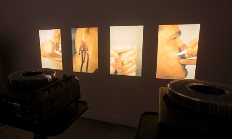
Someone is picking wild flowers. Isn’t that nice? Now the flower is being used as a tickling stick. Very amusing. Wait, isn’t that actually a foreskin? Yes, it’s definitely a foreskin. This is Rosebud, a sensual black-and-white film by Turner prize nominee James Richards that interweaves images of aroused flesh and censorship. Provocative photographs with rude bits scratched out are intercut with footage showing the erotic use of flowers. In one sequence, a flower tickles an anus, which reacts by clenching shut.
What a heartening way to celebrate 30 years of the Turner prize. People are always saying the Turner, which shocked the nation with Tracey Emin’s unmade bed and Damien Hirst’s bisected cow, has become tame and middle-aged. It no longer creates the kinds of visceral arguments about the nature of art that it did back in the 20th century, when Rachel Whiteread won both the Turner in 1993 and the K Foundation award for “worst artist of the year”. Nowadays, conceptual art is so widely accepted as part of every aspiring person’s cultural makeup that the Turner causes less controversy than The Great British Bakeoff.
So there’s something nostalgic about sitting in the first room of this year’s show to watch a tightening sphincter filmed in beautiful shadowy greys and blacks. In a second work by Richards, six knitted banners reproduce photographs of people who all have one thing in common: they are standing next to the same bespectacled figure, a man only half there, his face partly cropped out. He is Keith Haring, the New York artist who died after contracting Aids in 1990. But by his third exhibit, Richards is losing his way. It’s a slideshow of people applying fake wound makeup that typifies the dangers of ironic art in the age of the internet, when anybody can find strange images online and play with them. This daft bit of so-so surrealism undermines the apparent passion of his other contributions. It’s pointless.
Addendum 1 (Finding Chopin: Dans l'Essex) by Tris Vonna-Michell.
Addendum 1 (Finding Chopin: Dans l’Essex) by Tris Vonna-Michell. Photograph: Graeme Robertson
But if Richards is interesting, the next artist in the show has a strange genius. Tris Vonna-Michell, in his film Finding Chopin: Dans l’Essex, asks a bold question: why was I born in this place in this time? Before hearing this, we have watched picturesque scenes of the coastal marshes of south east England. Vonna-Michell comes from Southend-on-Sea but, as he tells us, he asked his dad one day: why? His father replied (as you do) that he should seek out a French concrete poet called Henri Chopin who could answer his question. Chopin likes quail eggs, he said. Take some as a gift.
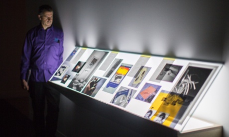
All this and a lot more information comes over in fast, ritualistic, cyclic sentences, as Vonna-Michell tells of his search for answers. The search leads to a room where we hear Vonna-Michell’s voice making various pronouncements: “Van Gogh says to Theo in one of his letters: I want to paint solitude”; “I used to be a vegan, now I’m a vegetarian.” Vonna-Michell has a lovely voice. The images in his films – the other tells of a doomed trip to Berlin in search of his mother’s childhood memories – are not important. It is the recorded voice that holds you. He is not, in fact, a film-maker. He is a spoken-word performance artist, usually telling his tangled, rapid, image-packed stories live. Obviously, in the Turner you need to show something, so he’s made these films.
What comes through is that voice, which is funny, engaging and capable of holding your full attention. Vonna-Michell is doing a kind of performance poetry. It’s quietly magnetic even though all you have is his voice and a sequence of images. Of course, he never does find out why he was born in Southend-on-Sea. By the time he tracks down Chopin, who died in Norfolk in 2008, the eggs he bought as a gift are ruined.Vonna-Michell is a true original and I kept coming back to his room with a deepening pleasure. There are no false notes in his installation. It is beautiful.
James Richards’ images of fake wounds
James Richards’ images of fake wounds. Photograph: Graeme Robertson
This is not, however, a vintage Turner year. The other two artists on the shortlist are not worthy of being there. What happened? Has the pool of British art, after 30 years of the Turner, got too small to produce four decent young artists? Or are the judges unable to recognise mediocrity when they see it?
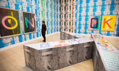
Ciara Phillips makes prints. But so what? Her room is papered with various blurred ones, plus portrait photographs and a kind of booth in the middle where you can read and listen to an alphabet of supposedly thought-provoking topics. There is a purported politics behind it all – campaigns, direct action, buzzwords – but the art does not come across with enough power to make that matter. It’s like a degree show. I’m sure she was top of the class at art school, but she is still going through academic exercises, making prints with no point, just because she can.
At least you can walk in and out of her exhibit. Duncan Campbell demands that you sit down and watch a 54-minute film in which he indulges in so much radical-chic, sub-Godardian posturing that by the end you will either be brainwashed into joining the nearest Maoist splinter group or, more likely, you’ll feel like slashing the seats. It is monstrously arrogant to show a film this long in the Turner Prize. He steals time from the other artists (unless you plan to spend four hours here) and what has he got? What’s he saying that’s so important? It for Others, as the film is called, is a rehash of Marxism and sociological textbooks set against images that include, in the best sequence, the Michael Clark dance company illustrating Marx’s theory of value. The ideas are secondhand and the hectoring tone obnoxious. Part of it is a lecture about a film made by Chris Marker about African masks – still with me? The narrator points out lots of basic stuff about how modern artists falsified the art of Africa. Later, there’s a bit about how artistic value is created. It is all presented as a radical revelation but who doesn’t know the art market is a bit funny?
Duncan Campbell.
Duncan Campbell’s 54-minute film. Photograph: Graeme Robertson
And yet. Maybe this is a great Turner prize after all, for it juxtaposes such radically different models of what art can be now. Glib reports will say this is a Turner dominated by video, but it’s just a medium, and the uses these artists put it to contrast wildly. For Richards, art is an arrow of desire. For Campbell, it is a theoretical weapon.
It is Vonna-Michell who deserves the Turner when the winner is announced in December. For him, video is just a way of getting at something more elusive and magical: the mystery of live performance. Of the four, he’s the only one whose artistic personality shines through. He seems to have found a highly imaginative way of being in the world. You feel he is an artist when he’s on the loo, as much as he is when he gets up to perform. At the end of his film, he even thanks the audience for listening – what a charmer. The winner of the Turner prize, at least as far as I’m concerned, is the human voice.
• The Turner Prize is at Tate Britain, London SW1, until 4 January.

2014年9月28日 星期日

Figure and Architecture: Henry Moore in the 1950s

> Figure and Architecture

Figure and Architecture: Henry Moore in the 1950s


Leeds Art Gallery Collections Display
24th July 2014 - 31st July 2015
Lower Sculpture Study Gallery, Leeds Art Gallery

Henry Moore
UNESCO Reclining Figure 1957-58
Roman Travertine marble (LH 416)
Sited outside the UNESCO headquarters, Paris
© The Henry Moore Foundation, 2014

'I think architecture is the poorer for the absence of sculpture and I also think that the sculptor, by not collaborating with the architect, misses opportunities of his work being used socially and being seen by a wider public ... the time is coming for architects and sculptors to work together again.'
From Sculpture in the Open Air: A Talk by Henry Moore on his Sculpture and its Placing in Open-Air Sites, 1955
Figure and Architecture: Henry Moore in the 1950s is a display of sculpture, photographs and archive material from the collections of The Henry Moore Foundation and Leeds Museums and Galleries relating to three key architectural commissions undertaken by Henry Moore: the 'Time Life Screen' (1952-53), the unrealised designs for the English Electric Company (1954) and the 'UNESCO Reclining Figure' (1957-58).
Throughout the 1950s Moore received an increasing number of approaches from architects wishing to commission sculpture for new buildings and public spaces. The universal, humanist themes of his work and his international reputation as a leading modern sculptor were considered particularly apposite for the reconstruction and civic regeneration projects of the post-war period. Yet, despite his belief in the potential for both artist and architect, Moore was initially reluctant to accept such commissions. He expressed concern that sculpture was too often considered by architects as 'mere surface decoration', while the increasing tendency for invitations to make work in urban sites was deeply at odds with his preference for natural, landscape settings, which he felt enhanced the inherently human, organic forms of his sculpture.
The Time Life Screen and English Electric Company maquettes were commissioned by Austrian architect Michael Rosenauer, in whom Moore found a collaborator willing to incorporate sculpture into the design of the building. These projects represent Moore's most fully realised attempts to integrate sculpture into the rhythm and fabric of a building by introducing abstract and biomorphic forms into the restrained elements of modern architecture.
The commission of a sculpture for the United Nations Educational, Scientific and Cultural Organisation (UNESCO) headquarters encapsulated the challenge Moore found in reconciling his asymmetrical, human forms with stark, geometric architectural planes. The project provided the impetus for numerous maquettes positioning figures on steps, platforms, benches and against walls; these architectural elements are integral to the sculpture, mediating between figure and built environment. The final sculpture would appear against a backdrop of the new building's rectilinear, glass façade. This prolific period of experimentation provided ideas that Moore would continue to refer back to throughout his career.

2014年9月24日 星期三

The Sculpture Arts of Chua Boon Kee


【新唐人2014年9月23日訊】(新唐人記者文沁英國倫敦報導)英國CAS藝術空間攜Shaftesbury PLC日前宣布新加坡藝術家蔡汶家(Chua Boon Kee)先生為「飲水思源(SUSTAIN)」雕塑藝術項目獲選人,並受邀訪英,參加9月地標雕塑Flowing倫敦中國城揭幕儀式。

  1. Chua Boon Kee

    www.chuaboonkee.com/
    The Sculpture Arts of Chua Boon Kee. “In art, he has inspired us to serve humanity and to do good. In life he has chosen the spiritual path of Buddhism and live a ...
  2. About Artist - Chua Boon Kee

    chuaboonkee.com/Chua_Boon_Kee/About_Artist.html
    About Artist. Chua Boon Kee, whose ancestors originated from Chaoyang in ...

    • Image result for Chua Boon Kee
    • Image result for Chua Boon Kee
    • Image result for Chua Boon Kee
    • Image result for Chua Boon Kee
    • Image result for Chua Boon Kee
    • Image result for Chua Boon Kee

2014年9月23日 星期二

Contagion helps to explain art value

Contagion helps to explain art value

The study’s findings indicate that people tend to attach a special kind of significance to original works of art.
The study’s findings indicate that people tend to attach a special kind of significance to original works of art. Photo by Wa Liu.

A new study by researchers at the Yale School of Management explores why we value an original piece of artwork so much more than an exact duplicate.
While it is common knowledge that an original is worth far more than a perfect forgery, it remained unclear what psychological factors distinguish work from fake. To probe this question, the study investigated whether people understood artwork to be more like humans or generic tools, and found that it landed somewhere in the middle of the spectrum — people believe that artwork, like humans, cannot be recreated, because it then loses part of its creator’s essence. The findings have implications beyond the art world, extending to markets for luxury goods or celebrity memorabilia, said George Newman GRD ’08, study lead author and SOM professor.
“It’s [an effect] we see cross-culturally, and it’s shared across many different people from many different cultures of many different ages,” Newman said.
The research was an exploration of the idea of “identity continuity,” the study of what makes something the same over time. Newman and co-researchers at SOM and the University of Chicago Booth School of Business investigated how people perceive identity continuity in relation to artwork, and in particular whether a piece of artwork is considered to be as valuable if it is destroyed and then replicated.
In the first experiment, researchers presented 37 participants with a scenario in which a man created a mold, poured plastic into the mold, and later realized that the product was deteriorating and had to be recreated using the same mold. Some of the participants were then told that the original had been a piece of art; others were told that it had been a tool. When asked whether or not the resulting duplicate was the same as the original, participants who had been told the object was a tool were far more likely to agree than those who considered the original a work of art.
This finding suggests that humans understand artwork as fundamentally special, said Rosanna Smith GRD ’18, a study coauthor. The second experiment aimed to explain this phenomenon: What is it about artwork that makes it more irreplaceable than a hammer or a trash can?
“When you recreate that artwork, every molecule is still there, so what’s missing?” Smith said.
To address this question, the research team posed three potential explanations for the uniqueness of artwork: that the artist transferred a part of his or her essence to the piece, the idea of individual creativity, or the idea of sentimentality. The study used an online survey of 303 adults to evaluate which of these hypotheses the participants deemed most important.
The results showed that people significantly valued the essence of the creator over any factors of creativity or sentimentality, Smith said. This finding suggests a common belief in “magical contagion,” in which a piece of the artist’s essence has been transferred to the artwork and cannot be duplicated.
“The object comes to embody, in a pretty literal sense, a piece of the creator,” Newman said. “A piece of the person is literally rubbed off on the object.”
These findings may have implications for the business world, Smith said. The contagion effect seems to defy the economic idea of humans as rational actors, since certain objects are valued at such high rates that cannot be explained by their material value, he explained. The finding adds more nuance to our understanding of how buyers make decisions, she said.
The idea of placing value on the intangible quality of essence spans cultures and ages, Newman said, adding that anthropologists and sociologists have researched the topic for the last century. While an explanation for this belief is still under investigation, there does seem to be a “core cognitive faculty” at play, he said.
“Seeing how we value objects can help us understand how we see ourselves as well,” Smith said. “We seem to prize people’s souls and uniquenesses at a very high rate.”
The study was published in the journal Topics in Cognitive Science on Aug. 27.

A Golden Age of Design

A Golden Age of Design

Thanks to a convergence of creativity, technology and big money, the heyday of the field may finally be upon us.
Photo
CreditPoster by François Caspar
The golden age of design has been heralded many times over the past couple of decades — four, by my count. Now, this previous momentum paired with technology, community and big business has fueled something new: an unprecedented belief in the power of design to not only elevate an idea, but be the idea.
First, at the turn of the 21st century, it became a democratic affair. Everyday objects were made more beautiful and more readily accessible, and suddenly it was no longer acceptable for things to be unnecessarily unattractive. Moment two arrived soon after, by way of products such as the iPod, which exemplified the possibility of form as actual function. “Design,” Steve Jobs told me in 2003, is “not just what it looks like and feels like. Design is how it works.” And the business world took note of what design could do for profits.
As the aughts advanced, it occurred to people that if design could make products work better, it might also be able to make the world work better. Design was heralded as a creator of social change: Magazines like Good spread the word about its impact on humanity and politics; the Cooper Hewitt museum staged a show in 2007 called “Design for the Other 90%,” and a popular T-shirt from the period read: “Design Will Save the World.” Finally, a fourth moment: The advent of social media made clear that the masses not only responded to design; they cared about it enough to speak up. A new Gap logo was attacked by online mobs, and Tropicana scrapped a redesign of its orange-juice packaging after a public rebuke.
These days, engineering-centric Silicon Valley sees design as something that no longer just adds value, but actually creates it. Last year, Nest Labs, maker of the sleekly styled smart thermostat, was purchased by Google for $3.2 billion. This was not just a staggering amount of money for a company that specializes in household objects; it was Google’s second most expensive acquisition ever. The industrial designer Yves Béhar, who is behind the elegant Jawbone Up fitness tracker, sometimes takes equity stakes in start-ups he works with rather than payment. Instead of thinking of himself as an outside consultant, Béhar invests in companies that invest in design, banking on their future growth.
The idea that design can generate profit is now being embraced by venture capitalists, too — that rarefied class known for its relentless focus on the marketplace as the ultimate arbiter of value. The well-regarded Silicon Valley venture firm Kleiner Perkins Caufield & Byers raised eyebrows last year by bringing in John Maeda, the former president of the Rhode Island School of Design, as a partner. The firm has noticed more designers starting companies with the help of engineers, rather than the other way around.
Kleiner’s Mike Abbott points to the Twitter co-founder Jack Dorsey, who moved from software to hardware when he founded Square, the seamlessly designed product that lets anyone take credit-card payments through a smartphone. Similarly, the home-sharing firm Airbnb’s systematic thinking and simple user interface have made it immensely popular — and earned it a $10 billion valuation. (Two of its founders are RISD graduates.) Smart design is intrinsic to its success.
“People who make things generally have not been in the seat of power,” Maeda argues, “because they’re busy making things.” But he believes that’s starting to change, and that eventually people like Airbnb’s co-founders will bring design-based thinking to mainstream business practices.
This design moment is also about a different marketplace — that of ideas.
The influential MoMA senior architecture and design curator Paola Antonelli believes that one of design’s most important functions is “to help people deal with change.” Her exhibitions have featured projects such as the EyeWriter, a pair of glasses outfitted with eye-tracking technology that lets a user “draw” with his eyes. Created for a paralyzed artist, the product is a collaboration between technologists and designers, and relies on open-source software. It has no commercial ambitions. It’s simply a sharp example of an expressive designed object.
We’re living in a time of “acknowledged urgency,” Antonelli says, and pragmatic fields from science to politics to business are looking to design for “inspiration, alternative processes, metaphor and a bit of uplift.” (“Delight” has become a buzzword in Silicon Valley.) As a result, design has become incredibly multifaceted in recent years, encompassing subfields such as interaction design, critical design, environmental design, social design, biodesign and service design, to name just a few. It’s become a medium for expressing ideas, raising provocative questions and addressing social and individual anxieties.
So is design a business builder or idea spreader? Both, often at the same time.
In earlier moments, the democratization of design was about what we could buy. Now it’s about what we can make and how we can sell. The online marketplace Etsy has redefined how small-scale makers can earn a living, or at least subsidize a creative hobby. Last year, the site hosted more than a million active shops. According to a 2012 survey, nearly a fifth of Etsy sellers considered running their creative businesses their full-time job. Crowdfunding services like Kickstarter also enable aspiring design entrepreneurs to find support for their projects. One breakaway success was an early-stage “smart watch” called Pebble, which could connect to smartphones, display emails and text messages and even run apps. Two years ago, without the backing of an established company — let alone venture capitalists — its founders raised more than half a million dollars in a matter of hours, eventually bringing in $10 million to develop the watch. As Maeda observed, today’s design student may be less interested in building a portfolio than in simply crowdfunding an idea.
Allan Chochinov, head of the Products of Design graduate program at the School of Visual Arts, talks about how design has moved “from the aesthetic, to the strategic, to the participatory.” In his thinking, the “open source” ideology we normally associate with certain corners of tech culture has made its way into design. Engineering and design are melding; code-y enterprises are making objects; and object makers are hardwiring all kinds of things with code. Young designers need to be conversant in tools like the Arduino platform (inexpensive hardware for programming interactive objects) and customizable Raspberry Pi computers (credit card-sized circuit boards that can plug into monitors and keyboards). Style, functionality and engineering are now one and the same, and even mundane objects are virtuously designed.
What is certain is that all these combined elements — style, function, social impact, creativity and profit motive — have yielded an original vision of what design is and why it matters. Design has fundamentally changed the way we experience the world, from the way we interact with objects to our expectations about how organizations are structured. It’s a new and exciting moment for design — that is, until the next one comes along.