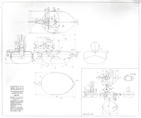
Patrick Rylands: a hero of toy design
Patrick Rylands' toys were once in virtually every household. He talks here about his classic designs – including those beloved primary-coloured floating ducks – and his thoughts on modern toys

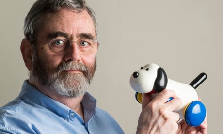
The name may not be immediately familiar to you, but if you grew up in the late 60s, 70s or 80s, the chances are you had at least one of his toys in your house, more specifically in your bath. Patrick Rylands was chief designer at Ambi Toys for more than 30 years, and responsible for some of the most-loved baby and toddler toys. He combined simplicity of design with movement, sound and bright primary colours to ensure that children grew up knowing exactly how to fit three miniature plastic ducks in one big one.
Now there is a renewed interest in simple, effective toys that stimulate the imagination (perhaps it's a backlash to the abundance of tech-heavy toys now on the market) and Rylands' work is beginning to be properly appreciated again. He talked us through his very first creations, and his thoughts on modern toy design.
PlayPlax
Invented by Rylands in 1966, PlayPlax has sold over a million copies – and is still in production today. Rylands had the idea while still studying at the Royal College of Art, and manufactured the prototype in his holidays, back home in Hull. "I'd become interested in the idea of play in itself and what I was trying to do was to make something that was just stuff, rather than anything that was predetermined. This is the least you can do to a bit of plastic and still make it useable for something else," he explains.
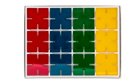
As he was working at the Hornsea Pottery during his summer holidays, he showed the design to the boss, Desmond Rawson. "He came in and said: 'Eh, that's interesting lad, I know someone who'd make that for you'", recalls Rylands. "And he spoke to the people that were making stoppers for salt pots and lids for spice jars. And they as it happened were looking for their own product at the time, a company called Trendon."
The interlocking, brightly coloured design, which allows you to build infinite 3D combinations of squares, is a classic – the first of many Rylands was to produce.
"I learned on the job," says Rylands. "There was never a drawing for PlayPlax or the first things, I just made a model – then the next things I did do drawings for. And we just sent the drawings straight to toolmakers. Little by little, things got more complicated. The boss was very cost-conscious so we never made prototypes. We always worked straight from drawings – in the end I was doing really quite complicated things straight from drawings, with huge complicated drawings, everything detailed."
Bird and Fish
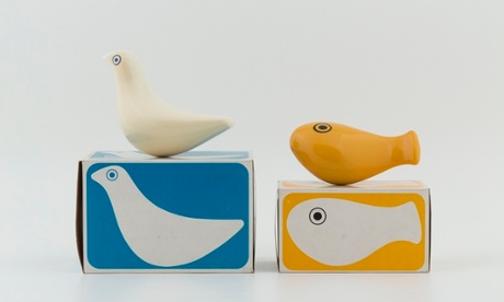
In 1970, Rylands won the Duke of Edinburgh prize, awarded to the designer of a product "distinguished by its elegance". The judges particularly singled out the abstract qualities of these Bird and Fish toys, "which encourage children to use their imagination and introduce them to ideas of structure, form, colour and balance". Both are bath toys, made from ABS plastics, with just eyes for decoration and internal ballasts to keep them upright in the water. The design was minimalist enough to appeal to adults and children alike (indeed there is a thriving eBay market for them still).
The bird design was actually based on an Eskimo bone carving in the British Museum. They are now part of British design history and like many other of Rylands toys are on display in the V&A Museum of Childhood. In 2012 they were relaunched by Selegiochi Toys under the MasterToys brand, but unfortunately a manufacturing fault meant they had to be discontinued. There are rumours, though, that they will be making a comeback later this year.
AmbiToys
After Trendon, Rylands worked closely with AmbiToys – orignally called Europlastic – in the Netherlands. "It was an outfit run by two Jewish friends who had fled Holland in the war, and when they came back they got together and set up import/export business. Among the things they bought and sold were fairly rudimentary plastic toys – you know, stacking beakers and that kind of thing. And being smart they realised they were paying too much for these, that if they made them themselves they'd get more out of it. So then they were in the toy business."
Rylands' time working for AmbiToys was hugely productive. "It would take me on average about six weeks to do a product, so we'd have a rolling list of things. And if I had half an idea I'd tell the boss about it and maybe send a little coloured sketch to say it could look like this … what do you think?
"Then I'd get down to the drawing board. Part of the difficulty, of course, is that you can't just draw a nice-looking thing. You have to draw a nice looking thing that will work. And if it's got parts, they've all got to come together. I'd find myself some days working on a section and then I'd discover that the part I was drawing had to go in a place where it wouldn't work. That was the downside of working alone."
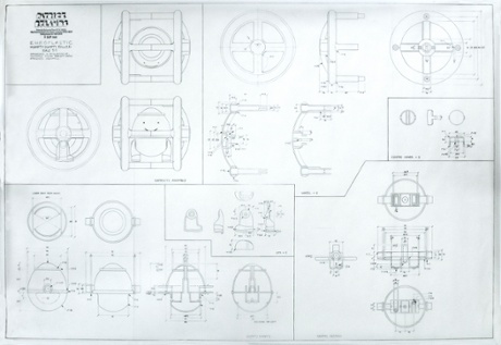
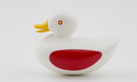
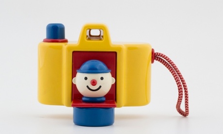
Bath duck
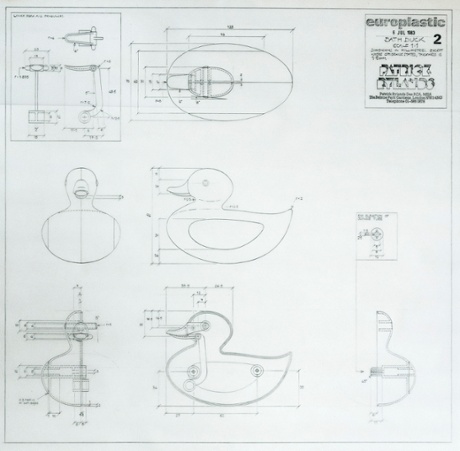
The meticulous detail in what seem superficially to be the simplest of toys is evident in Rylands' drawings, perhaps more than in the finished toys. The beak on this toy was designed so that the slightest movement of the water set it into motion. It also allowed any water entering the toy to escape, thus avoiding an unfortunate duck-sinking incident ...
Inspiration came from everywhere. "Occasionally there would be something ready made. One quite popular toy I did was based on a 19th-century tin toy called Magic Run. That I just took directly – I remodelled it so obviously it was a completely different-looking thing, but the principle was there. But you'd see other things – bits of mechanism in other objects that could convert to toys."
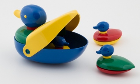
Duck family
In another of Rylands' ingenious designs, three little ducklings hide inside the mother duck, or float free in the bath.
Cool Cat
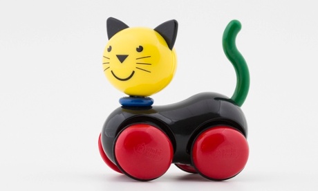
The faces on Patrick Rylands' toys have also developed over the years – conveying friendliness and character in a few simple lines. This cat's head spins and the body bobs when he is rolled along the floor. This cat dates from the period (around 1999) when Ambi Toys was sold to BRIO. That firm introduced the colour black into the range. Also at this time, Rylands was elected as a Royal Designer for Industry (RDI) - an honour introduced by the RSA in 1936.
Sniffer Mouse
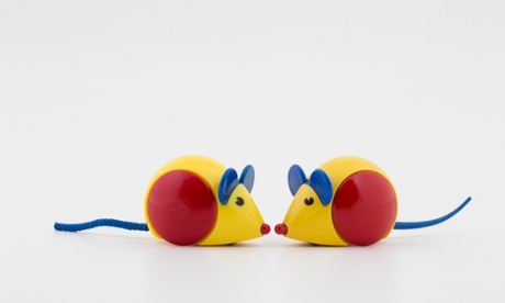
This photo shows an original design concept (right) and the current production model. In the original, the stiff rubbery tail points upwards and was designed to ping back into shape and position when flicked or pulled. But this was deemed unsuitable for children, due to risk of eyepoking, and replaced with a soft, cord-style tail. Health and safety gone mad?
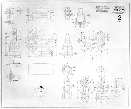
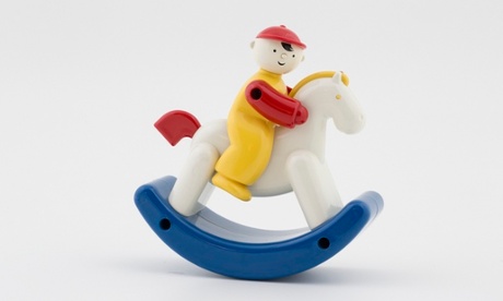
Rocky Jocky
Ambi Toys ground to a halt, and was bought by an Italian distributor and owner of toy shops who had been a longstanding fan of Rylands' work. But when he fell ill, it went into limbo, leaving 120-odd products without a manufacturer or a home. Then Galt Toys stepped in, bought the business and after meeting with Rylands, bought his drawings too, so it could begin manufacturing the toys again.
Rylands is now largely retired, though he consults with Galt on the range. So what does he make of contemporary toy design? "Nearly everything has got a screen and buttons to press. I find that sad because I think children need to learn through handling things. I've so often been to an antiques fair and seen something and thought 'Oh that looks interesting' and the minute I touched it I realised it wasn't, that I'd misread it. You need that extra information to make a judgment.
"I think that has to be important when you are growing up, that has to be what informs you about the physical world. And if it's all flat images that are manipulated on screen, it can't be as good. I love my computer, it's the most fabulous toy I've ever owned, but I don't think it should be the only thing."
Colours
All of Rylands' designs are notable for their bright, clean primary colours. So what does he make of the "pinkification" of girls' toys, and the colours used in manufacture today? "It had begun to happen in my time," he says. "There was a movement to have us not make everything in primaries. We did do just a handful of things in pastel shades one year – and luckily customers didn't like them. So we went back to primaries because that's what we knew to do.
"But I can't remember that it was ever a consideration, to be honest. We were making things for very young children and we used the brightest colours possible." Then there were practical considerations: "If we stuck to primaries and white it meant we didn't have to hold immense amounts of stock of material!"
")


