2009年12月27日 星期日

A New Look for the Public Library’s Lion Logo

November 9, 2009, 4:53 pm

A New Look for the Public Library’s Lion Logo

Sketches that were drawn by staff of the New York Public Library in the process of designing a new lion logo.New York Public Library Sketches that were drawn by New York Public Library staff members in the process of designing a new lion logo.

The library lion has shed its shaggy mane for the digital age.

For the first time in at least a quarter century, the New York Public Library has unveiled a new logo, this one designed to work both online and in print. Consisting of a profile of a lion inside a circle, it sheds the fussy detail of the old one. Instead, it uses bold, simple lines that evoke the style of stained-glass windows, woodcuts, or old printers’ marks.

The old logo of the New York Public Library, in use for over a quarter century, would lose detail when it was too small.New York Public Library The old logo of the New York Public Library would lose detail when it was too small.
The New York Public Library unveiled a new lion logo, its first in at least a quarter-century.New York Public Library The library’s new lion logo.

The strong lines allow for the logo to be scaled to different sizes — a requirement in an age when people are as likely, if not more likely, to see a logo on their computer as they are in print. “It’s got to be able to work that small and that large,” explained Marc Blaustein, art director for the library system, who oversaw the creation of the logo. The old logo had a hard time maintaining its detail as it shrank, Mr. Blaustein said.

At the same time a logo can’t be overly simple. “If it gets too minimal, then it doesn’t have any energy,” said Brian Collins, a designer who has been involved with a number of logo redesigns, including one for Yahoo.

The new logo has already been introduced on the library Web site and will be adopted eventually on library signs, library cards, and printed materials. (One hopes it will have a more positive response than the New York City taxi logo.)

The library started considering a redesign more than a year ago, in large part because it wanted to convey a more modern and digital-friendly image. The process also included adoption of a new color palette and a new typeface. Instead of going to an outside agency, the task fell to the library’s own staff. “This is an in-house product,” said Paul LeClerc, president of the library.

The logo started with a lion — specifically, Fortitude, the northern of the two lions that flank the steps to the main library, also known as the Stephen A. Schwarzman Building. The other lion is Patience.

(”It’s primarily based on Fortitude, but it’s a combination of both,” said Mr. Blaustein. “The angle is Fortitude, but some of the features are inspired by Patience.”)

While the lion had to be the focus, the conceptualization of the design was left open. “We explored dozens of concepts and did hundreds of drawings,” Mr. Blaustein said.

After searching through hundreds of typefaces, the staff settled on a sans-serif typeface called Kievit, which was designed by Michael Abbink in 2001. It was chosen in large part because it was contemporary and worked well on the Web and in print.

In contrast, there are fonts, such as Microsoft’s Verdana, that are designed to be screen-friendly. But the migration of some of these fonts into print, as in the case of the Ikea catalog, can be very controversial among typeface aficionados.

One enduring mystery: the origins of the old logo and its age. Mr. Blaustein said his search had turned up little about its history. “No one knows who designed it,” he said. Libraries excel at preserving history, but not always, it seems, their own.

2009年12月22日 星期二

為什麼我們必須反共抗馬

為什麼我們必須反共抗馬--本周周三23日起停刊數日--版主在某新聞管制之國家

2009年12月19日 星期六

The Real Cabaret


The Real Cabaret


Few musicals can claim to capture the mood of a historical period as well as the 1972 classic Cabaret.

Liza Minnelli's unforgettable portrayal of singer Sally Bowles and the film's stylish recreation of the era have become defining images of Weimar Berlin.

In this documentary, actor Alan Cumming explores the truths behind the fiction. He meets many of those closely involved with the original film, including Liza Minnelli, and talks to cabaret artists, among them acclaimed performer Ute Lemper.

Alan explores the origins of the Cabaret story in the writings of Christopher Isherwood and uncovers the story of the real life Sally Bowles, a woman very different from her fictional counterpart.

He talks to the composer of Cabaret about the inspiration for the film's most famous songs and discovers the stories of the original composers and performers, among them Marlene Dietrich. Finally, Alan reveals the tragic fate of many of the cabaret artists at the hands of the Nazis.

The documentary pays tribute to the magic of the original film and explores the fascinating and often shocking reality of the people and stories that inspired it.

2009年11月21日 星期六

丰子恺《护生画集》

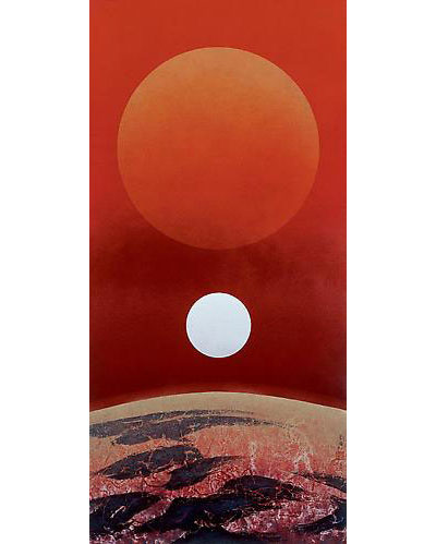
Beyond China:The New Ink Painting from Taiwan

liukuo-song
Liu Kuo-sung (b. 1932)
Sun/Moon Symmetry, 2008
Ink and colour on paper
62 x 29 1/2 inches (158 x 75 cm)

‘Beyond China’ is an ambitious exhibition of ten contemporary artists from Taiwan, all of whom represent the best of the New Ink Painting—the contemporary expression of the classical brush and ink style developed over the centuries. This exhibition highlights some of the most significant work being done by the most distinguished practitioners of the New Ink Painting beyond the Chinese mainland.

The works of these artists range from the neo-classical to the avant-garde and from those who have long been internationally established (Liu Kuo-sung, Tong Yangtze, Yuan Jai, Lo Ch’ing, Yu Peng, and Ho Huai-shuo) to the emerging younger generation of brilliant exponants (Fay Ku, Pan Hsin-hua, Yao Jui-Chung, and Chun-yi Lee). Each with their own distinct style, these artists represent different trends in the development of contemporary Chinese ink painting.

Ink painting, as expressed in calligraphy and monumental landscape painting, is the foundation stone of Chinese culture. While this tradition was interrupted in Mainland China because of the Cultural Revolution, Taiwan has benefited from an unbroken link with China’s cultural past.

In the past three decades, Taiwan has experienced enormous technological and economic development, which has in turn prompted its artists to search for ways to convert their culture’s traditional aesthetic into work that is relevant to the contemporary world. While all of these artists have benefited from a rigorous foundation in the brush and ink tradition, they have evolved in different adventurous ways to express the reality of modern Asia with a new pictorial language.

Opening Reception Friday, 30 October 2009, 6 – 8 PM

Michael Goedhuis, London
16 Bloomfield Terrace
London SW1W 8PG
Phone: +44 (0) 20 7823 1395
Web: www.michaelgoedhuis.com

十位來自台灣的現代藝術家在倫敦舉行聯展「中國之外:來自台灣的新水墨畫」(Beyond China:The New Ink Painting from Taiwan ),被譽為二○○九年倫敦亞洲藝術畫廊展出中,策畫精緻,最具宏觀性的展覽之一。

 「中國之外:來自台灣的新水墨畫」結集了劉國松、何懷碩、于彭、羅青、袁旃、李君毅、潘信華、董陽孜、姚瑞中、顧詠德、李真等具國際知名 度或獨樹一幟的台灣藝術家。這項從優雅新古典到風格前衛的水墨創作展,反應了台灣過去三十年在中國傳統水墨技巧和現代藝術創作間的巧思與創意。

 展覽策展人古德赫斯(Michael Goedhuis)表示,書法和水墨山水是中國文化的基礎。相較於受到文化大革命干擾的中國,台灣在這一方面比中國大陸幸運。

 從紐約大都會博物館、波士頓現代美術館,以及其他相關機構均準備於未來兩年內,陸續推出大型中國現代水墨展的趨勢觀察,古德赫斯預言,「現代水墨作品將是下一波國際藝術市場的新潮流。」

2009年9月30日 星期三

Abstract America﹕New Painting and Sculptur


抽象美國 倫敦曬冷
2009-09-30
【明報專訊】即日至2010年1月17日,倫敦現代藝術畫廊Saatchi Gallery舉辦Abstract America﹕New Painting and Sculpture,有超過30位美國藝術家展示抽象畫作及雕塑,當中包括愛以賽車為題的Kristin Baker,以拼貼畫像為主的Mark Bradford,以及製作全黑色雕刻的Peter Coffin等藝術家。

地址﹕Duke of York's HQ, King's Road, London, SW3 4SQ

日期﹕即日至2010年1月17日
時間﹕上午10:00至晚上6:00
網址﹕http://www.saatchi-gallery.co.uk
收費﹕免費

click artists to view

Kristin Baker
John Bauer
Mark Bradford
Tom Burr
Joe Bradley
Jedediah Caesar
Carter
Eric and Heather ChanSchatz
Peter Coffin
Guerra de la Paz
Francesca DiMattio
Bart Exposito
Mark Grotjahn
Jacob Hashimoto
Rachel Harrison
Patrick Hill
Ryan Johnson
Matt Johnson
Paul Lee
Chris Martin
Elizabeth Neel
Baker Overstreet
Stephen G. Rhodes
Amanda Ross-Ho
Sterling Ruby
Gedi Sibony
Amy Sillman
Agathe Snow
Kirsten Stoltmann
Dan Walsh
Jonas Wood
Aaron Young

Abstract America:
New Painting From
The U.S.

416 pages of full colour illustrations in hardback. This extensive survey of new abstract painting from America is available to order direct from the Saatchi Gallery Online Shop.


Shape Of Things To Come:
New Sculpture

686 pages of full colour illustrations in hardback. This extensive survey of new sculpture available to order direct from the Saatchi Gallery Online Shop.


2009年9月24日 星期四

ARTstor與台灣多樣性知識網功能比較

藝饗世界-ARTstor與台灣多樣性知識網功能比較

文/高朗軒、徐千禾

如果可以把世界上所有美術館、博物館的藏品匯聚在一個資料庫,從美國大都會美術館的當代藝術作品到中國沙漠的敦煌石窟,都可以在平台上瀏覽、檢索與編輯,世界的珍藏盡收眼底…甚 至可以下載到個人電腦裡儲存。在台灣,這是進行數位典藏工作人員心中的夢想與藍圖,但是在美國,美崙基金會在過去幾年開發了ARTstor線上資料庫系 統,結合數位科技與藝術人文,正朝向這個目標不斷前進。Myka Carroll來自美國紐約,擔任ARTstor拓展海外業務的公關經理,所學橫跨圖書資訊、歷史人文,並曾出版相關書籍,運用其資訊與圖書的專業,旅行 世界各地介紹ARTstor資料庫。她在2009年5月來到台北,透過「藝享新視紀:數位藝術的合作典藏」座談會分享ARTstor資料庫博大精深、縱觀 古今的藏品內容。

ARTstor簡介

ARTstor是一個非營利的數位典藏資料庫,由美國的美崙基金會於2004年正式推出,為了回應使用者與社群需求,建置了一系列瀏覽、展示與管理影像的工具,世界上有來自30個國家超過1135個學術與非營利機構共同參與,主要運用在學術研究、教育與學習等領域。

點進ARTstor,大幅的藝術作品躍然而現,「影像─為了學術與教育」開宗明義地告知資料庫的精神與主旨,首頁的設計大方而優雅,像是走進美術館,洋溢濃厚的藝術與人文氛圍。

博大精深、綜觀古今的資料庫

在過去五年內,ARTstor資料庫收錄了近百萬筆跨時代、跨文化、跨領域的藝術典藏影像檔案,內容涵蓋畫作、雕刻、器具、建築、手稿、樂譜、地 圖、文物與裝置藝術,透過眾多合作典藏機構的貢獻與分享,在平台上跨學科地提供博物館典藏、亞洲典藏、歐洲藝術、拉丁美洲與中南非文化、當代藝術、建築、 攝影、紀念物…等主題研究,並且積極強化圖檔的品質與各種3D、虛擬實境技術的應用,不僅呈現藝術品最細緻的一面,與哥倫比亞大學合作研發的 QTVR(Quick Time Virtual Reality)更進一步地呈現建築物的內部空間,提供各種拉近、拉遠、360度環繞…等功能。目前在資料庫中約有1200筆,主要應用在建築物上,讓使 用者在網路上身歷其境,甚至看到建築物在日常生活中無法窺見的一面,拓展使用者的日常視覺經驗。

從使用者需求出發的功能與介面

為了回應使用者與專業社群需求,ARTstor資料庫查詢與檢索的功能回歸到人性化與直覺操作的設計,除了最基本的檢索與查詢功能外,使用者可以簡 單地以滑鼠操作圖片的放大、縮小、拖曳…等功能,並且透過篩選、排序等方式組合搜尋結果,每一件圖片下方,提供了額外兩個功能選項,按一下便可顯示其他收 錄的複製與攝影作品,或者列出與主題相關的其他資料。

Andy Warhol – Campbells Soup Cans (1961-2)

進入圖片檢視視窗,ARTstor所提供的圖片品質與細膩度著實讓人驚艷,以安迪沃荷 (Andy Warhol)的Campbells Soup Cans畫作為例,在瀏覽器上將作品檢視放到100%視窗,螢幕上僅能顯現藏品約1/12的範圍,可以看到畫作上清楚的細節,雖然在檢視圖片細節時無法同 時看到藏品的全貌,但這樣的解析度確實不輸觀看畫作圖錄時的清晰度。

檢索結果列表(收錄其他複製品&顯示其他與主題相關的圖片)

在檢視結果列表中,某些藏品名稱上會顯示「3-D」:虛擬實境環物影像或「QTVR」:360度環景影像,這兩項功能提供了清晰的影像、角度翻轉與放大縮小的功能,可以自由的調整想看的角度及各項細節。

藝術活頁簿:在線上以個人帳號建立自己的筆記,在感興趣的藏品物件中加上自己的註解與附記。

打包藝術帶著走

看 過精采而豐富的資料庫,不管是想要加上個人的心得與大家交流和分享,或者是希望透過圖片的比對與展示在演講與教學上,都能運用OIV系統進行更個人化的編 輯與處理;其特別為影像展示所設計,提供簡單的排版和文字註記的編輯功能,讓使用者可以加上自己私人的圖片與簡報,整合起來成為一個完整的個人知識展示 櫃,應用於教學、演講,在離線的狀態下向觀眾展示經過設計與組織的影像,並且在展示中隨時進行影像的放大與縮小,介面設計極富質感,簡單而大方,讓人能夠 更清楚地將注意力集中在圖片上。此外,檔案size可以壓縮成read only格式,便於攜帶與分享。

台灣多樣性知識網

了解ARTStor資料庫的建置理念與功能後,讓人想到拓展台灣數位典藏計畫也正著手進行「台灣多樣性知識網」的建置。

知識網簡介

台 灣多樣性知識網的主要目的是呈現台灣文化、社會及自然生態的多樣性資源,數位藏品的來源是以參與數典計畫的機構、公開徵選計畫、「數位島嶼」徵集而來的資 源,透過各單位彼此資源的分享、組織、合作及聯結的方式,將各種藏品分享給眾多使用者。和ARTStor一樣,知識網的用途也是主打學術研究、教育與學習 等領域。

知識網以主題式的架構組織各種類型的資料,開闢知識專題讓使用者找到所需要的資料,進入知識網首頁後,沉穩典雅的網頁隨即映入眼簾,中間軸的設計方便使用者快速瀏覽各知識專題。

知識探索‧悠遊多樣的台灣之美

進入知識專題後,面對顯示的龐大資料,使用者可以挑選自己感興趣的主題,點選後出現左列樹枝狀階層的藏品分類瀏覽,可以選擇以縮圖、清單及地圖三種模組來檢視想要找的資料,提供使用者不同的瀏覽習慣與需求。

檢索功能上除了依照各知識專題設計專屬關鍵詞的篩選功能外,也設計時間軸的篩選功能,可直接 輸入時間範圍或使用拉霸設定時間範圍,使用者可以設定多重的篩選條件,找到自己想要的資料。另外,在瀏覽資料的同時,也可將用不到的搜尋功能隱藏,讓瀏覽 網頁時有更開闊的視窗來顯示更多的資料。

在瀏覽單筆藏品詳細資料的頁面,知識網提供各類詳細藏品資訊,以及最大到1024*1024pixel的藏品圖片,讓使用者可以隨意調整圖片大小來 檢視藏品細節。下方的藏品展示列功能就如Amazon.com的推薦書籍功能,以及ARTStor顯示藏品相關延伸資訊功能一般,經過這樣關連性的脈絡引 導,可以讓使用者經由單一主題物件,找到更多樣性與意想不到的藏品資訊。

研究時常需要將各種藏品進行比較,知識網也提供了後設資料與影像縮放兩種比較模式,最多可同時將四種不同的藏品進行比較。

個人知識櫃的功能和ARTStor OIV簡報功能類似,使用者可以將喜歡的藏品納入知識櫃,建立GIS知識地圖、將藏品附上個人註解、創建簡報、電子書並分享給其他使用者觀看。


e進藝術與人文的知識殿堂

在網際網路尚未發達的時代,全賴閱讀報紙刊登的世界大小事。現在個人電腦的普及和網路的發達,網路挾著強大的即時性優勢,可以立即刊登資料及更新錯誤資訊,取代了報紙的地位躍升為知識傳遞的大功臣。

ARTStor也藉著這種優勢建立部落格,不定時發表資料庫更新狀態,以及與各博物館的合作情形,也預計在2009年夏天建置使用經驗分享的部落格 (ART stories),提供大眾如何更有方法的使用ARTStor並交流。ARTStor和台灣多樣性知識網廣納眾多的數位化藏品匯入資料庫內,讓社會大眾在 敲擊鍵盤同時,就能看到世界各地知識文化的結晶。除了知識的吸收外,也提供素人經驗為藏品附上個人註解,彼此分享和創造知識,讓這些原本只是素材的藏品, 經過分享、組織和創造,變成更多有用的知識。

延伸閱讀:

1. ARTstor: http://www.artstor.org/

2. ARTstor Blog: http://artstor.wordpress.com/

3. 拓展台灣數位典藏計畫:http://content.teldap.tw/

4. 台灣多樣性知識網:http://knowledge.teldap.tw/

5. 數位島嶼:http://cyberisland.teldap.tw/

2009年9月16日 星期三

Jan Kaplicky

http://en.wikipedia.org/wiki/Jan_Kaplick%C3%BD

【明報專訊】剛於年初逝世的Jan Kaplicky可說是建築界的殿堂級建築師,London Design Museum由即日至2009年11月1日,舉辦Remembering Jan Kaplicky: Architect of the Future回顧展。他於1994年為倫敦Lord's Cricket Ground設計的媒體中心The Lord's Media Centre,獲得建築界最高榮譽的史特靈建築獎(RIBA Stirling Prize)。而他於2003年參與設計伯明翰Selfridges Building,亦為他帶來7項建築大獎。他的作品充滿未來色彩,展覽中陳列他歷年建築設計的模型、草圖,讓公眾一窺大師腦海中的世界。

■Remembering Jan Kaplicky: Architect of the Future

地址﹕Design Museum, Shad Thames,London, SE1 2YD

日期﹕即日至2009年11月1日


時間﹕上午10:00至下午5:45(最後入場時間為下午5:15)

電話﹕+44 (0)20 7940 8790

網址﹕http://www.designmuseum.org
收費﹕成人每人8.5英鎊(約110港元)
文﹕甄俊宇

Beguiling beauty

Beguiling beauty

Sep 13th 2009
From Economist.com

A young damsel and Old Masters await in Naples


It might seem odd for the Museo di Capodimonte to conclude our summer series about hidden-gem museums. How is it that this national museum, in a former royal palace at the top of a mountain (or sizeable hill) with grand views

After all, the Capodimonte is filled with masterpieces from the world famous Farnese Collection, some 800 paintings by such artists as Titian, Raphael, Masaccio and Mantegna. Caravaggio’s searing “Flagellazione” stands out among the dramatic pictures in the Neapolitan Galleries. And then there is Parmigianino’s beloved “Antea”, an arresting portrait of a beautiful young woman (pictured). In Italy images of this woman, whose identity is not known, can be found on everything from fridge magnets to tea towels and Christmas ornaments.

Yet the contents of the Capodimonte are best known from reproductions or loans to international exhibitions. Only 86,000 people visited last year, few of whom were foreigners. Sadly, the city's daunting reputation may put many off, and the museum’s website is too limited to lure the uninitiated. But courage is no longer a prerequisite for a stay in Naples. The city has cleaned up its act (or, in the case of its garbage, had its act cleaned up for it). Handbag snatchers are now far less common than opportunities for delectable pizza. The Capodimonte is not the only reward for spending time in Naples, but it may be the most lasting one.

The striking hilltop site for a new royal palace was chosen in 1734 by Charles, the first Bourbon king of Naples. Its wooded surroundings suited his passion for hunting; its capacious interior provided room enough for the enormous art collection amassed by his forebears. (The family of Elisabetta Farnese, his mother and Queen of Spain, had been great collectors for more than 200 years.)

An enormous room hung with Farnese family portraits soon greets visitors. Do not yawn: this is no tedious group of ancestor likenesses. It is somehow shocking to come upon so many pictures of such high artistry, which reveal so much about the variety and vagaries of human character. Among the seven Farnese portraits by Titian on view (seven Titian portraits in one room!), the most haunting may be that of a white-bearded, hunched over Pope Paul III, weary but majestic. Raphael also painted two of the portraits here.

In addition to the museum’s Old Master paintings, there is a suite of royal apartments as they looked in the 19th century. One large room is hung with “The Battle of Pavia”, a masterly cycle of early 16th-century Brussels tapestries. Based on drawings by Bernard van Orley, it is an exceptionally honest look at men making war. And then there is “Antea”. Yes, this is an Old Master painting, but in a sense this is a work apart. She is “our Princess,” says Mariella Utili, the museum’s director. “Antea”, it seems, has been exercising royal prerogatives since she first came into being.


During the sack of Rome in 1527, Parmigianino’s studio was broken into by German soldiers. Besotted by the woman in the painting, they left him unmolested. In 1799, when Charles’s son, Ferdinand IV King of Naples, fled advancing French troops, he took with him to Palermo some 20 works from the Farnese Collection—its Titians and “Antea”. During the second world war, many masterpieces were removed from Italy’s museums and hidden, only to be taken as booty.

A cache of works was discovered in 1945 in a Salzburg cave, including the Farnese Titians and “Antea”. Much celebrating greeted her return to Naples with the others, and they were honoured with a grand “new” home in the former palace at the top of the hill. The Capodimonte Museum opened to the public in 1957. To say a visit it is worth a detour is an understatement.

2009年9月12日 星期六

Roberto Gagliardi

Heads Up

An Art Collection Lands in Italy

Chris Warde-Jones for The New York Times

The new Museum of Art of Chianciano, near Siena.


Published: September 13, 2009

WHEN Roberto Gagliardi, an Italian-born art dealer and collector based in London, drove past an old, shut-down hotel on the main concourse of the ancient town of Chianciano Terme, in the Italian province of Siena, he saw an opportunity. After four years of renovation, the 150-year-old building has been converted into the just-opened Museum of Art of Chianciano (Viale della Liberta 280; 39-0578-60732; www.museodarte.org).

The museum now houses Mr. Gagliardi’s impressive collection, accumulated over a 30-year career, items from which have been lent to museums like the Cincinnati Art Museum and the Metropolitan Museum of Art in New York.

The museum is now home to works by artists like Delacroix and Dalí, Goya and Rembrandt, as well as historical pieces from China’s Han Dynasty and ninth-century sculptural fragments from Afghanistan.

In addition, Mr. Gagliardi is organizing a new contemporary art festival to run at the museum every two years, highlighting the work of 160 artists from around the world. The first Biennale di Chianciano, which will replace the museum’s permanent collection temporarily, begins today and runs through Sept. 27 (www.museodarte.org/EN/Biennale.html; admission is free). Works include some that have been lent to museums as far afield as the Picasso Museum in Barcelona and the Whangarei Art Museum in New Zealand.

With the new museum and festival, Mr. Gagliardi hopes to turn this provincial town into an artistic center, both provocative and analytical.

“Our aim is to create active spectators,” Mr. Gagliardi said. “Art isn’t two-dimensional; it transmits emotion and moves the intellect.”

With this goal in mind, the museum is laid out in an intentionally nonlinear format.

On the first floor, there is an array of diverse sketches by Magritte, Munch and Tiepolo. In the basement, an ambitious collection of artifacts from ancient Chinese dynasties is placed alongside rustic, romantic paintings by the contemporary artist Jincheng Liu.

Tonally, as well, works are displayed to play off one another. Frances Turner’s agonized self-portraits share space with colorful, soothing abstractions by Albert Louden. In the History Room a rather clumsy 19th-century drawing of artillerymen by Napoleon III is placed near an icon given by Pope Pius XII to Princess Margaret in 1949.

Although Mr. Gagliardi’s collection made the museum possible, its vision was collaborative.

“We all helped with the display,” said Francesca Vottari, his assistant. “Mr. Gagliardi was keen to listen to everyone’s opinion, to create the right sense of harmony.”

And while Chianciano isn’t as well known as its neighbor Siena (about a half-hour drive away), Mr. Gagliardi and his crew see the town — with both charm and a strong cultural history — as the perfect candidate for an art festival.

The town’s historic center is gloriously unspoiled and offers spectacular views of the Tuscan countryside. Thermal baths have been a strong tourist draw since the sixth century B.C., and Chianciano’s archaeological museum is one of Italy’s most important sources for Etruscan history.

Chianciano’s charms extend beyond the historical: pastas served in the town’s rustic restaurants are inevitably homemade, while wine lists are filled with bottles from nearby Montepulciano and Montalcino.

Despite these draws, Mr. Gagliardi isn’t the only one with a stake in his new museum and festival. Gabriella Ferranti, the town’s mayor, made no bones about feeling that Chianciano was going to receive a new lease on life in her reception speech at the museum’s opening. “Gagliardi’s fortune is our own fortune as well,” she said.

2009年9月10日 星期四

Velázquez, An Old Spanish Master Emerges From Grime

An Old Spanish Master Emerges From Grime


Ángel Franco/The New York Times
The newly cleaned “Portrait of a Man,” by Velázquez, in the Met’s conservation department.


Published: September 9, 2009

For years the Metropolitan Museum of Art displayed the painting of a mustached man in his mid-30s on the same wall as famous portraits of Juan de Pareja and Maria Teresa, infanta of Spain by the 17th-century Spanish master Velázquez.
Skip to next paragraph

Blog

The latest on the arts, coverage of live events, critical reviews, multimedia extravaganzas and much more. Join the discussion.

Metropolitan Museum of Art
Paints used in the conservation project.

Metropolitan Museum of Art
“Portrait of a Man,” by Velázquez, after it was restored.

Metropolitan Museum of Art
The portrait before it was cleaned.

But was the canvas of the figure with the mustache, “Portrait of a Man,” also painted by Velázquez, as thought when it was bequeathed to the museum in 1949? Or was it merely from “the workshop of” Velázquez, as experts concluded a few decades later? After revisiting a painting that had raised nagging questions, a Met curator and a conservator finally have the answer.
“It’s bugged me for 25 years,” said Keith Christiansen, the Met’s newly appointed chairman of European paintings. “The quality has always been there. And I had a hard time believing that a work of quality was the product of a generic workshop.”
Experts had reason to doubt the authorship: Decades of varnish had discolored the canvas so much that its palette looked far darker than that of other paintings by Velázquez. The painting had been heavily restored and cleaned in the 1920s and revarnished in 1953 and again in 1965. In 1960s a leading scholar demoted it to the workshop of Velázquez and by 1979, the museum had downgraded the painting as well.
Still, when the museum recently started to catalog the Spanish paintings in its collection, Mr. Christensen asked Michael Gallagher, chief of the Met’s paintings conservation department, to take another look. He ended up not only studying the painting but also carefully cleaning and conserving it. As details like the individual brushstrokes of a collar emerged, he concluded that Mr. Christiansen’s instincts were on target. Buried beneath decades of yellowed varnish and poor retouching were all the marks of Velázquez’s hand.
Convinced that the picture was indeed by the master, he and Mr. Christiansen showed it to Jonathan Brown, this country’s leading Velázquez expert, who agreed.
“One glance was all it took,” Mr. Brown said, adding later, “The picture had been under my nose all my life. It’s a fantastic discovery. It suddenly emerges Cinderella-like.”
The painting was so dull before it was cleaned that Mr. Brown said he didn’t think it was a Velázquez. But after the varnish and the layers of paint — additions made centuries later to make the canvas look more old-masterish and entice buyers — were removed, “all the liveliness of the artist’s brushstrokes and all the subtleties that for decades had been covered over were revealed.”
The discovery, he added, is particularly significant because “Velázquez was a painter who measured out his genius in thimblefuls.” His output was so small that, depending on who’s counting, Mr. Brown estimates, there are only 110 to 120 known canvases by the artist.
To a conservator, Mr. Gallagher said, the prospect of working on the painting was daunting. The canvas was so dark, “it was like looking at the bottom of a murky pond.” The synthetic varnish had deteriorated, as had some of the layers painted over the original.
He began gingerly, performing a test on a tiny portion, removing varnish with an organic solvent. The murky green background suddenly became gray after it was cleaned. The densely painted face showed a vibrancy that had been obscured as had the small number of brushstrokes needed to evoke the man’s detailed white collar. His eyes turned out to be haunting and his brow bushy.
The painting’s history is fairly well documented: It was left to the museum by Jules Bache, a collector who headed an American brokerage firm before World War II and who was a major benefactor to the Met. Bache bought the painting from Joseph Duveen, the legendary dealer, in 1926 with the understanding that it was a self-portrait by Velázquez. Bache paid $1.125 million for the work, a huge sum back then (about $13 million in today’s dollars), although experts today say the canvas is worth about $40 million.
Its royal provenance added to the value. Before Duveen, it belonged to Count Johann Ludwig von Wallmoden-Gimborn, the illegitimate son of George II of Britain, and later to the last king of Hanover, George V.
When Duveen had the painting, Mr. Christiansen and Mr. Gallagher said, the portrait’s informal quality was not necessarily considered as commercial as a full-blown old master so the dealer “tidied it up,” as Mr. Gallagher put it, or painted over parts to make it look old-masterish.
“The picture was thinly painted and never intended to be finished,” said Mr. Christiansen, who says he believes it was actually a study. “It was a sitting done from life, which gives it great immediacy. The figure of the man is more finished than the costume or the background.”
The figure’s face, tired eyes and nose bear an eerie resemblance to the man looking out at the viewer from the far right of Velázquez’s “Surrender of Breda” (1634-35), which he painted to commemorate the Spanish victory over the Dutch. That painting, which is in the Prado Museum in Madrid, dates from around the same time as “Portrait of a Man,” made when Velázquez was 35.
But at this point nobody knows for sure if the figure in “The Surrender of Breda” or the man in the Met’s canvas is the artist himself. Other depictions of Velázquez, in “La Meninas” at the Prado, for instance, were painted when he was 57.
“Why not be a self-portrait?” Mr. Christiansen said. “It might be fun to put it on a blog on the museum’s Web site and ask people to take a vote.”

Google Stretches Its Search Box

In a nod toward usability, Google increased the size of its home page's search box and typeface Wednesday, making it easier for users to see long queries.


Advanced Search
Language Tools


進階搜尋
使用偏好
語言選項

傳統首頁 | iGoogle: 台灣首頁


廣告服務 - Google 完全手冊 - Google.com in English

©2009 - 隱私權政策

2009年9月5日 星期六

“Arts of the Ming Dynasty: China’s Age of Brilliance.”

Last Chance

Hybrid Art, a Mash-Up of Reality and Fantasy

Metropolitan Museum of Art

Arts of the Ming Dynasty at the Metropolitan Museum of Art, includes the hand scroll "Searching the Mountain for Demons." More Photos >


Published: September 3, 2009

If you can look past the mushrooming 21st-century industrial blocks, you’ll find that Suzhou in southeast China is still, at least a little, what it anciently was: a city of humped bridges, walled gardens and winding dark-water canals. It was the cultural capital of the Ming dynasty (1368-1644) in the 15th and 16th centuries, which is when most of the gardens were built by scholar-officials, some of whom were artists.

Skip to next paragraph

Blog

ArtsBeat
ArtsBeat

The latest on the arts, coverage of live events, critical reviews, multimedia extravaganzas and much more. Join the discussion.

One of the smallest and most intricate of the surviving gardens — it’s like a walk-in clockwork of pavilions, freakish rocks and mini-trees — inspired the design of the Astor Court at the center of the Chinese painting galleries at the Metropolitan Museum of Art. And these days Suzhou is everywhere inside those galleries, in the exhibition “Arts of the Ming Dynasty: China’s Age of Brilliance.”

Like most dynasties, the Ming — the name means bright or brilliant — was built on the ruins of an earlier ruling line, in this case the Mongol Yuan dynasty. And again like most conquerors, the Ming sifted those ruins, extracting what was of cultural value or interest and adding new elements, including influences from a deeper Chinese past.

This mix of salvage and innovation produced, among other things, a hybrid art. The Ming inherited two different, parallel traditions of painting: courtly professional and scholar-amateur. They developed their own versions, which eventually bled into each other. The first, sometimes referred to as the Zhe school because of roots in Zhejiang province around the city of Hangzhou, involved a decorative, highly detailed and polished naturalism. It took as its model the academic art of the Southern Song dynasty (1127-1279) and was favored as very “Chinese” by the Ming rulers in Nanjing and Beijing.

The second tradition, which was concentrated in Suzhou and known as the Wu school, continued and elaborated on the self-expressive, improvisatory art practiced by Yuan scholars, and its artists followed the lead of their predecessors in keeping their distance from the centers of imperial power.

But in the Ming period the division between the modes was far from absolute. The court never established an academy, so professional art had no regulation look. And scholar-artists, far from being reclusive, often worked for the government. You can see all kinds of impulses — formal perfectionism, autobiographical storytelling, political commentary, soul-searching — playing out simultaneously in the Met show, which has been organized by Maxwell K. Hearn, a curator in the department of Asian art, entirely from the museum’s collection.

The large hand scroll “Elegant Gathering in the Apricot Garden” falls somewhere in the realm of Zhe realism. It documents a specific occasion, a reception given by a scholar-official for eight of his high-ranking friends in Beijing on April 6, 1437. The picture’s details are as precise as its date: the portraitlike faces, the minutely observed array of status objects — paintings, ceramics, brush holders, even a pet crane — arranged for maximum visibility here and there.

But this is realism of suffocating artificiality. The scholar-officials are substantial in form and dressed in colored robes, but they seem to exist in a depthless, monochromatic world. Are they sitting in a garden or on the front of an ink-painted mural of a garden? Or are they on a stage set with cut-out flats of rocks and trees for props? The painting is intensely naturalistic but detached from nature, realistic but unconnected to life.

By contrast, the scholar-artists of Suzhou conjure fantastic, half-abstract dreamscapes that feel oddly, inhabitably real. A hanging scroll titled “Anchorage on a Rainy Night,” painted by Shen Zhou, the founder of the Wu school, is almost as much an occasional piece as the Beijing party picture is. We know from an inscription that Shen painted it in 1477, less than two months after the death of his father. He seems to have intended it as a thank-you gift for a friend, Zhou Weide, who kept him company at the time as he drifted around, grief-stricken, in a boat.

The landscape features are both plain and strange: a tiny harbor at the bottom right, a few trees and a rounded mountain. The trees are composed of ink stippling — dot, dot, dot — and thin spines of line. They look shivery and molecular, as if seen through water. And the mountain doesn’t look like a mountain, but like a big, solid, hunkered-down beast with a wrinkled pelt. Everything about it is soft, invites touch, radiates comfort, like a pillow. You could curl up beside it, the way a child curls up with a pet dog, and sleep.

As it happens, the show has a painting of someone sleeping, an album-page image of a scholar dozing on his bamboo studio couch. With its Zhe-style photographic detail, the picture could have been taken from life, except for one feature: the room’s walls are covered with patterns of rippling lines that suggest projections of a mellowed-out sleeper’s brain waves.

The point is that as Ming painting develops, naturalism and fantasy, what is and what could be or should be, flow together. In 1543 the Suzhou artist Wen Zhengming painted a picture, “Living Aloft: Master Liu’s Retreat,” depicting a rooftop pavilion within a walled garden with a wide-open gate. He made the picture for an old friend, Liu Lin, who at 69 was finally able to leave his government job but, whether for lack of time or funds, had neglected to provide himself with a retirement getaway. Now that he was ready to power down, he had no place quiet to go.

So Wen built one for him in the painting. It’s a sweet place, set amid treetops at the base of a hill near a stream — great feng shui — and simply but elegantly furnished. We can see that Liu has already moved in: there he sits, with stacks of books on a shelf behind him. And he has a visitor: Wen himself, who has dropped by for a chat and some tea. In real life Liu never did manage to build a real retreat; he settled for a comfortable chair somewhere, and that was that. But he had one in art, where the seasons never change, the talk is always good and tea is always at hand. Fantasy was realer than real.

By the late Ming the reality-fantasy mash-up was getting pretty wild. Politically and socially things were in rough shape, with absentee emperors, armies of venal officials and the sound of angry underdogs growling in the air. Ordinary people were growing scared and superstitious. Religious revivalism was on the rise. Imperial support for art had long since stopped, leaving former court painters to scrounge commissions from a rich bourgeoisie. With government jobs hard to find, scholar-artists were vying for the same clientele. Almost everyone was reduced to doing whatever would sell.

One thing that sold was a new kind of religious Pop Art. In a hanging scroll by Chen Hongshou, dated 1620, a Buddhist goddess radiates the picaresque glamour seen in illustrations of theater stars of the time. A hand scroll by Zheng Zhong, “Searching the Mountains for Demons,” brings lurid realism and comic-book fantasy together in illustrations of supernatural tales dating back to the Song.

Then the Ming imploded and another dynasty, the Qin, began to sift its ruins for salvage. Fortunately, one of the things that appealed to them was the idea of the scholars’ garden, which is one reason so many have survived in Suzhou. They are curious, contradictory creations: exquisitely calculated artificial containers for the organic energies of nature. The Astor Court at the Met only hints at this dynamic. Even in modern Suzhou it can be hard to see, but it is there.

One of the city’s most popular gardens, the Garden of the Humble Administrator, has been altered so often over the centuries that it is basically a fantasy version of what it probably once was. Yet at least one Ming feature remains unchanged: a wisteria said to have been planted by Wen Zhengming still grows here, its trunk as dark and fantastically twisted as history, its branches flowering every spring.

“Arts of the Ming Dynasty: China’s Age of Brilliance” continues through Sept. 13 at the Metropolitan Museum of Art; (212) 535-7710, metmuseum.org.


"Bird on a Branch" by Chen Hongshou, from "Figures, Flowers, and Landscapes," an album of 11 paintings.

Photo: Metropolitan Museum of Art


2009年8月29日 星期六

Art to Make You Laugh (and Cry)

Art to Make You Laugh (and Cry)

Steve Legato for The New York Times

Fluxspace, an art collective, is housed in a former textile mill. More Photos >


Published: August 27, 2009

Philadelphia

Skip to next paragraph

Related

Getting There (August 28, 2009)

Art Review: Landscape of Eros, Through the Peephole (August 28, 2009)

Blog

ArtsBeat
ArtsBeat

The latest on the arts, coverage of live events, critical reviews, multimedia extravaganzas and much more. Join the discussion.

Steve Legato for The New York Times

Two text murals, at far right, created by the Mural Arts Program, which has worked with Philadelphia residents and artists to produce more than 2,800 works. More Photos »

WHEN it rains, geysers of water have been known to erupt from the floor drains of the art collective here known as Fluxspace, which makes its home in a mammoth former textile mill in the northern part of the city. The building has no air-conditioning, and on the harshest winter days its heating system borders on notional. It’s also a bear to find: one morning this week a taxi driver on his way to it ended up taking several unintended detours down trash-filled alleys, cursing the calm voice issuing from his dashboard G.P.S.

But the three-year-old collective is becoming known in the Philadelphia art world for its monthly exhibitions of work by its members and other artists. And “we actually get awesome turnout for our shows, considering the location and everything,” said Danielle Ruttenberg, one of 25 young artists who either pay for raw studio space in the building or take on chores in exchange for it. (The current exhibition, of bird-centric prints and drawings by a local artist named Tory Franklin, continues through Sept. 13.)

I had sought out Fluxspace at the beginning of Day 2 of a thoroughly idiosyncratic personal art tour (with some good eating woven in) of a city that has emerged, especially over the last decade, as a lively and unpredictable place to see new art.

There is a particularly Philadelphian brand of hardy, low-budget, do-it-yourself, do-it-for-love creativeness evident in art and art spaces across the city. It is a climate that, as new as it sometimes feels, has been embodied and nurtured for decades by organizations like two I included on my itinerary: the Fabric Workshop and Museum, founded in 1977 as a way to combine world-class artistic collaborations with community outreach and education, and the Mural Arts Program, which grew out of the city’s anti-graffiti efforts and has worked with neighborhood residents and artists for 25 years to create more than 2,800 towering murals on walls throughout the city.

But my first stop, after stepping off the train in 30th Street Station on Monday morning, was a real outlier: a tiny, hidden museum that interested me not because of new art — most of its pieces are well over a century old — but because of the obsessive nature it shares with so many places in the city, the sense that it exists only because its founders felt a necessity borne of fascination. Located on the grounds of a cemetery in the suburb of Drexel Hill, the Museum of Mourning Art — a name to make Edward Gorey proud — is a compilation of American and European funerary art and artifacts from several private collections, assembled by the family that has owned the cemetery for generations.

The small, haunting, very serious collection includes an ornate horse-drawn hearse from 1890, parked over a coffin made in 1610 with an oval window in the lid so — as the museum’s curator, Elizabeth Wojcik, explained — one could make the sure the deceased was good and deceased, and so the soul had an easy means of egress.

Housed in a reproduction of Mount Vernon, the museum centers on the profusion of objects (broaches, ribbons, books, paintings, embroidery) that were produced in the wake of the prolonged period of mourning after Washington’s death. And its highlight is one of a small number of mourning rings ordered to be made by Washington’s will, with a small glass oval lined with seed pearls and filled with gray strands of the president’s hair. The museum’s visitors — tours are by appointment — run the gamut from historians to artists to student undertakers to those who simply seem to be drawn to things deathly. (I was there that morning with two local artists and jewelry designers interested in mourning jewelry.)

“There’s a woman who comes in a lot,” said Ms. Wojcik, pointing out a gorgeous 1797 memorial embroidery, “and stands in front of this work and looks at the weeping willows in it and just cries and cries.”

As much as I enjoyed a museum about death and decay, I found myself slightly relieved that I had already eaten, at an unassuming nearby diner called the Hibernia Deli Coffee Shop, which serves a superb full Irish breakfast: eggs, beans, black and white pudding, thick rashers, potatoes and even a good grilled tomato.

For the rest of my dining, in the spirit of the trip, I decided to stick exclusively to restaurants in Philadelphia’s unusual bring-your-own-bottle scene, a huge number of no-wine-list establishments that have sprung up partly because of Pennsylvania’s state-controlled alcohol sales system, which means smaller profits and expensive licensing costs for restaurant owners. Many of the B.Y.O.B. restaurants are tiny, run by chefs who, maybe because of the absence of a bar, put the focus intensely on the food, which can be fantastic.

For lunch I visited Matyson — a longtime favorite among local foodies, opened in 2003 near Rittenhouse Square — and had perfectly cooked scallops on a bed of succotash, a Pennsylvania Dutch staple, with big, plump lima beans. (I forgot to hunt down a wine store ahead of time and had to settle for iced tea.)

Nicely fed, I walked over to the Fleisher/Ollman Gallery, a 47-year-old center for the work of self-taught artists which has also, since 1997, focused on contemporary artists whose work reflects the influence of such outsider art. The show on view, “Frenz,” which ends on Saturday, is a good, oddball one, with pieces by 11 artists who were chosen by the indie musician Will Oldham, including hilarious, rustic drawings by Able Brown, a New York City park ranger, and powerfully strange collages by Mr. Oldham’s mother, Joanne. A surreal, as yet unfinished animated video work by Lori Damiano, an artist in Portland, Ore., composed of thousands of her individual drawings, is almost impossible to take your eyes off of.

Next I made my way to the Fabric Workshop and Museum, the nonprofit art space founded by Marion Boulton Stroud that has finally — maybe — secured a permanent home in the eight-story building near the Philadelphia Convention Center that it moved into last year after inhabiting several other homes in the course of its 32 years. Over that time the workshop’s definition of fabric (wicker, horsehair, paper, wood, film emulsion, even metal) has grown almost as expansive as its list of artists in residence who have come to make works there: Vito Acconci, Claes Oldenburg, Kiki Smith, Louise Bourgeois, Roy Lichtenstein and Rachel Whiteread, to name just a few.

The workshop’s current show includes work by four artists living in Philadelphia — Tristin Lowe, Virgil Marti, Peter Rose and Ryan Trecartin — and is worth the trip if only to spend some time walking around Mr. Lowe’s “Mocha Dick,” a life-size re-creation, in pale industrial felt, of the notorious 19th-century sperm whale of that name that inspired Melville’s great white menace. This version, which took Mr. Lowe and a team from the workshop six months to make, is inflated and dominates a huge eighth-floor gallery, a ghostly beached immensity encrusted with sewn barnacles and scored with realistic-looking harpoon scars and squid-tentacle circles.

After seeing such a big fish, it was somehow appropriate — and also convenient for a writer later to be in need of a good transition — that I went to dinner that night at a wonderful South Philadelphia restaurant called Little Fish, which has room inside for about 20 people, if you don’t count the cooks crammed into the narrow open kitchen. The restaurant’s much-praised chef, Mike Stollenwerk, wasn’t there — he is busy getting ready to open a bigger sister restaurant, to be called Fish.

But Chadd Jenkins, the sous chef, filled in beautifully, with an appetizer of sweet peekytoe crab arranged atop a tarragon-infused fried green beefsteak tomato and an unlikely but delicious jerk-style lobster dish (inspired by Mr. Jenkins’s recent vacation to Jamaica) over a rice-and-peas risotto with nice black-eyed peas instead of kidney beans.

My second day started with a strong cup of cappuccino from Old City Coffee, a Philadelphia roaster, in the Reading Terminal Market, and then the long, wandering ride with the cursing cabby to Fluxspace. Amy Adams, the director of the Fleisher/Ollman Gallery, had suggested the day before that if I were in the area, I should also check in on one of the stranger collectives to spring up recently in the city, the impressively named Philadelphia Institute for Advanced Study, whose Web site, pifas.net, presents it as a gleaming-glass academic palace rising above manicured grounds.

It is actually located in an old, ramshackle industrial space that its founders — Brandon Joyce and Richard Davis, who met while studying philosophy at the University of Virginia — discovered after they lost a previous space as a result of what Mr. Joyce called a “profound misunderstanding” with their landlord, which led to a police raid. (“I think he thought we were running some sort of a criminal enterprise in there,” Mr. Joyce said.)

Pifas, as the collective is known, is like Fluxspace in some ways, a fluid gathering of artists paying ridiculously low rent for studios in a city that is unlike New York, as Mr. Joyce observes, in that “there are gobs of space — it’s like you can just walk down the street and grab it.” But the institute often functions more like a friendly anarchist academy, with lectures and seminars and experiments, than a place for making and showing art. (The next event open to the public, on Saturday at 8 p.m., is described as “an intrepid show of audio, poetry and acrobatics” by the institute’s scholar in residence, Luke Yates, a doctoral student from the University of Manchester in England, about Henry Box Brown, a slave who mailed himself in a box to Philadelphia in 1849.)

Lunch with Mr. Joyce was a quick but decadent suckling-pig hoagie from a tiny storefront called Paesano’s, an offshoot of another highly regarded Italian B.Y.O.B. called Modo Mio, just across West Girard Avenue from the sandwich shop.

The final stop on my tour actually ended up being many stops, as I stared out the window of an elevated-subway train in West Philadelphia, where the Mural Arts Program has been working for weeks with the artist Stephen Powers, a West Philadelphia native, and many local painters to create a series of more than 30 huge, text-based murals, collectively called “Love Letter,” along a sometimes blighted stretch of Market Street.

The project, painted in consultation with business and building owners, is in part Mr. Powers’s homage to Darryl McCray, known as Cornbread, a legendary Philadelphia graffiti artist who began painting messages of love on walls in the late 1960s to impress his girlfriend. (Mr. McCray also once managed to tag the Jackson Five’s private jet, and painted “Cornbread Lives” on the side of an elephant at the Philadelphia Zoo to dispel rumors that he had died.)

Jane Golden, the executive director of the Mural Arts Program, said she remembered Mr. Powers as a teenager, when he was a prolific and notorious graffiti writer known as Espo who couldn’t be persuaded to “come over to the other side” and paint legally. So there is a “wonderful irony,” she said, to the fact that now, as an established gallery artist living in New York, he has returned to Philadelphia to mount an ambitious urban beautification project, one whose odd, affectionate messages — like “Forever Starts When You Say Yes” and “Pre-pay is on/Let’s talk/Till my minutes are gone” — are about love and reconciliation. (The project will be unveiled officially on Sept. 10, though most of the signs are now visible for the price of a $2 subway token.)

Mr. Powers said the idea was to create a single, serial urban work whose hopeful messages might resonate with a kind of universality in a neighborhood in need of hopeful messages. And as a fringe benefit, he said the murals might even help in a more practical way.

“Hopefully, there will be a few sly guys out there who say to their girl: ‘Hey, Baby, I wrote that up there for you.’ ”

2009年8月28日 星期五

Zaha Hadid

Wikipedia article "Zaha Hadid".


The iconic work of a singular architect

This XL tome demonstrates the progression of Zaha Hadid’s career—including not only her extraordinary buildings but also furniture and interior designs—with in-depth texts, spectacular photos, and her own drawings.
More information

2009年8月24日 星期一

British Design: Not What It Used to Be

Design

British Design: Not What It Used to Be


Published: August 23, 2009

LONDON — Strikes. Disappearing letters. Shuttered post offices. Irritatingly long queues and suspicious smells in the survivors. There are (sadly) lots of reasons for the British to indulge in the popular national pastime of grumbling about the Royal Mail this summer.

The appearance last week of a new series of Royal Mail stamps to celebrate the 200th anniversary of the postbox should have struck a cheerier tone. Even the grouchiest grumblers agree that old-fashioned mailboxes are among the most popular symbols of Britain, and share many characteristics of the country’s other design icons.

One is that they come in a rousing shade of red, like the K2 telephone kiosk and Routemaster double-decker bus. Another is that they have the gutsy, no-nonsense engineering aesthetic of the K2, Routemaster and other national design gems, including the Concorde and Spitfire fighter jet. (The French tend to favor elegant icons, like the delicate Art Nouveau ironwork of the Paris subway and those dainty blue and white enamel street signs, but the pretension-phobic British prefer theirs to look pragmatic.) And like so many other jewels of Britain’s design heritage, the postbox is not what it used to be.

In fairness to the Royal Mail (not that I feel like doing it any favors in light of its other recent offenses), the design standards of mailboxes have not plunged quite as precipitously as those of phone booths and buses. The latest designs are unforgivably mediocre, but are neither as ugly as the shabby vandal-magnets that now pass for telephone kiosks, nor as dysfunctional as the lethally long “bendy buses,” which were imported to Britain from Germany to become objects of national hatred, alongside tax inspectors, bonus-grabbing bankers and expense-fiddling politicians. Why have so many British design treasures been so badly neglected?

There are some boringly obvious logistical reasons. The “change for change’s sake” syndrome among ambitious executives in an era of ever-decreasing corporate life expectancy makes them feel compelled to meddle with perfectly good designs to make an impact or, better still (in their eyes, at least), to replace them with something new. They then bungle the process of making modifications or choosing replacements by dint of any or all of the following: cowardice, laziness, lack of imagination, delegating decision-making to committees or focus groups (even though the result is bound to be compromised) and plain ineptitude.

None of these problems are limited to public design projects. They are routine corporate crimes that bedevil every area of design, and explain why we end up with other disasters, like inoperable cellphones, illegible instruction manuals, neurotically overstyled espresso machines and landfill sites bloated with indestructible, non-biodegradable rubbish. But their impact is greater when applied to public commissions, because mailboxes, phone booths and the like are so much more visible. Not only are there lots of them, they tend to be big and to be used by many people, not just individuals. If you analyze the design deficiencies of the average cellphone, they are depressingly similar to those of a Royal Mail postbox, but the latter will be seen by millions of people, regardless of whether or not they actually use it, while the phone will seem conspicuous only to its luckless owner.

All of this could, of course, be avoided, if the designers, and the people who commission them, were better equipped to do their jobs. Throughout design history, almost every national design coup was initiated by a stellar patron, not just in Britain, but other countries, too. Take Frank Pick, who made London Transport a model of modern design management in the early 1900s. Many of his innovations, like Harry Beck’s 1933 diagrammatic London Underground map and Edward Johnston’s 1916 roundel symbol, are still in use today. Pick oversaw everything, traveling around the network on rare “nights off” to check that it was perfect. Even the Routemaster, which was commissioned after his retirement, owes much to his legacy.
None of the people currently running London Transport come close to matching Pick’s dynamism, nor do their peers at the Royal Mail or British Telecom, and they tend to choose designers of their own mettle (or lack of it).

There is another problem, which is specific to public projects. An essential quality of a national design gem is that it reflects the country’s culture. The neo-classical dome of the K2 telephone kiosk symbolized Britain’s attachment to tradition and ambivalence toward modernity in the 1920s, just as the Routemaster’s can-do style captured the determination of the postwar era.

It was easier for designers to accomplish this then than it is today, when Britain’s national identity seems so much more complex, diverse and contradictory than it did in the 1920s and 1940s. Those eras had their complexities, too, but there was less inclination to recognize them, and it is simpler for designers to articulate a clearly defined message, than ambiguity.

This goes some way to explaining why so few new design jewels have emerged, although the shortcomings of the current postboxes, phone booths and most other flops are down to bad design, rather than doomed attempts to reflect the confusion of modern life. The achingly embarrassing London 2012 Olympics logo succeeds in doing that, but is also ugly and inappropriate.

And success is possible, as Matthew Dent proved with his designs for Britain’s new coins, which were introduced last year by the Royal Mint. The backs of the 50-, 20-, 10-, 5- and 2-pence and 1-penny coins bear fragments of the 14th-century Shield of the Royal arms. When those coins are placed together the shield appears intact, as it does on the back of the £1 coin. By fracturing an emblem of British history and reunifying it, Mr. Dent created a sensitive and appealing symbol of contemporary Britain, which has proved so popular that the Royal Mint has run short of coins, because people are keeping, rather than spending, them.

2009年8月22日 星期六

台灣表演藝術通路

【文/李雪莉.彭昱融】


「宜蘭的美,是因為任何一塊土地都被認真照顧、經營時才會發生的。創意需要善意走在前面,當你不知道要幫誰時,就幫公共吧!」這個已有「宜蘭」烙印的黃聲 遠,其實不是宜蘭子弟,還是個外省第二代。清晨的觀音山,時差中的林懷民。他剛從莫斯科回來,不是去演出,而是去向甫過世的好友德國編舞家碧娜鮑許的舞團 致意。他談到他「最大的恨」,是看得到民眾需求,但文化藝術卻沒有通路,藝術家和民眾間的橋樑沒有搭起來。「你可以想像今天的統一沒有7-Eleven 嗎?」林懷民談地方文化中心的機能失靈,使得沒有通路把文化藝術的成果輸送到人民生活的動脈。雲門的淡水新家,林懷民找黃聲遠來設計,「因為他不是以造型 取勝的建築師,他關心建築裡面的人。」是啊,林懷民其實也不是以視覺取勝的編舞家,因為他關心台下看表演的人。

林懷民:在南部的農村度過童年,後來我們搬到都市。父母親留日,叔叔姑姑留美,隔壁的堂叔到唐山留學娶回一個北京太太。我從小穿梭在這些文化因子裡,也珍惜台灣文化多元的特色。

在海外和外國人交往,他們常常很驚訝西方的東西我多少知道一點。他們驚訝,因為他們對於台灣跟東方不熟。他們是強勢文化,我們必須學習,最 後我們反而多了一個層面。不過我也意識到一件事情,如果不透過學習,本國本土的文化也不會留在我們身上。像故宮博物院,大部份人不去或者是走馬看花,養分 也不會溶入我們生活裡。

台灣有很多的好,但她的潛力沒有辦法被統合發揮,許多行業都有這樣的問題。

以表演藝術來講,我們到台灣各地,都可以看到對於表演藝術飢渴需求的民眾。一個很簡單的例子,像台北這樣的城市居然支持了愛樂古典音樂電台,它完全是民間、不是大企業經營,就靠廣告及收聽率,有些計程車司機也都在聽,這是個驚人的事情。

我們到南部鄉村做免費戶外演出,看到民眾的投入和熱情,眼睛睜得很亮,掌聲很大,表示他們對藝術有渴望。我最扼腕的事情,就是表演藝術沒有通路。

以人口比例來看,台灣有相當蓬勃的表演藝術,艱辛環境中竟然生長出幾個經常在國際行走的團隊,這是很高的比例。近年來,雲門國外演出場次多過在台灣在地的表演。我們在台灣只能在四個城市賣票,台北台中高雄台南,台南還是一個不是很可靠的點。

我們沒有通路。

台灣有十幾個文化中心,每個都有劇場。但文化中心階層低,人員,預算不足,若有盈餘,也要繳庫。劇場若努力行銷,到頭盈餘仍要繳庫,因此大都主辦送票的演出。民眾沒有買票的習慣,我們離開台北,花費增加,票價壓低,仍然很難賣票,很難不虧本。雲門如此,其他團隊更是艱難。

你可以想像統一沒有7-Eleven嗎?沒有通路,就沒有市場機制,因此台灣的表演藝術無法成為健康的產業。

沒有通路,團隊為了生存一定到海外、到大陸。大陸是一個很大的市場,發生在台商身上的事情也會發生在表演團體上。

今年冬天,雲門在大陸六個城市賣票公演。台灣只到四個城市,但大陸已經變成六個城市,這只是個開始。你說有一天會不會變成十六個或三十六個 城市?賴聲川的戲去年在大陸有一百多場,是台灣演出的兩倍吧。表演團體為生存,全球都可以是它的舞台。但社會的資源所凝聚出來的藝術成果無法全民共享,是 整個國家的損失。當文化中心不專業經營,收穫台灣藝術成果的是台灣以外地方的人。

我不只是為表演藝術請命,更重要的是:文化中心這個通路應該要把社會的文化藝術成果,輸送到人民生活的動脈。文化中心不專業化,地方民眾無法和大城居民共享文化成果,除了電視、電玩、卡拉OK、網咖,沒有多餘的選擇,城鄉距離愈來愈大。

這個現象還有一個潛在的副作用。外頭跑多了以後,藝術家吸收的材料,逐漸促成作品的質變。這些年來,每年到歐洲演出,歐洲公園的樹,歐洲人衣著的顏色,歐洲人的美學觀,不知不覺滲入我的作品。

在台灣,我關在排練場工作,只在大城演出,反倒沒有太多機會感知本土。

就個人創作,不是問題,就整個文化的發展,卻是個必須關注的課題。

北美館收藏的廖繼春「有芭蕉樹的庭院」,安靜的風景畫呈現的是南台灣炎炎驕陽。侯孝賢「戀戀風塵」、「悲情城市」鏡頭裡是北台灣丘陵,海邊的濕氣。這些觸感是台灣的特色,透過藝術家的敏感呈現出來。

你可以想像過了一陣子之後,我們團隊去多了大陸,回來台灣都講京片子,新的導演即使拍「悲情城市」這類的片子,也只有劇情,而無台灣的觸感。

台灣的文化仍有底蘊,卻極脆弱。在全球化、商業化、大陸化之後,是否仍能擁有強烈的獨特的特色?

文化中心專業化,成為團隊與民眾的橋樑,豐富民眾精神生活,讓藝術家面對觀眾,面對島嶼的生活與文化,消化為有特色的作品,這是我的乞求…

【全文未完,完整內容請見《天下雜誌》427期;訂閱天下雜誌知識庫;訂閱天下雜誌電子版

2009年7月30日 星期四

Aenne Burda

Fashion | 28.07.2009

100th birthday anniversary of German "Queen of patterns"

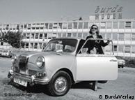
Germany's grande dame of fashion would have celebrated her 100th birthday on Tuesday, July 28. In post-war Germany, Aenne Burda won the hearts of women with a simple idea: a magazine with sewing patterns.

The war was over, people were beginning to enjoy themselves again, and women were keen to wear pretty and fashionable clothes. But where to get them in the struggling bombed-out grey cities of post-war Germany? Ready-made and off the rack weren't yet available, Paris Haute Couture was too expensive and too extravagant.

Aenne Burda had the right idea at the right time: a magazine with sewing patterns for women who wanted to be fashionable. "I wanted to offer not sophisticated but wearable fashion," Burda said.

The daughter of a railroader, Aenne Burda was a rebellious child with a mind of her own. At the age of 17, she chopped off her braids, and wore her hair cut short; she didn't like her name Anna-Magdalene, so she changed that to Aenne. In 1931, she married publisher Franz Burda, and had three children.

But that was not enough for the energetic, beautiful and ambitious Aenne. Hubert Burda, Aenne's youngest son, remembers that his mother had a vision: "She was driven by the desire to give elegance to women who, like her, had survived the war."

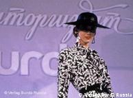
"I will prove that miracles are possible" A fashion model at a Burda show in RussiaBildunterschrift: Großansicht des Bildes mit der Bildunterschrift: Burda-Moden: worldwide success

Aenne's chance to fulfill her dreams of wearable and affordable elegance came in 1949, when her publisher husband handed her a small, ailing publishing company. Franz was trying to appease his wife, who had only just found out that he had been having an affair.

The first edition of Burda-Moden hit the streets in 1950. The magazine started off with 100,000 copies. Then, in 1952, sewing patterns for clothes were added – an instant success. Copies printed skyrocketed to four million.

In no time at all, women in more than 120 countries were following Aenne's patterns. In 1961, Burda-Moden, which was printed in more than a dozen languages, was the world's most widely published fashion magazine.

Aenne Burda headed her publishing house for 45 years. At the age of 85, the business woman stepped down; she died in 2005 aged 96. Her patterns, though mainly on the internet, live on to this day.

Author: Benjamin Wüst (db)

Editor: Neil King