2008年12月29日 星期一

Adolf Loos

路斯 魯斯 羅斯

路斯和 魯斯之翻譯都將oo當英文如book等
其實這oo是長音點的o 羅斯
荷蘭 羅斯福Roo

阿道夫·路斯(Adolf Loos)(1870年 12月10日布爾諾捷克——1933年8月23日維也納)為奧地利建築師與建築理論家,在歐洲建築領域中,為現代主義建築的先驅者。他提出著名的「裝飾就是罪惡」的口號。
アドルフ・ロース(Adolf Loos, 1870年12月10日 - 1933年8月23日)は20世紀オーストリア建築家
日本語

Born in 1870 in Brno, Moravia, Loos was only nine when his stonemason father died. A rebellious boy who rather lost his bearings, he failed in various attempts to get through architecture school. Contracting syphilis in the brothels of Vienna, by 21 he was sterile and in 1893 his mother disowned him. He went to America for three years, and did odd jobs in New York, somehow finding himself in that process and returning to Vienna in 1896 a man of taste and intellectual refinement, immediately entering the fashionable Viennese intelligentsia. His friends included Ludwig Wittgenstein, Arnold Schönberg, and Karl Kraus. He quickly established himself as the preferred architect of Vienna’s cultured bourgeoisie. Diagnosed with cancer in 1918, his stomach, appendix and part of his intestine were removed. For the rest of his life he could only digest ham and cream. He had several unhappy marriages. By the time he was fifty he was almost completely deaf; in 1928 he was disgraced by a paedophilia scandal and at his death in 1933 at 63 he was penniless.[2] He died in Kalksburg near Vienna.

[edit] Architectural theory

To fully understand Loos’s radical, innovative outlook on life, his admiration for the classical tradition, his passion for all aspects of design, lifestyle and taste, and the breadth of his ideas it is essential to read his own collected writings, which were published by MIT press in English as “Spoken into the Void” in 1982.

In his essays, Loos was fond of using the provocative catch phrase and has become noted for one particular essay/manifesto entitled Ornament and Crime written in 1908, in which he repudiated the florid style of the Vienna Secession, the Austrian version of Art Nouveau.

In this essay, he explored the idea that the progress of culture is associated with the deletion of ornament from everyday objects, and that it was therefore a crime to force craftsmen or builders to waste their time on ornamentation that served to hasten the time when an object would become obsolete. Perhaps surprisingly, Loos' own architectural work is often elaborately decorated. The visual distinction is not between complicated versus plain, but between "organic" and superfluous decoration.

Loos was also interested in the decorative arts, collecting sterling silver and high quality leather goods, which he noted for their plain yet luxurious appeal. He also enjoyed fashion and men's clothing, designing the famed Knize of Vienna, a haberdashery.

Loos is known for his entry to the 1922 Chicago Tribune competition, which took the form of a single colossal Doric column. But it was in the field of private houses that he most completely developed his unique spatial language.

[edit] Major works

Looshaus in Michaelerplatz, Vienna.
  • 1908 American Bar, Vienna
  • 1910 Steiner House, Vienna
  • 1910 Goldman & Salatsch Building, a mixed-use building overlooking Michaelerplatz, Vienna (known colloquially as the "Looshaus")
  • 1922 Rufer House, Vienna
  • 1925 Maison Tzara, house and studio for Tristan Tzara, one of the founders of Dadaism, in Montmartre, Paris, GIS coordinates: +48.888146, +2.335500
  • 1926 Villa Moller, Vienna
  • 1927 House (not built) in Paris for the American entertainer Josephine Baker
  • 1928 Villa Muller, Prague (now in the Czech Republic)
  • 1929 Khuner Villa, Kreuzberg, Austria

2008年12月26日 星期五

Full Constant Light 紐約市

紐約市的光線是不太一樣的
曾令Matisse驚豔
Art

Full Constant Light

Librado Romero/The New York Times

The Rose Window at the Cathedral of St. John the Divine. More Photos >


Published: December 25, 2008

At this dark time of the year, we like light. So we have festivals of light: Hanukkah, Kwanzaa, Christmas, and New Year’s Eve too, with its bright parties, and fireworks, and the fabulous walk-in lantern that is Times Square.

Skip to next paragraph
Rudy Burckhardt, Metropolitan Museum of Art

A 1939 photograph by Rudy Burckhardt of a man in the street. More Photos »

Times Square, of course, is a lantern year round. In cities the lights are always on. To a large degree cities are constructed of light enclosed and released. This is what attracts people to them, the great blaze that never goes out. And the light is extremely varied. From our Bronx apartment, we look one way and see sunlight changing color on nearby high rises and a Milky Way of all-night Manhattan lights beyond. The view in the other direction is to empty sky and the Hudson, by day as mutable in tone as gray jade and all but invisible after dark unless a passing ship tells you it’s there. Same city, different impressions of light.

But this is true in any neighborhood, anywhere, just as it is true of images of light in art spread across the city. And the way light looks depends a lot on who’s looking. In the 19th century American landscape artists hiked the wilderness, taking field notes on natural light, obsessively recording its qualities at specific times and places. When they returned to their city studios to paint, though, they bathed their landscapes in a theatrical glow that showed little evidence of direct observation.

For them light was a complex element; a hard, recordable fact, yes, but also a symbol, a big idea. In a new nation still deeply religious and in search of a triumphal identity, light in art implied revelation. And what was being revealed was God’s plan for America as the chosen land, the New Eden. Divine light shone on it and on the artists inventing its national image.

Time passed. Culture changed. And light, ever volatile, has taken on many other roles in art. Sometimes it is used to obscure rather than clarify meaning. Sometimes it serves as a warning rather than a warming agent. Traditional religious associations hold. Light streaming from the great Rose Window at the Cathedral Church of St. John the Divine seems austerely empyreal in the recently scrubbed and brightened interior.

But increasingly, illumination has become a private experience, the way poetry is: one piece matched to one reader, a reader willing to be “lit with piercing glances into the life of things,” to quote Marianne Moore. Moore, a lifelong New York City resident, did not take aesthetic revelation casually, but she was pragmatic. She understood you had to seek it to find it. She found a constant source in her hometown.

Poetic and pragmatic is an apt description of New York and its light. This is an island city — of its five boroughs only the Bronx is part of the North American mainland — with an island light, alternately obdurate and romantically moody. It can be too candid. Noon light in New York is not going to make you look rosy if you’re pale, or rested if you’re tired, or younger than you are. But its toughness is democratic: it falls on everybody and everything the same way.

You can see this in a set of photographs by Rudy Burckhardt (1914-1999) at the Metropolitan Museum of Art. Born in Switzerland, Burckhardt came to Manhattan in 1935 when the city was still in the grip of the Depression. Fascinated by the city but shy about using a camera on the street, he first shot architectural details, then the feet of pedestrians and finally the walkers themselves, most of whom didn’t notice him.

That warming up is documented in the slender album Burckhardt put together and hand-titled “New York, N. Why?” Its original pages, with pasted-in pictures and six sonnets by his partner at the time, the poet and dance critic Edwin Denby, make up the Met show.

With its images of newsstands, advertising and sidewalk traffic, the album is an essay in period culture. And with its shots of architecture it becomes a study in light used by the artist as a ready-made construction material, as solid as steel and stone, as abstract as the bars and blocks of Mondrian. In front of the light structures New Yorkers boogie and strut in place, nailed down by their cast-iron shadows. Denby’s poems echo the pictures’ mock-monumentalism:

When they build for a million a day to use it,

What is the point in, say, five hundred years,

Abroad they’ve still got the pyramid of Whoosis,

Would it last in New York? The answer is, who cares.

In 1939, while Burckhardt and Denby were compiling the album, they met Fairfield Porter, a figurative painter and near-contemporary who would later become a probing art critic. Most of his paintings were portraits of friends and family set in domestic interiors, with the figures and space alike defined by modulations of light and shading.

Someone once asked Porter what he looked for when he visited museums. “Light,” he said. He found it in the art of Édouard Vuillard and in the paintings of Edward Hopper, a big influence. Hopper’s light tends toward the stagey, but in a painting like “Queensborough Bridge,” at the Whitney Museum, it doesn’t go there. It doesn’t hint at teasing, B-movie back story. It’s realism plain style: an image of a particular structure in the particular light of a damp gray day.

When the poet John Ashbery described Porter’s colors as “transparent and porous, letting the dark light of space show through,” he might have been speaking of Hopper too, or of this Hopper at any rate. Like Porter’s art, Hopper’s exemplifies one version of American-style luminosity, painting that has some sort of spiritual dimension, but is also as unpretentiously humane as a piece of fine, body-friendly furniture.

I’d say the same of certain abstract art too, including the early woven work of Lenore Tawney. Tawney, who died last year at 100, developed a distinctive, unfancy, off-the-loom tapestry technique that left areas of otherwise dense weave translucent. An example from the 1950s, “Jupiter,” is now on view at the Museum of Arts and Design, though disadvantageously displayed, flat against a wall.

Were it freely suspended, preferably near a window, light would filter through the fabric. Such a presentation would allow the central, circular planetary emblem to optically shimmer and spin and would clarify the equal importance of two sources for Tawney’s art: Bauhaus practice and Asian mysticism. “A shine is that which when covered changes permission,” wrote Gertrude Stein. “Jupiter” should be given permission to shine.

The quality of transparency — letting light through — sounds straightforward enough but isn’t. When Ralph Waldo Emerson referred to himself as a “transparent eyeball,” he was talking about extreme experiences of cosmic consciousness, and ego loss as destabilizing as it was ecstatic. The poet Anne Porter, the wife of Fairfield, spoke of transparency as desirable but paradoxical, describing poetry and art that “lucidly shows you something that is a mystery.”

For the contemporary artist Daniel Joseph Martinez transparency as fulll disclosure is suspect and potentially subversive. His new sculpture “the west bank is missing, i am not dead, am i,” installed in the City University of New York Graduate Center, has, it seems, nothing to hide. In the form of two enormous upright rings, it is made of clear plastic, looks abstract and is fully visible from the street.

The piece is, however, coded. Odd-shaped patterns stamped into the plastic were molded from two architectural models. One was for a suburban development in Irvine, Calif.; the other, inspired by that plan, for an Israeli settlement project on the West Bank. In the United States modern suburban communities have often served to isolate middle-class whites from urban minorities. In Israel, Mr. Martinez suggests, another kind of apartheid is in operation.

None of this is immediately evident from the glowing, helix-shaped sculpture. But once understood, its lucidity clouds over. In this case, as so often in politics, transparency means hiding truth in plain sight.

Mr. Martinez is not a romantic when it comes to using light as a symbol; other politically minded artists are. In 1950 the California artist Chesney Bonestell (1888-1986) produced a fantastically melodramatic oil sketch of an apocalyptic scene: New York City ruined and in flames after an atom bomb attack.

The picture, at the New-York Historical Society, was commissioned as a magazine illustration at the height of cold war paranoia. Now, inevitably, it brings 9/11 to mind. But it also carries art historical resonances: the reds and oranges of Bonestell’s conflagration are the same used in 19th-century American paintings of sunsets, intended as emblems of a nation under providential care.

Just such a sunset is essential to a Robert Gober installation called “Prison Window” at the Andrea Rosen Gallery in Chelsea, though here the effect is distanced, if not sardonic. There isn’t much to the installation, which is basically a piece of stage design consisting of a small barred window set in the gallery wall with a sunset painted on a second wall behind it.

We all know such light and have feelings about it, possibly strong ones: sunset sadness is built into our culture; late-day light is associated with partings, endings, the coming of night, not to mention Hollywood westerns. Is Mr. Gober suggesting we are prisoners of such feelings, locked in by nostalgia — that passive and unprogressive emotion — and by art that promotes it?

Whatever his meaning, there’s no question that light is a trigger of memory. And much art, like much poetry, is focused on the past, examining it, revising it or simply evoking it as George Tooker does in his 1952 painting “Garden Party,” included in his retrospective at the National Academy Museum.

Mr. Tooker’s formally exacting work has taken several directions in the past half-century, alternating political subjects with portraiture and religious painting. In “Garden Party” he is dealing in personal memory, specifically the recollections of summers when he was a child and even more specifically what light was like then: the early evening sky with the moon and one star; the soft flush of Japanese lanterns in the garden. Although the painted scene is highly stylized, the light rings true. It feels like the real, lived-in but long-lost thing, the way it does in the paintings of Aelbert Cuyp and Edward Hicks and Watteau.

Past is past, and if one

remembers what one meant

to do and never did, is

not to have thought to do

enough? Like that gather-

ing of one of each I

planned to gather one

of each kind of clover,

daisy, paintbrush that

grew in that field

the cabin stood in and

study them one afternoon

before they wilted. Past

is past. I salute

that various field.

The poem, about the past remembered and embraced, is by the New York writer James Schuyler (1923-1991), about whose work Fairfield Porter wrote it “tends toward a deceptively simple Chinese visibility, like transparent windows on a complex view.”

What is most complex about the view — any view — is the reality of change, every minute, all the time, “like in water a reflection” as Denby puts it in the palooka patois of his sonnets. The light on the buildings outside the windows changes, the all-night lights of the city, the shadow of clouds on the river, the light through a rose window, the light through a sculpture, the light in Times Square, where one year will soon be seen out, while another, with a sizzle of light, brought in. Change, like light, can be blinding; it can also show the next right way to go. All we can do about the confusion is what artists do: keep looking and thinking, and making the mind and eye — Denby once more — the shutter of a camera that is open forever.

2008年12月24日 星期三

罗斯金《前拉斐尔主义》(1906)

這本書沒索引 對照辭太簡略
錯誤不少 譬如說 聖母翻譯為處女 (p.148)
shoeblack 前的形容詞沒翻譯 (p.298)

《前拉斐尔主义》(1906)是罗斯金公开为前拉斐尔派辩护的杰出的艺术评论作品,它的面世引起了艺术界、学术界强烈的轰动。
本 书收录了罗斯金论前拉斐尔主义的大部分作品,以及一些论建筑与绘画的经典论文。其中第一篇同书名的文章发表于1851年,是前拉斐尔派的三位创始人(霍尔 曼·亨特、米莱斯、罗塞蒂)首次展出的绘画遭到媒体的猛烈抨击时,罗斯金所做出的回应;其后的关于建筑与绘画的部分,是罗斯金1853年在爱丁堡发表的演 讲;本书还包括了罗斯金于1855至1859年间发表的对艺术院展出作品的注释,主要谈的也是前拉斐尔派的绘画作品及其不断增长的影响。
约翰·罗斯金(John Ruskin,1819-1900),英国作家和美术评论家,他对社会的评论使他被视为道德领路人或预言家。据说其著作《留给这个后来者》(Unto This Last)曾对甘地产生过影响。
   他的主要作品包括:《金河王》、《近代画家》、《建筑的诗歌》、《建筑的七盏明灯》、《威尼斯的石头》、《佛罗伦萨的早晨》、《亚眠的圣经》、《时至今 日》、《野橄榄之冠》、《芝麻与百合》、《空气女王》、《十九世纪的暴风云》、《绘图要素》和《透视要素》等。罗斯金的作品语言优美,内容深刻,对甘地、 托尔斯泰和普鲁斯特有较大影响,普鲁斯特甚至为了翻译罗斯金的作品而下决心学习英语。...

作者作品:
· 《前拉斐尔主义》
前言
前拉斐尔主义
前言
前拉斐尔主义
关于建筑与绘画的演讲
前言
演讲一
演讲二
对演讲一和演讲二的补充说明
演讲三
演讲四
演讲四的附录
艺术院注释
第一部分(1855)
第二部分(1856)
第三部分(1857)
第四部分(1858)
第五部分(1859)
透纳美术馆的注释
透纳美术馆的注释
附录
译名对照

李鑄晉 《鵲華秋色:趙孟頫的生平與畫藝》 2003/08

李鑄晉 《鵲華秋色:趙孟頫的生平與畫藝》

鵲華秋色 李鑄晉台北:石頭出版股份有限公司,出版日期:2003/12/20 北京:生活.读书.新知三联书店出版社 :2008年

2008年12月23日 星期二

Christmas Tree Exhibition 2008

Arts on the Air | 24.12.2008 | 05:30

The art of Christmas Trees on show in the German city of Karlsruhe

Ever wondered about the art of Christmas trees? Well, at The Christmas Tree Exhibition at the Karlsruhe University of Arts and Design in Germany shows the festive pine tree as you’ve seldom seen it before.

The Christmas Tree Exhibition in Karlsruhe has grown into a cult happening as students, professors, artists and designers jostle to provide the most inventive and creative tree on display. This year, 130 works ranging from sculpture to photographs, posters, prints, video and audio installations and readymade objects are on display in the Fifth Christmas Tree Exhibition.

Report: Kate Hairsine


Christmas Tree Exhibition 2008

- [ 翻譯此頁 ]5th Christmas Tree Exhibition 12.12.2008 - 21.12.2008 opening event: Friday 12.12.2008 6pm HfG Karlsruhe University of Arts and Design ...

2008年12月21日 星期日

Chanel’s Mobile Art Pavilion 2008

經濟差 Chanel叫停巡迴展
2008-12-21

【明報專訊】全球經濟不景,連高級品牌亦要改變經營策略。法國著名時裝品牌Chanel周五宣布,決定中止其世界巡迴的流動藝術展 (Chanel Mobile Art),暫停手袋展宣傳,並重整投資策略。另一法國著名品牌LV日前亦宣布取消在東京銀座興建全球最大旗艦店。

調整投資策略 增開分店揾真銀


Chanel 流動藝術展最近在紐約中央公園舉行,原準備移師到倫敦,但突遭叫停。發言人表示,「在現今經濟環境下,我們要調整策略。為了未來發展,我們寧願重新把資源 集中在戰略性投資項目」,Chanel今後將集中開設更多分店及發展新產品,不會繼續進行「不賺錢的項目」。

Chanel流動藝術展展期 本為兩年,主要展出旗下的經典菱格紋手袋,以及一些相關的藝術品,展覽場地為一座貌似太空船的白色流動展館,由英國建築師哈迪德(Zaha Hadid)設計。藝術展橫跨3大洲,香港今年2月27日更成為全球首個展覽城市。展覽其後到了東京及紐約舉行。按計劃,藝術展明年會移師倫敦及莫斯科, 於2010年在巴黎舉行告別展。

法新社


December 19th, 2008 5:03 PM

Bagged: Chanel’s Mobile Art Pavilion

Color us Coco-friendly black and white, but don’t color us surprised: the latest victim of these troubled times is the Zaha Hadid-designed Chanel Mobile Art Pavilion. Somewhat inexplicable even in a flush economy, the traveling, snail-shaped guerrilla gallery, built to house interpretations of Chanel’s iconic 2.55 handbag by such artists as Sylvie Fleury, David Levinthal and Fabrice Hybert, has finally deflated after stops in Hong Kong, Tokyo and New York City. A company spokesperson tells WWD, “We will be concentrating on strategic growth investments.” Karl Lagerfeld, who didn’t even show up for the unveiling in Hong Kong, has no comment. Perhaps he’s too busy designing his next vanity stuffed animal. This time it had better come with a bag.

Tags: , , , , , ,

2008年12月14日 星期日

辟邪與獅子之間 (■字.文∕漢寶德)

漢先生的獅子沒提到古波斯等地


中華日報 十五日

 最近由於結識了跑單幫的古玉商人,使我看到過去幾乎看不到珍貴古玉。為了怕被偽貨騙了,我把幾年前買的,由大陸真正內行的作家所寫的古玉鑑賞的著作,仔細的複習了一遍,覺得確有把握,再看東西,好像跑單幫還真有本事買到好東西呢!

 前幾天他拿了一件玉彫給我看,是一只六朝的辟邪,我就與讀者們聊聊辟邪吧!

  辟邪是什麼玩意兒呢?可以稱它為一種神獸,中國的古人喜歡通過想像力創造一些古怪的動物,滿足精神上的需要,是其他文明萬萬趕不上的。最莫名其妙的莫過於 龍了,這樣一個稀奇古怪的人造動物,居然支配了中國人的靈魂幾千年,到今天還自稱龍的傳人,實在不可思議!鳳是另一個怪物,究竟為什麼發明這麼一種神鳥, 後來又居然與龍佩成一對,正式成為皇后的象徵!老實說,我每想到這種發自原始時代高貴的想像,發展到後來淪落到民俗之中,居然又堂而皇之的為統治階級所利 用,就覺得中國文明在本質上是很粗淺幼稚的。

 這一切與中國沒有正式的宗教有關。因為沒有宗教,文化就失掉了主心,對於超自然的力量只有用胡思 亂想來解決。法子是原始中國人發現了恐龍的骨頭化石,就點燃起想像力,自新石器時代就用各種方式來描述龍的形式,從而發明了各種具有神力的動物,連莊子這 種讀書人都相信有一種大鵬,展翼蔽天,一飛萬里呢!

 辟邪是怎麼來的?我查不到可靠的資料,可是顧名思義與「邪」有關。人類文明的早期,對不可 理解的事情,特別是不幸的事,如病痛與死亡,總疑神疑鬼,認定有一種邪靈在做怪。怎麼辦呢?今天的鄉下人用各種方式驅魔趕鬼,經常煞有介事的做好笑的動 作,有些儀式還被視為文化資產呢!古人沒有那麼花樣,自戰國以來就發明用怪獸來嚇跑邪靈的辦法。我猜想一定是從養狗看家推想出來的,狗可以趕走壞人,一定 有一種獸可以趕走邪魔,所差的只是想出這是一種什麼獸而已!

 從漢代發掘出的遺物來看,他們終於找到一種比狗兇猛的動物。在中國,最兇猛的動物 應該是老虎,但是老虎太普通了,不能視為神獸。他們就用虎做樣子,發明了辟邪這種東西。中國人最善於在現有動物中變換身份。另一個例子是麒麟,顯然是脫胎 於鹿的原型。鹿是平和、可愛的動物,所以麒麟就是吉祥的象徵了。

 要使一個普通動物變成神獸,一定要加些裝備才能神化。龍來自大蟒,可是頭上長 了角,兩臂多了翅膀。那麼漢人怎麼把辟邪裝備起來呢?可能是與龍連上一點關係,顯示其神性。首先是多了一只角,自額頭向後。其次是下頷多了一把鬍子,也是 龍的特徵。第三是兩脅生出翅膀,最後是長叉的長尾巴,都與當時的龍相近。原來只是把一只虎變成帶有龍性而已。


 辟邪這種怪獸在漢代極為流行,一 直流行到六朝,可知當時的中國人內心對鬼靈之恐懼。我們今天到南京一帶六朝時期核心地區看到的古蹟中,最特殊的文物就是石刻的碩大無比的辟邪,有些還站在 高高的柱子上遙望著四野。這些辟邪的造型與我描述者無異,都是立在帝王墳墓的兩側,保護邪靈不會欺壓亡者。可以想像在漢代有錢人的墳墓裡,小型的玉刻辟邪 必然守護在身邊。

 今天看到的石彫辟邪,大多以老虎鎮山的姿態,高高的抬著頭,睜大眼睛向前看,前腳一只向前,拖著長尾巴,翅膀貼在背上。可是 玉彫屬於半文玩的性質,自漢到六朝近五百年間是有發展跡象的。老虎鎮山式是比較早期的姿態,台北故宮博物院那只著名的赭紅色辟邪就是如此,看上去生動有 力。大陸陜西咸陽博物館有一只早期的玉辟邪,則是甫地爬行的姿態,嘴巴張得很大,好像要躍起捕捉獵物,兇猛異常。這只辟邪的頭部介乎虎、狗之間。可是玉辟 邪到六朝就沒有神氣了,獨角、鬍鬚、翅膀都在,看上去卻溫順得像一只貓。顯然到了這個時候,辟邪在精神上有名無實,成為玩物了。我在書上看到天津博物館有 一件黃玉辟邪,嘴巴都不張開,乾脆稱之為瑞獸。

 比較起來,我最近看到的那只六朝辟邪還真是有點漢朝兇猛味道的!這只辟邪是青玉製成,捲曲著身 子,胖胖的,像一只哈巴狗,可是獨角又變成一把鬃毛了,翅膀變成腰間大腿上的小翅形裝飾,分叉的大尾巴仍然是商標。一個柔軟的身體,那只大嘴巴倒是兇巴巴 的,很典型的,鼻孔、牙齒、上下唇形成一個平面。驀然看來,這只辟邪仿已有後世獅子的味道了。

 辟邪變獅子的過程,至今沒有看到學者討論過,應 該是很有趣的。辟邪來自狗與虎是我的臆想,請讀者們指教。到了漢代晚期,外來文化闖進來了,那就是佛教,佛教帶來的一切徹底改變了本土精神生活,為中國人 多了一個選擇:信教。獅子是印度的猛獸,當佛教在彼邦盛行的時候,獅子逐漸成為佛陀的守護者。我相信當時人們自彼邦來到中土,看到那些墓園的大辟邪時,一 定以為是獅子,只要把它們移到佛寺門前就可以了。這就是為什麼後世獅子的大嘴巴與辟邪非常相像的原因。

 獅子都採坐姿,完全是守門的模樣,也是 自六朝末年就開始了。很奇妙的,在漢代以來的古墓裡開始有鎮墓的觀念,放了鎮墓的象徵物,到了六朝末,就有鎮墓獸這種東西了。唐朝的三彩鎮墓獸非常威武, 已成為當時重要的藝術品。問題是,鎮墓獸是來自辟邪呢?還是獅子呢?就很不容易理解了。相信都有些牽連吧!

 若干年前,我熱衷於古物收藏的時 候,買過兩個唐代的鎮墓獸。當時大陸門禁初開,古物難得,價位頗高,有些古物要自日本來。可是鎮墓之物頗犯中國人之忌,只有我這種傻子才會買。唐代的陶製 鎮墓獸墓中左右各放一只,是不同的造型,其中一只是人面獸身,有點近似古代埃及的獅身人面像。是何來源,是否有中東文化的影響,是另一個值得深究的問題。 另外一只則是獸面獸身,與辟邪有些近似。由於其功能是連續的,不能不使我推想鎮墓獸是後代的辟邪。
 我所買的兩只獸,一只三彩的是人面,另一只陶土加彩的是獸面,各有特色。我選的人面獸是很溫和又美觀的,獸面獸則完全是張牙而吼的獅子模樣了。這只鎮墓獸我稱它為辟邪,因為額頭有一只角,兩脅有翅膀,角與翅膀都有損傷,但我不是生意人,未考慮市場價值。

  唐人的寫實能力很強,鎮墓獸也好,石獅子也好,原則上都是很生動的,身體彎曲有力,前腿直立蹲坐,一副守衛的架勢,用怒吼來趕走心中的惡魔,這大概就是明 清以後,官衙、貴族大門外亦豎一對獅子的原故。今天連台北市政府大門前還擺著一對呢?那是從北京皇宮普遍仿造的一種,看多了,就覺得很俗了。

  玉質的辟邪自六朝漸變成玩物後,兇猛的動物搖身變為可愛的動物,可以放在手上把玩,或放在書桌上當紙鎮,等於哈吧狗一樣的玩物化了,大約十年前,我去大陸 蘇杭一帶旅行,在一家官營文物店裡買到一只小型的辟邪,當時未深究其年代,只覺得它可愛,官營店裡應該不會是偽貨,也許年代並不久遠。這件東西至今在我案 頭,仍不知其年代。但是它的頭上有兩只角,與六朝前的古物是不同的。其他特徵一應俱全,只是打磨不夠光亮。這件小東西握在手心,老人家為保持手指觸摸的敏 感度而不斷盤弄,倒不失為有用的玩物。掂它的重量,應該是和闐玉,但色澤近乎薑糖,溫潤而略有深淺不勻的現象。這種東西是一般收藏家所不屑一顧的。可是我 每看到它,就想起它兩千多年的系譜來了。

Designers Play Dollhouse for Retrospective in Utrecht

EuroVox | 15.12.2008 | 05:30

Designers Play Dollhouse for Retrospective in Utrecht

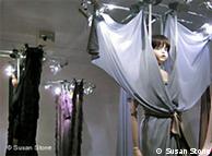
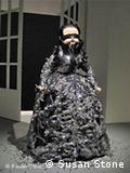
Known simply as Viktor & Rolf, daring Dutch designers Viktor Horsting and Rolf Snoeren like to dress up dolls in their fantastical fashions.

Bildunterschrift: Großansicht des Bildes mit der Bildunterschrift:

The duo is known for presenting glamorous but surreal clothing in elaborate runway shows. They’ve shown fashions inspired by such concepts as bedtime stories, black holes and the atomic bomb.

So it’s no surprise that when it came time for a museum retrospective, they created an exhibition like no other. It’s on display in the city of Utrecht from February.

Report: Susan Stone

In Qatar, an Art Museum of Imposing Simplicity

Architecture

For I. M. Pei, History Is Still Happening

Hassan Ammar/Associated Press

The Museum of Islamic Art at Doha, Qatar, was designed by I. M. Pei. The building is on a small man-made island that is accessible from a short bridge. More Photos >


Published: December 12, 2008

DOHA, Qatar

I CAN’T seem to get the Museum of Islamic Art out of my mind. There’s nothing revolutionary about the building. But its clean, chiseled forms have a tranquillity that distinguishes it in an age that often seems trapped somewhere between gimmickry and a cloying nostalgia.

Part of the allure may have to do with I. M. Pei, the museum’s architect. Mr. Pei reached the height of his popularity decades ago with projects like the East Building of the National Gallery of Art in Washington and the Louvre pyramid in Paris. Since then he has been an enigmatic figure at the periphery of the profession. His best work has admirers, but it has largely been ignored within architecture’s intellectual circles. Now, at 91 and near the end of a long career, Mr. Pei seems to be enjoying the kind of revival accorded to most serious architects if they have the luck to live long enough.

But the museum is also notable for its place within a broader effort to reshape the region’s cultural identity. The myriad large-scale civic projects, from a Guggenheim museum that is planned for Abu Dhabi to Education City in Doha — a vast area of new buildings that house outposts of foreign universities — are often dismissed in Western circles as superficial fantasies. As the first to reach completion, the Museum of Islamic Art is proof that the boom is not a mirage. The building’s austere, almost primitive forms and the dazzling collections it houses underscore the seriousness of the country’s cultural ambition.

Perhaps even more compelling, the design is rooted in an optimistic worldview, — one at odds with the schism between cosmopolitan modernity and backward fundamentalism that has come to define the last few decades in the Middle East. The ideals it embodies — that the past and the present can co-exist harmoniously — are a throwback to a time when America’s overseas ambitions were still cloaked in a progressive agenda.

To Mr. Pei, whose self-deprecating charm suggests a certain noblesse oblige, all serious architecture is found somewhere between the extremes of an overly sentimental view of the past and a form of historical amnesia.

“Contemporary architects tend to impose modernity on something,” he said in an interview. “There is a certain concern for history but it’s not very deep. I understand that time has changed, we have evolved. But I don’t want to forget the beginning. A lasting architecture has to have roots.” This moderation should come as no surprise to those who have followed Mr. Pei’s career closely. I recall first hearing his name during construction on his design for the Kennedy Library in Boston in the mid-1970s. The library, enclosed behind a towering glass atrium overlooking the water, was not one of Mr. Pei’s most memorable early works, nor was it particularly innovative, but the link to Kennedy lent him instant glamour.

The building’s pure geometries and muscular trusses seemed at the time to be the architectural equivalent of the space program. They suggested an enlightened, cultivated Modernism, albeit toned down to serve an educated, well-polished elite. Completed 16 years after the assassination of John F. Kennedy, the library’s construction seemed to be an act of hope, as if the values that Kennedy’s generation embodied could be preserved in stone, steel and glass.

In many ways Mr. Pei’s career followed the unraveling of that era, from the economic downturn of the 1970s through the hollow victories of the Reagan years. Yet his work never lost its aura of measured idealism. It reached its highest expression in the National Gallery of Art’s East Building, a composition of angular stone forms completed in 1978 that remains the most visible emblem of modern Washington.

Since that popular triumph Mr. Pei has often seemed to take the kind of leisurely, slow-paced approach to design that other architects, no matter how well established, can only dream of. When first approached in 1983 to take part in a competition to design the addition to the Louvre, he refused, saying that he would not submit a preliminary design. President François Mitterrand nevertheless hired him outright. Mr. Pei then asked him if he could take several months to study French history.

“I told him I wanted to learn about his culture,” Pei recalled. “I knew the Louvre well. But I wanted to see more than just architecture. I think he understood immediately.” Mr. Pei spent months traveling across Europe and North Africa before earnestly beginning work on the final design of the glass pyramids that now anchor the museum’s central court.

In 1990, a year after the project’s completion, he left his firm, handing its reins over to his partners Harry Cobb and James Ingo Freed so that he could concentrate more on design. More recently he has lived in semi-retirement, sometimes working on the fourth floor office of his Sutton Place town house or sketching quietly in a rocking chair in his living room. He rarely takes on more than a single project at a time.

Such an attitude runs counter to the ever-accelerating pace of the global age — not to mention our obsession with novelty. But if Mr. Pei’s methods seem anachronistic, they also offer a gentle resistance to the short-sightedness of so many contemporary cultural undertakings.

Many successful architects today are global nomads, sketching ideas on paper napkins as they jet from one city to another. In their designs they tend to be more interested in exposing cultural frictions — the clashing of social, political and economic forces that undergird contemporary society — than in offering visions of harmony.

Mr. Pei, by contrast, imagines history as a smooth continuous process — a view that is deftly embodied by the Islamic Museum, whose clean abstract surfaces are an echo of both high Modernism and ancient Islamic architecture. Conceived by the Qatari emir and his 26-year-old daughter, Sheikha al Mayassa, it is the centerpiece of a larger cultural project whose aim is to forge a cosmopolitan, urban society in a place that not so long ago was a collection of Bedouin encampments and fishing villages. The aim is to recall a time that extended from the birth of Islam through the height of the Ottoman Empire, when the Islamic world was a center of scientific experimentation and cultural tolerance.

“My father’s vision was to build a cross-cultural institution,” said Sheikha al Mayassa, who has been charged with overseeing the city’s cultural development, during a recent interview here. “It is to reconnect the historical threads that have been broken, and finding peaceful ways to resolve conflict.”

Mr. Pei’s aim was to integrate the values of that earlier era into today’s culture — to capture, as he put it, the “essence of Islamic architecture.”

The museum’s hard, chiseled forms take their inspiration from the ablution fountain of Ibn Tulun Mosque in Cairo, as well as from fortresses built in Tunisia in the eighth and ninth centuries — simple stone structures strong enough to hold their own in the barrenness of the desert landscape.

In order to create a similar sense of withdrawal from the world, Mr. Pei located his museum on a small man-made island, approachable from a short bridge. Seen from a distance, its blocklike forms are a powerful contrast to the half-finished towers and swiveling construction cranes that line the waterfront. Stepped on both sides, the apex of the main building is punctuated by a short tower with an eye-shaped opening that masks an interior dome.

From certain angles the structure has a flat, chimeric quality, like a stage set. From others it seems to be floating on the surface of the water — an effect that recalls Santa Maria della Salute, the imposing Baroque church that guards the entry to the Grand Canal in Venice.

As one approaches the building, the full weight of the structure begins to bear down, and the forms become more imposing. The bridge, flanked by rows of tall palm trees, is set diagonally to the entry, which makes the stacked geometric forms appear more angular and the contrast between light and shadow more extreme.

Soon a few traditional details begin to appear: the two small arched windows over the entry; a covered arcade that links the museum to an education center. These touches seem minor, but they provide a sense of scale, so that the size of the building can be understood according to the size of the human body.

The blend of modern and Islamic themes continues inside, where Mr. Pei draws most directly from religious precedents. The hemispherical dome, an intricate pattern of stainless steel plates pierced by a single small oculus, brings to mind the geometric patterns used in Baroque churches as well as in ancient mosques.

The weight of the interior’s chiseled stone forms, with the dome resting on a faceted drum and square base, evokes both classical precedents and the late works of Louis Kahn, whose fusion of modern structure with a timeless monumentality was a turning point in Modernist history.

Mr. Pei’s design lacks the depth and cohesion of Kahn’s greatest work. The structural system that supports the dome, for instance, is not particularly elegant; on one side the drum that supports it rests on slender three-story-tall columns, on the other it extends down to meet a wall that encloses a floor of offices before resting on a series of shorter columns, upsetting the room’s natural symmetry.

Nonetheless the meaning of the space is clear. Mr. Pei has created a temple of high art, placing culture on the same pedestal as religion. His aim is both to create a symbol of Islamic culture and to forge a common heritage for the citizens of Qatar and the region.

The grandeur of the atrium is only a prelude to the real climax: the galleries, which are as intimate as the atrium is soaring. Objects are encased in towering glass cabinets set on tables, giving them an accessibility rare in a major museum. There is also just the right amount of space between the objects — enough to let them breathe without being isolated.

And like the building itself, the collections are a reflection of the notion that Modernity and Islamic culture are not in opposition, but woven out of the same historical thread. There are dazzling scientific objects here, including a display of astrolabes, as well as priceless works of calligraphy. (Philippe de Montebello, the director of the Metropolitan Museum of Art, which owns one of the world’s premier collections of Islamic Art, put it best when I spoke to him at the museum’s inaugural gala: “Many of the pieces I’ve bid on over the past 10 years, they got.”)

Yet the most moving works are those that underscore the cosmopolitan values that are at the core of this museum: the notion that the free, open exchange of ideas is what builds great — and tolerant — civilizations: a matrix of Spanish Corinthian columns with Islamic flourishes; early translations of classical texts that formed the hinge between antiquity and the European Renaissance; a silk tapestry of a couple in front of a tent, illustrating the Islamic fable “Laila and Majnun” that is likened to Romeo and Juliet.

These are the moments that Mr. Pei’s architecture is meant to embody. His museum reminds us that building a culture, as much as a political or social agenda, can be an act of healing. Like all great art, it requires forging seemingly conflicting values into a common whole.


In Qatar, an Art Museum of Imposing Simplicity

Karim Jaafar/Agence-France Presse — Getty Images

Fireworks lighted up the sky at the inaugural festivities for the new Museum of Islamic Art, in Doha, Qatar, on Saturday. I. M. Pei designed the building. More Photos >


Published: November 23, 2008

DOHA, Qatar — There is nothing timid about the ambitions of the new Museum of Islamic Art that opens here next week. Rising on its own island just off the city’s newly developed waterfront corniche, it is the centerpiece of an enormous effort to transform Qatar into an arts destination. The inaugural festivities on Saturday, including a performance by Yo-Yo Ma, attracted art-world luminaries from around the globe.

Viewed under the light of a spectacular evening fireworks display, the museum’s colossal geometric form has an ageless quality, evoking a past when Islamic art and architecture were a nexus of world culture. At the same time it conveys a hope for reconnecting again.

The building seems austere by the standards of the flashy attention-grabbing forms that we have come to associate with Persian Gulf cities like Dubai and Abu Dhabi. Designed by I. M. Pei, 91, who has described it as his last major cultural building, it recalls a time when architectural expression was both more earnest and more optimistic, and the rift between modernity and tradition had yet to reach full pitch.

The museum, which houses manuscripts, textiles, ceramics and other works mostly assembled over the last 20 years, has emerged as one of the world’s most encyclopedic collections of Islamic art. The origins of its artifacts range from Spain to Egypt to Iran, Iraq, Turkey, India and Central Asia. (Among the exquisite works on view at the opening were a bronze Andalusian fountainhead in the form of a doe with a heart-shaped mouth, and an ornate spherical brass plate from Persia or Mesopotamia used to measure the position of the stars. Both date from the 10th century.)

Taking his cue from the diversity of the collections, Mr. Pei sought to create a structure that would embody the “essence of Islamic architecture.” He spent months traveling across the Middle East searching for inspiration. He visited the ninth-century Ahmad ibn Tulun Mosque in Cairo, a sober structure organized around a central court with a templelike central fountain, and ancient fortresses in Tunisia.

“Islam was one religion I did not know,” Mr. Pei said in an interview. “So I studied the life of Muhammad. I went to Egypt and Tunisia. I became very interested in the architecture of defense, in fortifications.”

“The architecture is very strong and simple,” he added. “There is nothing superfluous.”

The imposing simplicity of his new museum is brought to life by the play of light and shadow under the gulf’s blazing sun. Mr. Pei visited several proposed sites in downtown Doha before settling on the area just off the end of the seafront corniche. Worried that his building might one day be hemmed in by new construction, he asked Qatar’s Emir, Sheikh Hamad bin Khalifa al-Thani, chairman of the museum’s board, to build him a private island so that his monument would be isolated from the rest of the city.

“I worried a lot about what will come after,” Mr. Pei said. “Even a beautiful piece of work can be overshadowed, destroyed by something else.”

For now, “Doha in many ways is virginal,” he said. “There is no real context there, no real life unless you go into the souk. I had to create my own context. It was very selfish.”

The resulting structure is a powerful Cubist composition of square and octagonal blocks stacked atop one another and culminating in a central tower. An esplanade of giant palm trees leads to the island. Inside the museum, 41,000 square feet of galleries are organized around a towering atrium capped by a dome, with a narrow beam of light descending from its central oculus.

Seen from across the water its massive sand-colored stone blocks call to mind the Tunisian fortresses it is modeled after.

“The museum is an object,” Mr. Pei said. “It should be treated as a piece of sculpture.”

Free trial. Read the complete New York edition of The Times on computer, just as it appears in print.

2008年12月4日 星期四

Johann Zoffany

Zoffany, Johann (c.1733-1810).


Painter of portraits, conversation pieces, and theatrical scenes, Zoffany was born in Germany and came to England about 1758 after studying in Italy. He began by painting clock faces and doing hack work, before turning to painting theatrical scenes, especially depicting David Garrick. He was favoured by the royal family. George III nominated him for the Royal Academy in 1769 and recommended him to the duke of Tuscany.

('hän zŏf'ənē) , 1735–1810, English painter. After 12 years of study in Italy, Zoffany settled in England. He frequently painted conversation pieces, domestic tableaux filled with detailed, animated figures (see portraiture), that were influenced by Hogarth. His major full-length portraits include Mrs. Oswald (National Gall., London).

Self-portrait as David with the head of Goliath, 1756
Enlarge
Self-portrait as David with the head of Goliath, 1756
The Tribuna of the Uffizi, by Johan Zoffany, 1772-8, Royal Collection, Windsor.
Enlarge
The Tribuna of the Uffizi, by Johan Zoffany, 1772-8, Royal Collection, Windsor.
Charles Towneley and friends in his library, by Zoffany
Enlarge
Charles Towneley and friends in his library, by Zoffany
Commons-logo.svg
Wikimedia Commons has media related to:

Johann Zoffany, or Zauffelij (b. March 13, 1733November 11, 1810) was a German neoclassical painter, active mainly in England. His works appear in many prominent British national galleries such as the National Gallery, London and the Tate Gallery.

Zoffany was born in Frankfurt. He came to Britain to enjoy the patronage of the royal family. Zoffany was favoured by British King George III and Queen Charlotte, painting them in charmingly informal scenes — including one, "Queen Charlotte and Her Two Eldest Children" (1764), in which the queen is with her children in her dressing room. Johann Zoffany was known for being very arrogant with his art. He had been known to have an outstanding argument with many artists, he would often draw caricatures of other artists he did not like in his art. "It is the best designed of all Zoffany's works and in the minute imitation of nature...it is unexcelled."[1]

He was also noted for his portraits of prominent actors and actress in the roles they played, as in his "Garrick as Hamlet" and "Garrick as King Lear". This genre is sometimes known as the "theatrical conversation piece," a sub-set of the "conversation piece" genre that rose with the middle class in the eighteenth century. (The conversation piece painting was a relatively small—and therefore inexpensive—informal group portrait, often of a family or a circle of friends; a type of painting that had developed in the Netherlands and France and became popular in Britain after 1720. The term "conversation" was applied to any informal small group.) Zoffany has been described by one critic as "the real creator and master of this genre" and "a thoroughly bad painter" simultaneously[2] — which necessitates a low opinion of the "conversation piece" genre.

In the later part of his life, Zoffany became especially noted for producing huge paintings with large casts of people and objets d'art, all readily recognizable. In paintings like "The Tribuna of the Uffizi,"這是為英國皇家無法去歐陸"大旅行"的代替教育 he carried this extreme fidelity beyond clutter, almost to mania - the Tribuna was already displayed 18th century display (ie with many objects in little space), but Zoffany had other works brought in from elsewhere in the Uffizi. He remained in Britain, and died at Strand-on-the-Green.

2008年12月3日 星期三

Philip James de Loutherbourg

(b Strasbourg, 31 Oct 1740; d London, 11 March 1812). Alsatian painter, illustrator and stage designer, active in France and England. Loutherbourg's father, Philipp Jakob (1698-1768), was an engraver and miniature painter to the court of Darmstadt. In 1755 he took his family to Paris, where Loutherbourg became a pupil of Carle Vanloo; he also attended Jean-Georges Wille's engraving academy in the Quai des Augustins and Francesco Casanova's studio. Wille directed Loutherbourg's attention to 17th-century Dutch landscape artists, such as Philips Wouwerman and Nicolaes Berchem, and in 1763 Denis Diderot noticed the inspiration of the latter in Loutherbourg's first Salon exhibit, a landscape with figures (Liverpool, Walker A.G.). In this and other works, focus is on the foreground figures, which are framed by natural formations that occasionally fall away to reveal distant horizons. This informal style found favour with the French public; Loutherbourg's vivid, fresh colour and ability to catch specific light and weather conditions made the pastoral subjects of Fran?ois Boucher and his school seem contrived and fey. Rather more romanticized were Loutherbourg's shipwreck scenes (e.g. A Shipwreck, exh. Salon 1767; Stockholm, Nmus.), inspired by Claude-Joseph Vernet, and pictures of banditti recalling Salvator Rosa. Loutherbourg became the most prolific painter to exhibit at the Salon between 1762 and 1771. In 1766 he was elected to the Acad?mie Royale de Peinture et de Sculpture and nominated as a Peintre du Roi.

More on
Wikipedia article "Philip James de Loutherbourg".