Characterized by spontaneous brushwork, drips and scribble marks, today's #artword is 'Tachisme'. The introduction of the term is usually credited to the critic Pierre Guéguen in 1951. However, it was used in 1889 by the critic Félix Fénéon to describe the impressionist technique, and again in 1909 by the artist Maurice Denis referring to the fauve painters.
⠀⠀⠀⠀⠀⠀⠀⠀⠀
Patrick Heron, 'Azalea Garden' 1956
⠀⠀⠀⠀⠀⠀⠀⠀⠀
More Tachisme: http://ow.ly/1zyR303DyPM
⠀⠀⠀⠀⠀⠀⠀⠀⠀
Patrick Heron, 'Azalea Garden' 1956
⠀⠀⠀⠀⠀⠀⠀⠀⠀
More Tachisme: http://ow.ly/1zyR303DyPM

- Born: January 30, 1920, Headingley, United Kingdom
- Died: March 20, 1999, Zennor, United Kingdom
- Period: Modern art
“Every great painter,” Patrick Heron wrote “has succeeded in projecting a new and wholly distinct species of pictorial space.” He was a great writer about art, vision and painting, and said he had had to give up writing criticism in case he became classified as a writer who painted as opposed to a painter who wrote. He was wise about the relationship between abstract forms and representation in all kinds of painting. In his essay on “Pierre Bonnard and Abstraction” he wrote a wonderful bravura passage on the varying underlying abstract shapes of every great painter. Velázquez painted eggs and fish, Picasso flat triangles, El Grecosolid diamonds, Rubens “endless spheres” and Bonnard “a large-scale fishnet” pulling the surface of the canvas into loosely connected squares and lozenges. I think that one of Heron’s own underlying shapes is a kind of attempt to square the circle – a hook that has a square angle, a triangular point and a curved hole inside the angle. There was a time when Heron was belligerently abstract, needing to paint purely abstract forms. He was, he said, startled when Herbert Read found a source for this resolute abstraction in Heron’s own surroundings – in the forms of the lichens on the stones in his Cornwall garden. He came to see that many of his hooks and piers resembled the Cornish coastline and harbours. He painted the abstract forms underlying his world.
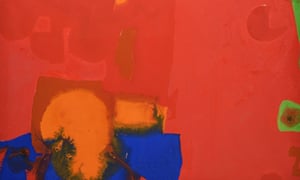
Very Soft Yellows and Formal Reds, April 1968 in the Mercer Art Gallery, Harrogate, is purely abstract. At the bottom of the frame is a blocked and very solid blue, containing a golden space like a hemisphere with an adjacent rectangle. Most of the rest of the painting is a nuanced red with ghosts of squares and a shadowy Heron form of knobs on stalks. There is a balancing golden almost-crescent form at the top of the painting where you might expect a sun or a moon. But the staggering thing is the finely delineated green curtain or fringe that impinges on the blue and the gold, dark against the blue, vegetable greens against the gold. The green is a fringe or a frond. The whole discrete structure at the bottom left, somehow closed off from the complicated reds of the rest of the canvas, is a harbour, with a harbour wall – and maybe the uniform poster blue around it is an icon of the sea. I have seen other paintings with this green fringe, so unexpected against the clear simple delineated colours, but very few. I began to ask myself, is the green paint fronds of seaweed, or is it the dash of the water itself breaking against the harbour? The answer is that it is paint and colour and one can read it – not as one will – but in as many ways as are possible.
So what do we make of the rest of the image? It is unusually tentative for Heron – deliberately tentative. There is a vertical oblong where the gold is overlaid with a pale brown muddy colour, linking and not linking the harbour to the gold splash at the top. A strange jaunty bright green form is trying to worm its way from the right edge into the painting or – this is how I read it – it may be trying to escape. “Jaunty”, “trying” and “escape” are my words, not the painting’s. Heron was very interested in the edges of paintings – he liked, so to speak, to run over them, to emphasise their edginess by contradicting it.
I love Heron’s paintings because they are the opposite of stories. Writing moves on the whole from beginning to end, however much experimental writers may try to break this temporal lock. Words follow one another and there is an end.Painting is space, and writing is time, and Heron’s abstraction is at one end of that spectrum. You can close a book. There is no reason ever to stop looking at a painting. The Mercer Gallery kindly arranged for me to sit alone with this Heron for as long as I wanted to – it was on a chair and I stared and stared – and it kept changing in my gaze. When I left it, I kept coming back for a last look. I was trying to save the forms in my brain. I don’t think (I may be wrong) that Heron thought much in terms of the brain, as opposed to the mind or the eye. He writes about charcoal, pigment, brushes, edges.
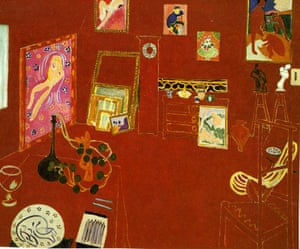
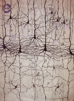
Whereas I have come to think of my writing as a moving screen of images which I use to see what is unbalanced, what needs elaborating, what is overdone. I need to know something about the whole form of a novel – changing as I work, and I have four images with which I generally work to do this thinking. The first is Matisse’s Red Studio, a strong red space inhabited by the ghosts of furniture and paintings. This was Heron’s favourite painting, and it has been mine as long as I have known it – not because of him, but because of my passion for Matisse. Next there are the completely amazing (and beautiful) images of brain cells made in the 1890s by Santiago Ramón y Cajal, showing the axons and dendrites, their knots and thrust. And the third and fourth are by Heron – I think with different images at different times, ghostly inside my head. There are colours, some strong, some transparent.
I’d like to end with a strange and wonderful experience I once had at an exhibition of Heron’s works in the Tate Gallery. The paintings were large and many were red. They knocked you out. Already dizzy, I found myself wandering through a host of dancing ghosts of colours – after-images, green for the reds, yellow for the blues, blue for the yellows. Heron’s paintings already show, with their juxtapositions of colours which change the colours around them, that no colour is stable. The colours that floated free in the gallery space were an intensification of that experience.
• Writing About Art: Literary Connections in the Harrogate Fine Art Collection by Lara Goodband and John Wedgwood Clarke is published by the Mercer Art Gallery. harrogate.gov.uk
AS Byatt: the artist who helps me write
They may be ghostly, dizzying and ‘the opposite of stories’, but the novelist needs Patrick Heron’s abstract works to shape her fiction. Here she explains why she is so haunted by his work
沒有留言:
張貼留言