2008年3月31日 星期一

‘operation’ gown: ‘Incisions’

A unique surgical gown that brings together art and science

Durham and Ulster Universities in the United Kingdom have developed a unique surgical gown which will help medical students to understand what it’s like to go under the knife. This world-first project has brought together art and science in the form of a gown which, the developers hope, will significantly improve understanding of where operation incisions are made. The garment – called ‘Incisions’ – was on international display at the Museum of Science in Boston. Rajiv Sharma spoke to leading medical developer Professor John MacLachlan, Associate Dean at Durham University’s School for Health, and asked him first just what made this gown so unique.

News

Art and medicine meet to make the world’s first ‘operation’ gown

(30 January 2008)

A world-first project bringing together art and science will help medical students understand what it's like to go under the knife.

A unique surgical gown, which goes on international display in the USA today, should significantly improve understanding of where operation incisions are made, and what they mean to the patient, say its developers at Durham and Ulster Universities.

It is hoped the gown, which would be worn by medical students in the classroom, will supplement the traditional plastic models of the human body that are currently in global use as teaching aids. It will also help in explaining procedures to patients, according to the scientists.

The gown has nine zips showing where surgeons make cuts in the body for various operations such as removal of the appendix and open heart surgery and its silk material is more like human tissue than the plastic of the traditional models. Medical students will wear the gown in the classroom whilst fellow students learn about surgical incisions using the zips. It will lead to a greater understanding of what it means to be the patient, say the developers.

Researchers say it will contribute to an improvement in teaching aids currently available. They say that, although the traditional plastic models can be used to show areas of the body and where incisions will roughly be made, they are not able to give medical students a sense of the feeling if they were the patient or show them the type of texture they will find once they have made an incision.

Leading medical developer Professor John McLachlan, Associate Dean in Durham University’s School for Health, explains: “Current anatomical teaching aids describe but they don’t evoke. They take no account of emotional involvement or the feel of the body. The way medical students distance themselves emotionally from the patient’s body has long been seen as a desirable outcome of current modes of medical training.

“But this ‘desensitation’ also brings with it the risk of objectifying the body. The patient becomes ‘the liver in bed four’ rather than Mrs Smith. We think we can use art to bring meaning back into medical teaching and we want to help students understand the significance of the body as well as its structure.”

The garment, named ‘Incisions’, was funded by the Wellcome Trust as part of a wider project to explore teaching, learning and thinking about the body through a series of art works and artefacts. ‘Incisions’ has been selected for inclusion in two major international exhibitions with the first one at the Museum of Science in Boston, USA opening today (30 January).

Artistic lead, Karen Fleming, Reader at Ulster University, said: “The body and garments are common objects in art and design but collaboration with medical knowledge brings a new dimension. The challenge for us has been finding material metaphors for living matter that were aesthetically inviting rather than repulsive. We have combined some of the familiar features from hospital gowns with fashion detailing to make it appealing”

The research team aims to feed the use of the gown into medical schools around the UK and beyond. It could form an integral part of the Personal and Professional Development strand of medical training in which students develop the ability to communicate effectively and sensitively with their patients.

2008年3月30日 星期日

Mural panel: relaxation in a garden

Mural panel: relaxation in a garden
17th century
© Musée du Louvre/A. Meyer

「美國大學出版社印象頗深的是他們出版翻譯作品。以我們SU討論過的,加州大學出版· The Age of Constantine the Great: Jacob Burckhardt...;MIT出版Journey to the East by Le Corbusier, Edited by Iv...*;哥倫比亞出版羅蘭 巴爾特;哈佛大學”海德格”;史丹佛大學”繁華物語;芝加哥大學”西遊記(全譯本和簡易本)…….

*再舉一翻譯錯誤例:

a letter to friends 近結尾;「….記得在伊斯法罕城見過一幅大壁畫,那是以前從盧浮宮學來的玩藝。畫面上,一些嬌小的女人穿著藍底黃點…….你知道這幅壁畫讓我多興奮呀!……

hc評:作者沒去過伊朗的Isfahan,他指的是他在巴黎臨摹 Mural panel: relaxation in a garden 的記憶 ….


Mural panel: relaxation in a garden

The garden, with its feasts and gatherings, was a very popular theme in miniatures. It was also depicted on various other materials, such as ceramics.

A connotation of paradise is associated with the garden: freshness prevails and earthly foods - here, a bowl of fruit and a covered dish carried by a female servant - evoke celestrial fare.

Description

The charm of a garden scene


Rather strange trees grow in this garden. One of them, with a blue trunk, evokes Fauvism.

On a grassy spot strewn with clusters of flowers, the two central figures are sitting in the oriental fashion. One is writing in a small volume called a "langue de boeuf", while the other expressively accentuates his reading with the movement of his hand. A page, standing behind him, indicates that he is a person of a certain importance.

A female servant carries a large blue-and-white covered bowl. This piece is fully representative of the ceramic decoration of the period.

The clothing and the morphology of the figures place this scene in Iran during the first half of the 17th century. The heads of the men, with broad faces, are covered by very large turbans from which long curls fall. Close-fitting tunics emphasize their supple and somewhat androgenous appearence. Large belts, wrapped several times around their waists, accentuate their slender silhouettes.

In his curvilinear but slightly languid style, the painter Riza Abbasi was the first to depict this new style of dress on the pages of illustrated albums as of the last decade of the 16th century.


A rupture with the 16th century


A single composition occupies the entire tile-panel. Up until this time, each tile had been a separate entity decorated with an independent motif.

Yellow reappears on ceramics after having disappeared for five centuries as did the technique of cuerda seca. This technique of decoration involves painting lines of a grease-based pigment on the object. Upon firing, the grease evaporated and left a black outline separating the different colored glazes. Known during the first centuries of Islam, then forgotten, this technique reappeared in the region of Samarkand during the 15th century. The style of dress, the canon of the figures, the style of Riza Abbasi, the composition limited to a single theme, the techniques, and the palette are all new. And break with the established customs of the preceding centuries.

Parallel to the political changes which took place in the Safavid empire, an entire regeneration in art occurred as well. In 1598 Shah Abbas I (1588-1627) created a new capital at Isfahan and largely rebuilt the city. By the rectilinearity of its axes and its vast dimensions, its urban plan and architecture broke with the prevailing traditions. The Maidan-i-Shah (Royal Square) is three times larger than the royal Place des Vosges in Paris which was built during the same period.

Under the impetus of contact with European missionaries, merchants and travelers, Shah Abbas I affirmed the splendor of his realm. A realm he had opened up to outside influences and had made into a modern empire.


Gardens in the royal pavilions


In the new Isfahan, the royal pavilions were places of relaxation and festivities. They opened amply onto the greenery of large gardens and numerous pools.

The interior of the Chihil Sutun pavilion ('Forty Columns') is decorated with mural paintings in the style of Riza Abbasi. Similar decoration was also applied to ceramic panels. The tilework "relaxation in a garden" very probably figured on the walls of a garden pavilion. The Chihil Sutun has been proposed as its origin.

2008年3月29日 星期六

弘前のブナコ、英国でデザイン賞

bunaco

弘前のブナコ、英国でデザイン賞(03/29 11:51)


食器 【ブナコ】 ·bunaco
ブナコは、原材料の加工から完成まで自社で一貫生産している国産の木工品です。
 木材資源を有効に活用する「地球にやさしい」独自のエコ製法で作られています。


英国の国立博物館に収蔵が決まったティーセットと同様のブナコ製品

英国の国立博物館に収蔵が決まったティーセットと同様のブナコ製品

2008年3月22日 星期六

The Federal Military Memorial Cemetery,

"俄 羅斯的「聯邦軍事紀念公墓」本周開始整地,位在莫斯科以北的公墓,為俄國版的美國阿靈頓公墓。宏偉的公墓完成時,將成國家元首與民族英雄長眠之地,換句話 說,興建公墓,普亭不僅在圓史達林的美夢,他本人也將可與他推崇的聖人史達林埋在同一個地方。預計2010年竣工,成為莫斯科的新地標。 新公墓號稱是蘇聯垮台後,俄國最具雄心的建築計畫。公墓將極盡堂皇之能事,以重現俄國榮耀。 許多人認為,公墓的新古典建築形式與蘇聯時代的風格相近。在獨裁的普亭於俄國普受愛戴後,俄國將領建議讓俄國總統與民族英雄長眠於蘇聯的光輝中。公墓因此最後定調為蘇聯主題,批評者則認為這項設計為共產時代復活的跡象。 公墓的首席建築師高耶夫表示,雖然新古典的建築可能讓人聯想到蘇聯的高壓政治。他說:「在別人眼中,它可能是高壓,但對我們,它是莊嚴與榮耀。"


「聯邦軍事紀念公墓」可能有誤: federal指 [before noun] relating to the central government, and not to the government of a region, of some countries
或許是「中央軍事紀念公墓」
(我搞錯了
Russian Federation (the ~) ロシア連邦.
1991年8月24日,俄羅斯蘇維埃聯邦共和國宣佈獨立,成為俄羅斯聯邦。作為前蘇聯的主要加盟共和國俄羅斯聯邦依然是一個十分有影響力的國家,特別是在由11個前蘇聯加盟共和國
組成的獨立國協組織內。1991年,蘇聯解體,俄羅斯繼承蘇聯,......)


"高壓政治"為 oppress (RULE) 此處談的是此種設計風格讓人"有壓迫感"

oppress (MAKE UNCOMFORTABLE)


Vladimir Putin's last resting place - with Stalin
By Adrian Blomfield in Moscow
Last Updated: 2:04am GMT 23/03/2008
http://www.telegraph.co.uk/news/main.jhtml?xml=/news/2008/03/22/wputin122.xml

Vladimir Putin is to fulfil an unrealised dream of Joseph Stalin's by creating a grandiose state cemetery.In a corner of northern Moscow bulldozers began churning the earth his week in a section of wasteland where Mr Putin and Stalin, the dictator he is said to revere, could one day be laid side by side.

The Federal Military Memorial Cemetery, its designers boast, will be Russia's answer to America's Arlington. Arguably the most ambitious architectural project undertaken since the fall of the Soviet Union, it remains to be seen whether the cemetery, due to be completed by 2010, will become the landmark the Kremlin hopes.

There is no doubt that the project encapsulates the Putin era, which officially ends on May 7, though the president is likely to remain Russia's most powerful man in his new job as prime minister.

The cemetery will be a testament to extravagance, a piece of architectural monumentalism intended to reflect the glory of a resurgent Russia. For the critics, it is also a worrying sign of the Kremlin's flirtation with its Communist past. The design marks a return to the style many assumed had gone with the end of the Soviet Union.

Drawings show that the 132 acre site will feature obelisks, golden statues of figures from Russia's past and friezes of workers in heroic poses.


It is architecture from the era of heroic realism and a style of propaganda favoured by both Stalin and Hitler - a fact that has dismayed a dwindling number of liberal architects fighting the current trend of Soviet nostalgia.

The concept of a national cemetery was resurrected in the early 1990s by a state-owned body called Mosproject-4. The designer Alexander Taranin said he wanted to create a minimalistic cemetery that gave a quiet and honest reflection of Russia.

"We tried to show the difficult road the country has travelled while still being optimistic about the future," he said.

The Yeltsin government ignored the project but the plans gained traction after Mr Putin came to power in 2000. But as the liberalism of the 1990s gave way to Putin's authoritarianism, Mosproject-4 fell out of fashion. Russia's generals felt that a Soviet theme would be fitting for the final resting place of Russia's presidents and national heroes.

Mosproject was usurped by the Combine of Monumental Decorative Art, a turgid Soviet-era state institution that was again in the Kremlin's favour.

Its chief architect, Sergei Goryaev, was only too happy to oblige the generals - even if it meant aping the neo-classical style of the past that had done so much to give Moscow its oppressive atmosphere.

A drawing of Moscow’s Federal Military Memorial Cemetery: Vladimir Putin's last resting place - with Stalin
A drawing captures the grandeur of Moscow’s monolithic Federal Military Memorial Cemetery, Vladimir Putin’s corpse will be transported to the cemetery’s pantheon in an armoured personnel carrier

"What is oppressive to you is solemn and glorious to us," he said. "The Soviet empire's style has many beautiful examples which are among the highlights of 20th century architecture anywhere."

An updated funeral ceremony for heads of state is also being developed that restores some of the militaristic traditions of the past. When Mr Putin dies, his corpse will be transported to the cemetery's pantheon in an armoured personnel carrier before being laid to rest, Mr Goryaev said.

He added that it was possible that leading figures from the Soviet era, such as Stalin, could be reburied in the cemetery.

It is possible that Lenin could be moved there as well.

2008年3月21日 星期五

What Will Be Left of Gehry’s Vision for Brooklyn?


Gesamtkunstwerk ("total," "integrated," or "complete artwork") is a German term
attributed to the German opera composer Richard Wagner which refers to an operatic
performance encompassing music, theater, and the visual arts. ..

Gesamtkunstwerk


Term first used by RICHARD WAGNER in Das Kunstwerk der Zukunft (1849) to describe his concept of a work of art for the stage, based on the ideal of ancient Greek tragedy, to which all the individual arts would contribute under the direction of a single creative mind in order to express one overriding idea. However, the term is applied retrospectively to projects in which several art forms are combined to achieve a unified effect, for example Roman fora, Gothic cathedrals and some Baroque churches and palazzi.


Architecture

What Will Be Left of Gehry’s Vision for Brooklyn?

Gehry Partners

Frank Gehry’s design for Forest City Ratner’s proposed Atlantic Yards development in Brooklyn. Much of the project may now be delayed.


Published: March 21, 2008

The growing possibility that much of the multibillion-dollar Atlantic Yards development in Brooklyn will be scrapped because of a lack of financing may be a bitter pill for its developer, Forest City Ratner. But it’s also a painful setback for urban planning in New York.

Skip to next paragraph
Gehry Partners

Part of the Atlantic Yards project in Brooklyn, as originally envisioned by Frank Gehry.

Designed by Frank Gehry, the project was a rare instance in which the architectural talent lined up for a New York project matched the financial muscle behind it. When it was unveiled in late 2003, it seemed to signal a genuine effort to raise the quality of large-scale development in a city still stinging from the planning failures at ground zero.

So if the decision to proceed with an 18,000-seat basketball arena but to defer or eliminate the four surrounding towers is defensible from a business perspective, it also feels like a betrayal of the public trust.

Mr. Gehry conceived of this bold ensemble of buildings as a self-contained composition — an urban Gesamtkunstwerk — not as a collection of independent structures. Postpone the towers and expose the stadium, and it becomes a piece of urban blight — a black hole at a crucial crossroads of the city’s physical history. If this is what we’re ultimately left with, it will only confirm our darkest suspicions about the cynical calculations underlying New York real estate deals.

The project that the city approved in late 2006 would have included eight million square feet of residential and commercial development on an eight-acre site extending east from Flatbush and Atlantic Avenues, one of the borough’s most congested intersections. For many who opposed it early on, it was yet another instance of powerful economic interests trampling on the rights of a deeply rooted middle-class community — one that had already been reshaped by waves of transplanted Manhattanites. Mr. Gehry’s involvement was simply a bit of window dressing intended to give the project an aura of enlightenment.

I sympathized with these arguments to some degree. New York has had a terrible track record with large-scale planning in recent years. Look at Battery Park City. The MetroTech Center. Donald Trump’s Riverside South. All are blots on the urban environment, as blandly homogenous in their own way as the Modernist superblocks they were intended to improve on.

But it’s important to remember that this is also the city that spawned Rockefeller Center, a 22-acre development at the core of Manhattan that became a glorious emblem of the 20th-century metropolis. For some of us Atlantic Yards presented a creative opportunity for the 21st century.

If large-scale development is unavoidable, why not enlist serious talents like Mr. Gehry to come up with an alternative to the bottom-line proposals that have been the accepted norm for decades? Finally a big developer had turned to a legitimate architectural hero for help, rather than the usual corporate hacks.

As it turned out, Mr. Gehry’s design revealed both the promise and the limits of that collaboration. The main residential blocks to the east of the arena lacked the architect’s signature ebullience. A series of mismatched towers along two sides of a central courtyard encompassing several blocks, they followed most of the usual planning rules: adhere to the street grid, pack in a good deal of retail along the street, add a dose of public space.

But if that part of the development bordered on soporific, his design for the arena block was a tour de force. Most urban sports arenas are big, windowless boxes that suck the life out of their surroundings; Mr. Gehry’s great invention was to conceal this one behind a dense array of residential and commercial towers. The most glamorous of these, Miss Brooklyn, clad in cascading sheets of glass, anchored the arena to Flatbush Avenue. Three smaller residential towers, their playful forms like unevenly stacked children’s blocks, framed the arena on the east and south.

This imaginative fusion of inside and out, with the intensity of the sports arena paralleling the bustle of the street, spelled promise. Visitors arriving by subway would spill out into a multitiered glass atrium; directly above, the voluptuous curves of Miss Brooklyn would be a counterpoint to the nearby Williamsburgh Savings Bank tower — a classic stone phallus.

Between the bases of the towers, views would open up from the street onto the concourses that envelop the arena. During a Nets game, pedestrians strolling along Flatbush Avenue would be able to catch glimpses of anguished fans inside; when the arena was empty, its dark, gaping void could have the haunting effect of the ruins of a Roman coliseum. A cold, characterless intersection might thereby be transformed into Brooklyn’s vibrant answer to Times Square, minus the saccharine Disney décor.

The first sign that something was amiss arose when Forest City began to reduce the percentage of affordable housing units in the design and add condominiums, decisions that altered the project’s character. Then the developer quietly asked Mr. Gehry to redesign Miss Brooklyn to cut costs. The delirious exterior was replaced by a less graceful design, with floors piled loosely on top of one another, their forms twisting as they rose. The atrium was reduced to an empty glass hall with a set of bleachers overlooking the street.

Meanwhile, Mr. Gehry invested more energy into designing a 20-story tower for a site across Flatbush that he hoped would balance his composition by creating a visual bond between the sides of the avenue.

Still, the core of his concept, the charged relationship between the enclosed arena and the street, remained intact.

Without the towers the arena is likely to become an enormous eyesore. Even if Mr. Gehry adorns it with a seductive new wrapper, its looming presence will have a deadening impact on a lively area. The magical peekaboo effect of peering between the bases of the towers into the arena will be lost. The atrium, once a vital public space, will be reduced to a barren strip of pavement.

No development at all would be preferable to building the design that is now on the table. What’s maddening is how few options opponents seem to have.

We could wage a public campaign to stop it. We could pray that Forest City Ratner comes up with more money. But given that the city approved the plan, we cannot prevent the developer from building the arena. Nor is there any way of preventing Forest City from selling off pieces of the property to other investors, who could then come up with any design they liked, as long as they abided by zoning and density guidelines.

Mr. Gehry, on the other hand, could walk away.

In the old days, when he was still a budding talent with an uncertain future, he walked off jobs when a client began pushing things in the wrong direction. This was not simply an act of vanity; it showed that the quality of his work mattered more to him than a paycheck.

Years later, he has been backed into a familiar corner. There’s much more money at stake here, and I expect that he is torn between a sense of loyalty to his client and a desire to make good architecture.

But by pulling out he would be expressing a simple truth: At this point the Atlantic Yards development has nothing to do with the project that New Yorkers were promised. Nor does it rise to the standards Mr. Gehry has set for himself during a remarkable career.

2008年3月16日 星期日

Ecole de Paris

Ecole de Paris


Term applied to the loose affiliation of artists working in Paris from the 1920s to the 1950s. It was first used by the critic Andr? Warnod in Comoedia in the early 1920s as a way of referring to the non-French artists who had settled and worked in Paris for some years, many of whom lived either in Montmartre or Montparnasse, and who included a number of artists of Eastern European or Jewish origin.

モジリアニ [Amedeo Modigliani]

(1884-1920) イタリアの画家。エコール-ド-パリの一人。細長い首の単純化した形態と重厚な色彩で、哀愁を秘めた情感ある婦人像を描く。


スーチン [Cham Soutine]

(1894-1943) リトアニア生まれのフランスの画家。モジリアニらのエコール-ド-パリに仲間入りし、強い色彩、特に赤を用いて幻覚や激情をほとばしらせた独自の画風で人物・風景などを描いた。

Wikipedia article "Chaim Soutine".

シャガール [Marc Chagall]

(1887-1985) ロシア生まれの画家。パリで活躍。幻想的作風で、絵画における抒情詩人といわれる。旧約聖書の世界を題材にしたパステル画をよくした。版画・陶芸の作品も多い。


キスリング [Mose Kisling]

(1891-1953) フランスの画家。ポーランド生まれ。エコール-ド-パリの一人として、透明感があり色彩あふれる絵を描いた。作「ポーランド風の肩掛の娘」「モンパルナスのキキ」
(b Krakow, Poland, 22 Jan 1891; d Sanary, France, 29 April 1953). French painter of Polish birth. He studied at the School of Fine Arts in Krakow, where his teachers included Jozef Pankiewicz, a fervent admirer of Auguste Renoir and the French Impressionists, who encouraged him to go to Paris. He arrived there in 1910, frequented Montmartre and Montparnasse, and soon became acquainted with Amedeo Modigliani, Georges Braque, Pablo Picasso, Max Jacob, Andr? Salmon and Cha?m Soutine. For a short time he lived in the Bateau-Lavoir in Montmartre and in 1911-12 spent nearly a year at C?ret. In 1913 he took a studio in Montparnasse, where he lived for the next 27 years; Jules Pascin and later Modigliani lived in the same building. On the outbreak of World War I he volunteered for service in the French Foreign Legion, and in 1915 he was seriously wounded in the Battle of the Somme, for which he was awarded French nationality.

エコール-ドパリ 6 [(フランス) cole de Paris]

〔美〕〔パリ派の意〕
(1)第一次大戦後、パリを中心に活躍した外国人画家たちのグループキスリングシャガールスーチン・パスキン藤田嗣治モジリアニなどで、当時のイズムや運動に加わらず、それぞれが独自の画風を展開した。
(2)パリに住み、制作活動を続ける画家の総称。


Reddot , iF獎, 大同電鍋換新衣


「德國紅點」台灣奪62座獎項
【陳一姍/台北報導】

 國際設計獎的後起之秀紅點獎Reddot昨公布得獎名單,台灣勇奪62座獎項,其中包含五座金獎。加上日前公布77座iF獎,獲獎較去年成長九成。與過往不同,今年紅點獎五座金獎得主,除大同是大企業,其餘大可意念、雷耀與飄逸實業都是中小企業。  

紅點獎已經有五十一年的歷史。有別於與漢諾威電腦展一起頒發的 iF獎,近幾年時有遭外界質疑商業化,紅點獎以獨立評審著稱,近年來在設計界地位逐漸提高。昨日紅點獎宣布2008年產品設計類名單,台灣拿下六十二個獎項,比去年三十五件大幅成長77%。明基以十一項獎,再度成為台灣的得獎王,第二名則是國內最大設計公司浩漢為大同操刀的一系列作品,拿到八項獎。  

值得一提的是,過去台灣都是靠華碩等大企業,去拿國際設計獎的金牌獎。紅點最難得的金牌獎每年五十件,今年台灣一舉拿下五座,其中有四座得獎者是名不見經傳的中小企業。  

位在北市北投的雷耀公司,已經有三十六年的歷史。在家庭即工廠的年代,雷耀就開始做聖誕燈外銷,近幾年第二代接班,公司轉向LED燈研發,希望能在照明第三次照明革命中佔一席之地。  

「設計是成本最低,可達到最大效果的工具」雷耀總經理林原說。雷耀今年第四次參加國際設計比賽,靠著LED玻璃磚燈拿下金獎。雷耀在燈磚兩面玻璃上度上一層物質,玻璃變成了鏡子。一打燈,靠著反射造成的錯覺製造出無線深度的錯覺,在空間應用出全新的趣味。  

國際設計比賽的常勝軍—大可意念,今年又以可捲式氣墊秤甜甜圈氣墊秤奪下兩金獎。大可設計一項以運用材質與創新結構見長,這一次的可捲式氣墊秤靈感來自英國,英國有一種醫護人員會到民眾家幫嬰兒量體重。帶著墊秤很重,大可於是想到用空氣幫浦打氣式的體重計,要量體重時,只要迅速充氣。不用時,就可以洩氣,方便攜帶。

 工業局組長蘇文憲說,這一次中小企業拿下許多獎,表示從大企業品牌公司往下延伸,台灣連中小企業的設計力都已經起來了。台灣去年度爭取到2011年全球設計年會在台灣舉辦,這表示,台灣的設計能量已受到國際重視。


中國時報2008.03.15

大同電鍋換新衣 iF、紅點:「金」讚
【陳一姍/台北報導】

 台灣人永遠的最愛,煎煮炒炸樣樣行的大同電鍋,今年換上新衣,一舉替台灣拿下一座紅點與iF兩項大獎。在iF設計大賽,拿的還是台灣唯一的金獎。  

新大同電鍋的設計人,浩漢設計總監林炳昕說,設計這個電鍋壓力很大。因為這個電鍋是台灣人共同的回憶,而且產品的功能很強,新電鍋絕對不能讓舊功能有任何的減少。設計師必須要讓電鍋有現代的語彙,但因為這個產品形象太普遍,還是必須讓人一看就知道「這是大同電鍋」。「這是個國民電鍋,牌子這麼大,不能砸鍋。」他說。  

林炳昕說,浩漢為了這個電鍋,設計了好幾個版本,還動用了好幾名設計師,最後才由他做定稿。在他的想法裡,這還是一款平民電鍋,所以不能變得很豪華。但必須省掉過去造型裡,一些繁瑣的設計,以符合現代語言,同時可替大同簡化生產流程。  

最後出來的新大同電鍋,變身為鐵灰色,原本像兩個耳朵的黑塑膠把手,轉變為一體成形的一圈黑木環。運用電木材質產生隔熱效果,既不燙手又方便移動,還可以固定內鍋。原本鍋蓋凸出的黑色把手,現則嵌入透明玻璃製成的視窗,讓使用者可以清楚看到電鍋內食物的烹調進度。

 林炳昕表示,這個設計,是大同今年九十周年部分計畫之一。對浩漢而言,能夠讓台灣人的國民電鍋揚名海外,「對我們的鼓舞很大,」林炳昕說。


Amazing Rare Things:The Queen's Gallery at Buckingham Palace 2008


The Royal Collection © 2006, Her Majesty Queen Elizabeth II

The Queen's Gallery at Buckingham Palace is a permanent space dedicated to changing exhibitions of items from the Royal Collection, the wide-ranging collection of art and treasures held in trust by The Queen for the Nation. Constructed forty years ago on the west front of Buckingham Palace out of the bomb-damaged ruins of the former private chapel, the Gallery has recently been redeveloped. It was reopened by The Queen on
21 May 2002 and is now open to the public on a daily basis.

白金漢宮自然歷史畫展 達文西珍貴畫作在列

包括十五世紀文藝復興時期偉大畫家達文西等四位知名藝術家所創作,英國王室珍藏的一百三十幅以自然歷史為主題的珍貴畫作,今天起在白金漢宮女王畫廊展出,帶領參觀者一睹十五世紀末到十七世紀自然生物演進的歷史。

畫展策劃人之一,資深博物館專家克雷頓告訴中央社記者,王室珍藏的達文西畫作約有六百多幅,這次特別挑出其中十八幅,畫作中充分展現這位曠世奇才不僅是傑出的藝術家,更是了不起的科學家,他對生物的深刻觀察與描繪,以及非常人所及的想像力,相信能讓參觀者大開眼界。

達文西畫作中一幅名為「貓群、獅群與一條龍」,是十五世紀西方繪畫史上極少數出現龍的形象,另一幅對熊腳的透視解剖,不僅有肌肉、骨骼還有筋絡組織,極為細膩,令人讚嘆;他筆下的黑莓樹更有躍然紙上的生動。

克雷頓指出,其它展出的還有英國十七世紀畫家馬歇爾獨特的花卉畫作,婀娜多姿的各式花卉,在馬歇爾筆下,展現迷人的風采;另一位十七世紀畫家瑪麗安除了喜歡花卉題材,對動物也十分著迷,一幅鱷魚與蛇糾纏互鬥的作品,色彩鮮明,生動充滿生命力。

另一位英國畫家凱茲比,曾遠赴美洲大陸觀察自然生態,探尋「新世界」,一幅白頭老鷹自空中飛向河流叼食躍起的魚,勾勒大自然的食物鏈,及弱肉強食的法則。

這項名為「令人驚嘆的罕見生物」展,特別邀請英國知名生物學家,同時也是電視名主持人艾坦勃勞參與策劃。

他說,四位畫家的共通點,就是可以從他們的畫作中深刻感受到他們觀察自然生物的喜悅,那種投入即使到了二十一世紀的今天,仍能延續不變。

這項展覽將一直進行到九月二十八日。三月二十一日配合復活節休館。


Amazing Rare Things: The Art of Natural History in the Age of Discovery

Alexander Marshall, Anemone (detail), c.1650-82

The Queen's Gallery, Buckingham Palace

14 March – 28 September 2008


The Scotsman ***** 'an imaginative projection into the world around us'

This extraordinary exhibition, recently shown in Edinburgh at The Queen's Gallery, Palace of Holyroodhouse, has been selected from the collections of the Royal Library by curators of the Royal Collection in collaboration with the distinguished naturalist and broadcaster Sir David Attenborough. It brings together the works of four artists and a collector who have shaped our knowledge of the world around us.

Mark Catesby, Great hogfish, c.1725

Leonardo da Vinci, Cats, lions and a dragon (detail), c.1513-16 Leonardo da Vinci, Cassiano dal Pozzo, Alexander Marshal, Maria Sibylla Merian and Mark Catesby are diverse figures who shared a passion for enquiry and a fascination with the beautiful and bizarre in nature. All lived at a time when new species were being discovered around the world in ever increasing numbers. Many of the plants and animals represented in the exhibition were then barely known in Europe. Today some are commonplace, others are now extinct.

There is a common denominator that links all these artists. It is the profound joy that all feel who observe the natural world with a sustained and devoted intensity.

Sir David Attenborough

More information about visiting The Queen's Gallery

View highlights of the exhibition online

Attributed to Vincenzo Leonardi, Head of a white stork, c.1630-40

Maria Sibylla Merian, Common or ‘spectacled’  caiman and South American false coral snake


2008年3月15日 星期六

''Summer Mountains,'' attributed to Qu Ding


A detail from ''Summer Mountains,'' attributed to Qu Ding

The uses of that vision varied. In “Summer Mountains,” attributed to the Southern Song painter Qu Ding, the landscape is descriptive, a pileup of painstakingly rendered details, from minute curved bridges to an elaborate temple tucked in a notch. By contrast, in Guo Xi’s water-soaked “Old Trees, Level Distance,” emotion reigns. The landscape looks as shadowed with regret as a Mahler song. Two old men, tiny figures, meet for a parting meal before one begins a journey. Where is he going? Will he return? Or is this a last goodbye? The men are dwarfed by a landscape seen through tears.

Photo: Metropolitan Museum of Art


屈鼎,中國北宋畫家,生卒年不詳,河南開封人。

屈鼎以善畫山水著稱,傳世作品不多,而以美國紐約大都會藝術博物館收藏的《夏山圖》最為著名。


Qu Ding, (Chinese: 屈鼎) was a Chinese painter of Song Dynasty.

He learned paintings skills from Yan Wengui, a painting master of that time. "Summer Mountains", kept at Metropolitan Museum of Art, is perhaps the only work of his that has come down to present time. Landscapes in his painting brings out a panoramic view of mountains and rivers.

Summer Mountains


2008年3月14日 星期五

銭選與“Anatomy of a Masterpiece”

我十幾年前在此觀賞過"董其昌的世界/時代"
日子很快


銭選(せんせん、男性、生没年不詳)は、初の文人画家篆刻家である。生年は1235年前後、卒年は1301年以降と推定される。江蘇呉興(湖州)の人。

は舜挙、号は玉潭・巽峯・清癯老人・習懶翁・霅谿翁など。


銭選は南宋末に進士に及第するも生涯にわたって仕官していない。宋朝滅亡後は蘇州呉興に移り住み、他の遺民画家と文人グループを形成し、「呉興八俊」と称揚される。元朝最大の芸術家とされる趙孟頫と文雅の交友があり、書画三昧の生活を送る。趙孟頫がフビライに招聘されると他の文人達もこれに従ったが銭選は潔しとせず、ひとり故郷に隠逸した。このことが遺民としての忠誠心の現れとして後世に評価されている。

画の力量は職業画家と間違われるほど巧みで、晩年はそのためにかえって贋作が横行した。これを防ぐ為に画に詩文を書き入れたという。南宋画院の硬直した画風に反駁し、北宋趙伯駒李公鱗趙昌などの筆法を採り入れ、復古主義的な画風を確立した。この主張は元末四大家に受け継がれ、文人画の隆盛に繋がった。趙孟頫に「文人画とは?」と問われて「隷体の画である」と返答したとされるが、この逸話は文人画論に著名である。

銭選・趙孟頫・李カン・高克恭商琦元初五大家とする呼称もある。

落款印が拙劣であることなどから職工に依頼せず、印章を自刻したと思われるが、篆刻家の先駆けでもあった。

1970年から1971年にかけて発掘された明の太祖の第10子である魯王朱檀の陵墓(山東省鄒県)から銭選の画(蓮花図)が出土した。中国の学術的な発掘調査によって出土した絵画の作者が同定できた例はこれのみである。

這兩本參考書台灣都有翻譯本:

錢選《王羲之觀鵝圖卷》元紙本設色23.1×92.3 公分

美國紐約大都會博物館 ......

修竹林間爽致多

閑亭坦腹意如何

為書道德遺方士

留得風流一愛鵝


Art Review | 'Anatomy of a Masterpiece'

The Art Is in the Detail

Metropolitan Museum of Art

Detail of Qian Xuan's “Wang Xizhi Watching Geese.” More Photos >


Published: March 14, 2008

From his terrace, the world is blue and green — mountains and trees — or almost green. Spring is on the way; the geese are back. One, then two, alight on the river, with more still invisible but close behind. Pavilion living! The only way. With the city somewhere down there, and nature everywhere up here, he watches mist rise. River meets sky.

Skip to next paragraph

Related

Mapping Asia Week (March 14, 2008)

Metropolitan Museum of Art

“Wang Xizhi Watching Geese,” ink and color on a paper scroll, painted around 1295 by Qian Xuan and on view in “Anatomy of a Masterpiece: How to Read Chinese Paintings,” at the Met. More Photos »

Metropolitan Museum of Art

A detail from Han Gan’s “Night-Shining White” (eighth century). More Photos >

The calm watcher is the fourth-century scholar-artist Wang Xizhi, father of classical calligraphy and model for living an active life in retreat. He is depicted by the painter Qian Xuan, another connoisseur of reclusion, in a 13th-century handscroll at the Metropolitan Museum of Art. The scroll is in “Anatomy of a Masterpiece: How to Read Chinese Paintings,” a spare, studious show that offers, along with many stimulations, a retreat from worldly tumult — the religious fervor, the courtly pomp, the expressive self-promotion — that fills much of the museum.

This exhibition is also a refuge from the hurly-burly of Asia Week in New York, which is now in session and has mushroomed into three weeks this year. Dealers are in town from abroad with special shows; others arrive next week. Two art fairs are returning. Add a passel of events devoted to contemporary Asian art, along with the auctions, and the situation is clear: a marathon stretch of looking, judging, sorting, tsk-tsking and oh-mying, not to mention wheeling and dealing. Naturally, the urge to get away from it all can be strong.

I mean, isn’t part of the point of our Western passion for Asian art to find a serenity that we can’t seem to cook up on our own, a metabolic slow-down, a less-is-more state of grace? One 15th-century Chinese writer recorded such an ideal in a lifestyle wish list that includes: “A nice cottage. A clean table. A clear sky with a beautiful moon. A vase of flowers. No cares of the world.” He was describing the optimum environment for looking at art, but also for living artfully.

“Anatomy of a Masterpiece” has all the elements on his list, and one more: instruction. The curator, Maxwell K. Hearn of the Met’s Asian art department, has given the museum’s lofty Chinese painting and calligraphy galleries the intimacy of a teaching collection, with a limited number of objects accompanied by short labels and photographic enlargements of details. The labels are thematic and ruminative, approaching paintings through ideas rather than dynasties. The photographs are a revelation.

To many visitors Chinese brush-and-ink painting, with its faint images on time-darkened silk, has a generic look; entire galleries register as a soft brown blur. Close and repeated looking slowly reveals those images and brings them to life in a startling way; partly this is a matter of individual vision evolving, sharpening. But photographs speed the process, cutting through obscuring patinas, clarifying what is otherwise hard to see, and in dramatic ways.

I can easily imagine Mr. Hearn’s photo-supplemented show creating converts to Chinese painting; it is museology as consciousness-raising. (Yale University Press is publishing an accompanying book.)

Mr. Hearn has the immense advantage of working with some of the most famous Chinese paintings in existence, and he opens with one of them, “Night-Shining White,” a picture of a spirited horse by Han Gan, who lived in the ninth century during the Tang dynasty. By that point the criteria for a successful painting had been established, and the first was the ability to convey a subject’s vitality, or life-energy.

Han was a master of this, bringing an animal to life with contour lines and calligraphic strokes that look almost joltingly vibrant. And if that dynamism escapes us, the testimony of generations of connoisseurs is there to confirm it: the horse is hedged in by a halo of seals applied by scholars and artists over the centuries. Each is a stamp of approval; together they are a storm of applause.

During the Tang dynasty, figure painting was the prestige genre, and landscape subsidiary. With time this hierarchy was reversed. Landscape became the big picture, figures mere dots to establish scale. And the scale was tremendous: towering mountains, limitless vistas, sourceless rivers, as befitted an image of nature that was an emblem of creation itself, a vision of matter forever consolidating and evaporating .

The uses of that vision varied. In “Summer Mountains,” attributed to the Southern Song painter Qu Ding, the landscape is descriptive, a pileup of painstakingly rendered details, from minute curved bridges to an elaborate temple tucked in a notch. By contrast, in Guo Xi’s water-soaked “Old Trees, Level Distance,” emotion reigns. The landscape looks as shadowed with regret as a Mahler song. Two old men, tiny figures, meet for a parting meal before one begins a journey. Where is he going? Will he return? Or is this a last goodbye? They men are dwarfed by a landscape seen through tears.

Several generations later, in Zhao Mengfu’s “Twin Pines, Level Distance,” something new appears. No more realism; no more romanticism; in a sense, no more painting. Now the landscape image is an extension of writing, a form of embodied thought, an essence of landscapeness, a text to be read. In the contemporary West we have a term for this: conceptual art.

And my guess is that if certain Chinese artists in the Met show could leap the centuries, they would feel at home in the concept-intensive environment of the current Whitney Biennial, with Carol Bove’s towering driftwood sculpture, or Charles Long’s skeins of river debris, or even the text-based art of Dexter Sinister (Stuart Bailey and David Reinfurt) snaking down a computer screen.

Not that Chinese painting ever abandons sheer visual punch. Liang Kai’s “Poet Strolling by a Marshy Bank,” with its vision of the natural world gashed open and turned inside out, is a shock to the system no matter how often you see it. So is Zude’s painting of an old man’s face as a fissured topography of rock and earth. And Wu Bin’s depiction of Buddhist saints as a cavalcade of rubber-limbed freaks.

Then there is the peculiar vivacity of calligraphy. If Zhao’s “Twin Pines, Level Distance” is the pictorial equivalent of writing, the show’s great example of his actual script, “Four Anecdotes From the Life of Wang Xizhi,” seems to have an aural dimension, like a dramatic reading. So expressive are the linear twists and turns of the brush, the pressure and weights of ink, the spatial punctuations, that you can practically hear his voice.

No doubt that voice often spoke in isolation. In his later years, Zhao alternated life in the quotidian world, with its markets and politics, with periods of withdrawal. And the passage he copied in calligraphy at the Met is a story from the life of Wang Xizhi, the man with the vista of blue and green, the man who loved geese.

In the story, Wang is visiting a Daoist monk who owns a flock of geese, exceptionally beautiful ones. Sell them to me, Wang begs the monk, who replies that he will not. They argue; they wrangle; they spar. It’s exhausting. At last they swing a deal. The monk says that if Wang, such a famed calligrapher, will copy two chapters of Laozi’s Daoist scripture for him, he will give him the birds. Wang makes the copy, which takes all afternoon. Then the geese are his and he returns home, jubilant.

Home, one assumes, is the high terrace in Qian Xuan’s painting. And there, one likes to imagine, Wang Xizhi set the birds free. The legend is that his calligraphic style, the one that shaped so much later Chinese art, was inspired by watching geese fly, observing the bend of their wings, the curve of their necks as they descended to the river. Such are the benefits of the pavilion life: fresh ideas and a sharpened eye. You can acquire both in the Met’s pacific Chinese painting galleries and carry them to the hubbub that is Asia Week outside.

“Anatomy of a Masterpiece” runs through Aug. 10 at the Metropolitan Museum of Art, (212) 535-7710, metmuseum.org.


錢選1239年?~1301年?)字舜舉,號玉潭,別號巽峰等,中國元代畫家,吳興(今浙江湖州)人,工青綠山水(blue and green)。錢選- Wikipedia 日文版更豐富:


2008年3月9日 星期日

Hotel Everland

EuroVox | 10.03.2008 | 05:30

A Portable Paradise in the Heart of the City

In Suite 6 of Room Service, we redefine the term "a single room with a view" in the romantic city of Paris, France.

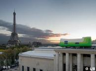
Drive down the side of the River Seine this year and you’ll see something weird perched on the roof contemporary art museum in Paris.

Designed by Swiss duo Sabina Lang and Daniel Baumann, Hotel Everland is an artwork where you can spend the night.

The hotel is made from a prefabricated wooden frame with luxury interior design and it is quiet possibly the world’s first ever portable hotel.

Report: John Laurenson


Xixi
"生活在瑞士" 來自 Xixi 用中文 (共18 篇日記)收藏
名稱: Xixi
留言: 0 | 被收藏: 0 | 鮮花: 0
xixi.xihalife.com


2008-01-1 - 只有一间客房的酒店
著名的Hotel Everland酒店只有一间客房,面积约为35平米,除了一张双人床外,还有淋浴和休息部分。然而其价钱可不便宜,周二-周四每晚333欧元;周末更贵,周五-周日甚至达到444欧元。

Hotel Everland酒店其实更是一件艺术品,2002年瑞士艺术家Sabina Lang和Daniel Baumann为瑞士国家博览会(Expo.02)创作了该“作品”。艺术家对酒店的使用也做出了限制:客人只能预订该酒店一夜。

该酒店曾在德国莱比锡当代艺术馆展出,现已“移宫”法国巴黎现代艺术博物馆的天台,不知这座爱搬家的酒店今后还将坐落何处,但直到今年年底,游客们都能在巴黎见到它的身影,而酒店的客人也可享受到它所带来的美丽视野。
"生活在瑞士"有18篇日記


2008年3月4日 星期二

新款冰箱

東芝Consumer Marketing推出了新款冰箱“擺放方便細長型 GR-34ND”。與原機型相比,年耗電量約減少12%。通過改進散熱設計,提高了冷卻器的性能。容量為339L。在同級別機型中,冷凍室最大,達 91L。可一次購買較多的冷凍食品,不必擔心容量問題。橫寬為60cm,採用細長型設計,提高了冰箱放置位置的自由度。

  採用了食品不直接接觸冷氣的“Cool air Wrap”方式。可避免食品乾燥。還具有冰箱內部均勻製冷的效果。

  價格採用開放式,零售價為12萬日元左右。3月25日上市。(3月1日 《日本經濟新聞》晨報)


访德国著名家具名师马利 by 祝红

文化社会 | 2008.03.03

现代家具传代家具:访德国著名家具名师马利

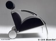
虽说已年过70,但德国家具设计师彼得-马利却依旧忙于设计绘图。法国、德国等多家品牌家具企业因马利的设计而驰名世界,设计师本人也因此而一展才华。经 由马利设计的多件家具已被业内人士推崇为现代派的古典主义经典之作,由德国多家博物馆展出。在不断革新求异的同时,这位生活在汉堡的设计师将美学和质量的 持久性作为自己的座右铭,他的格言是:家具必须达到传代水平,马利的设计可谓不虚此言。

彼 得-马利始终是国际家具展上一颗耀眼的明星。欧洲多家品牌家具企业因马利而驰名。马利的工作室和住所位于汉堡近郊的豪华住宅区奥米勒。青春艺术风格的房屋 掩映在参天古树之中,室内的家具大多出自马利的手笔,简约实用,没有丝毫刻意的夸张,白色调的浅色系列构成室内布置的主旋律,与今年科隆国家家具展上发出 的信号不谋而合。马利提倡将建筑与室内设计融为一体,马利的住所就是典范之作,内外和谐,相映成辉。多次荣获国内外设计大奖的马利已无需多言,工作室和住 所的艺术氛围为人们讲述了一切。

设计依赖于创新马利设计Bildunterschrift: Großansicht des Bildes mit der Bildunterschrift: 马利设计

德国之声:马利先生,您好!您是家具设计业的权威人士,有长达数十年的室内建筑和家具设计的经验。但我们首先想知道的是,您近来有什么大作吗?

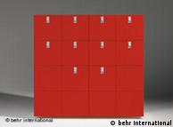
马利: 我一直与世界品牌家具制造商合作,比如法国的“写意空间“Ligne roset。近来,我为法国的这家公司设计了两款新家具。一个是长宽各两米的书架,书架的结构很有新意,打破了传统的框架结构,书架的内部结构呈不规则图 形,从而产生一种独特的视觉效果,也便于使用者使用。另一件设计是放在地上的长柜,造型上也有所创新,是长方型的,下面有金属支架。这样的柜子既可以放在 厨房里,也便于放在客厅里,便于放置电子音响设备和DVD等。我与其他德国家具设计师一样一向重视精确和简约,在设计过程中常常使用直线构图。为“写意空 间”设计的家具则打破了这样的传统结构思维,我试图摆脱某种传统的束缚。

Bildunterschrift: 设计的意义愈发重要

德国之声:您被视为业内的常青树。在您看来,几十年来家具设计领域发生的最大变化是什么?

马利: 我认为,最大的变化是:在当今社会,设计已是一个不容忽视的经济因素。目前,设计市场全球化的趋势愈发明显。设计已跨越了国家的界限。如今已不存在典型的 意大利设计,或是典型的德国设计。不过从另一方面来说,尽管设计行业越来越国际化,但每一项设计都必须体现出设计师的独到之处,必须有自己的品位。

德国之声:难道设计行业的最大变化仅限于经济因素吗?

马利: 当然不是,设计风格也发生了很大的变化。上一世纪初,德国成立了包豪斯学院,德国的设计师都强调功能性、理性和精确。但今天则完全不同了,人们在设计时已 不再墨守陈规,严格地遵守包豪斯的风格,而是加入了某些浪漫和轻松的元素。在设计时,德国的设计师们与其他国家的设计师一样会尽情发挥自己的想象力,注重 调动人们的情感因素。我们不仅要让客户相信设计作品的理性和功能,也试图影响客户的情绪,激发客户的兴趣,使顾客愿意购买,乐于将这样的产品作为自己生活 的一部分,以此提高个人的生活品位。

美观设计与功能实用缺一不可Bildunterschrift:

德国之声:但目前也有一种与现实生活完全脱节的发展趋势,似乎设计作品不必具备实用性,只具备观赏性即可。您如何看待这个问题?

马利: 我个人认为,优秀的设计作品必须令客户兴奋,必须能感染使用者的情绪,但另一方面也必须合理,便于使用。两者缺一不可。比如以沙发或椅子为例:它们不仅要 坐着舒服,用户不会因此而后背疼痛,还要美观。如果只是徒有其表,坐着不舒服就不能称其为优秀的设计。美观的外形与产品的功能和实用性是无法分开的,它们 是一个完整的统一体。

德国之声:您刚才提到了德国设计师的特点,谈到了德国的包豪斯学院。对许多中国人来说,一谈到设计,人们首先想到的是意大利、法国和英国,而不会想到德国。在全球化的当今,德国设计师如何能立于不败之地呢?

马利: 德国设计在世界范围内成就辉煌。保时捷跑车就是一例。我认为,中国人之所以有这种想法,是因为德国设计师亟待提高其在中国的知名度。也就是说德国产品的知 名度在中国尚为达到应有的水平。但这与德国制造的产品质量和设计质量没有任何关系,对此我深信不疑。德国的设计质量是世界一流的。

保时捷跑车Bildunterschrift: 保时捷跑车德国设计堪称世界一流

德国之声:也就是说,我们可以这样理解,尽管德国人以理性著称,但这并不影响产品的设计。

马利: 当然了。相反理性有助于优秀设计产品的诞生。另外,德国设计师也不乏丰富的想象力,但我们的想象力受到理性的控制,因为我们首先要为客户提供优质产品,便 于客户的长期使用,同时也使他们能长时间地保持这份乐趣。我的设计理念是:设计产品必须是高质量的,包括产品的制作和生产工艺,不仅要外形美观,还必须便 于顾客的长期使用。做到这一点并不容易,所以我认为,设计外形线条必须尽量简约,比如我一向偏爱的几何图形就具有强大的生命力,它们永远也不会过时。因为 它们是理性和智慧的造型。

德国之声:在21世纪设计究竟具有怎样的地位?

马利: 我认为,设计的地位和意义越来越高,越来越大。不仅设计的社会地位有了极大的提高,媒体的相关报道越来越多,另外,设计的经济因素也越来越重要。从前可不 是这样。如今,对许多生产商来说,设计几乎扮演着最为关键性的角色。目前,世界各地都能生产出优质产品,比如中国的生产质量同样能达到德国生产商的水平, 唯一不同的是,由于文化背景的不同,产品的设计会是不一样的,所以决定产品好坏的关键因素归根到底是设计。

德国之声:但人们对产品设计外形的评判都难免不带有主观色彩,它取决于评判人的个人喜爱。请问,什么是评判优质设计的关键因素呢?

马利: 当然有许多客观的衡量标准了。对我来说,优秀的设计必须满足功能性这一前提条件。也就是说如果是椅子的话,那么这张椅子必须坐着舒服,必须满足人类工程学 的要求,做工要精细,选材也要考究。设计绝不能仅限于外表,而要体现产品的特点。另外就是我刚才提到的,好的设计还必须能影响使用者的情绪,使他们产生某 种渴望心理。

重在和谐与交流马利的住所和工作室Bildunterschrift: 马利的住所和工作室

德国之声:您如何定义美观外型这一概念呢?

马利: 我认为,人们不能孤立地打量和评价一个产品,而应将其放在一个家居环境里。我最关注建筑和居住的问题。所以在评价家具时,必须从房间的总体效果上来进行评 价。家具必须是房间摆设的一个有机成分。也就是说每个家具的外形都必须非常简约,唯有如此,才不会产生喧宾夺主的效果。

德国之声:您曾亲口说过“设计需要交流”。这话该如何理解?

马利: 就是我现在做的事情。如果德国设计产品在中国不太被人们理解的话,那么就得为此付出努力了,要进行彼此间的沟通和交流。比如与我合作的公司会为我组织与终 端客户进行交流的机会,我要回答用户提出的问题,告诉他们,我为什么要这么设计等等。我认为,这样的活动很有意义,因为作为设计师,我们只与专业人员打交 道,与普通人没有任何交往,也缺乏对他们使用需求的真实了解。

Bildunterschrift: Großansicht des Bildes mit der Bildunterschrift: 家具需拥有更长的生命周期

德国之声:您的名字与设计线条清晰,永不过时是连在一起的。请问,是否真的的存在永不过时的设计款式呢?

马利: 这要相对来说了。我认为,不过时的设计的确存在。由我设计的几件作品就证实了这一点。比如我于上世纪80年代为法国家具制造商“写意空间”设计的马利床就 是这样的一个产品。我于1983年设计的马利床如今已被视为现代派的古典主义作品,直到今天依旧热销。甚至有不少客户认为,马利床是新产品,而不是诞生于 上一世纪80年代的产品,对此我很高兴。

德国之声:曾有一位德国设计师亲口对我说,设计师最怕记者提的问题是,灵感源自何处。不过,我还是想借此机会问您一个问题,设计师如何能设计出既新颖时尚,又不过时的产品呢?

马利: 这是任何设计师都无法做到的。就如同向作家提出如何创作畅销书的问题一样,毫无意义。当然作品能否成功,能否经久不衰必须满足一定的客观条件,而不是由偶 然因素决定的。对我来说最重要的是,要选择没有时间限制的简单的几何图型。这是我的成功法宝,因为这样的外型是永远不会过时的。另外人们在设计时还必须具 有一定的前瞻性,努力设想未来。比如当我设计马利床时,我将幻想着这张床将被放在一个空旷的大房间里,就象大海上的一座孤岛一样。我当年的幻想如今变成了 现实。许多人都希望能住在一个大房间里,将多功能的家具放置在大的空间里。

设计师应是多面手Bildunterschrift:

德国之声:在设计领域,您几乎无所不能。不仅我们刚才提到的沙发、床、橱柜、钢琴、地毯,德国的大百科全书也是由您设计的。请问,将设计的触角伸向各个领域,有其内在的联系吗?难道年轻一代的设计师都必须是多面手吗?

马利:年轻一代对家居环境了解得越多,产品的设计当然就会更好。只专注某一个产品的设计是绝对不足取的。

德国之声:上一世纪80年代,您在设计上获得了实质性的突破,从而确立了您在业内的世界声誉,您至今仍沉迷于设计。您认为,设计这一行对您的最大魅力是什么?

马利:最大的魅力在于,我们在不断创新,能亲眼目睹产品的诞生,就如同经历婴儿出生一样。从绘制草图,到电脑模拟,直至样品的诞生,整个过程是集体合作的产物,令人非常兴奋和激动。

德国之声:有成功就有失败,您一定也经历过失败的痛苦了?

马利:我的确有过这样的经历,但幸好没有经常发生。经验越多,失败的时候也就越少。开始创业时曾经历过失败的惨痛教训,但人们也能从中汲取了教训。

Bildunterschrift: Großansicht des Bildes mit der Bildunterschrift: “悦子者”设计

德国之声:世界发生了巨大的变化,您在采访开始时也提到,国家的界限在逐渐消失,市场已愈发国际化。那么您本人是如何应对这样的挑战的?

马利:在设计时,我根本不考虑各自市场的问题。而是想象自己喜欢的人。我为他们设计有关的产品。在全球化的当今社会,世界各地居民的需求其实都很相似。

德国之声:您能否想象10年、20年以后的情形?

马利: 10年是不长的时间,我认为,我的设计在10以后依旧不会被淘汰,这是我的目标。希望在20年以后也能做到这一点。家具设计不同于流行时装,不会很快地被 淘汰。制作工艺上的要求也更高一些。否则就是材料和金钱的浪费。只为一个季节制作新款家具是错误的决定。家具必须有更长的生命周期。

德国之声:目前您在与一家日本公司进行合作。您从未想过要与中国的家具企业联手合作吗?

马利:从原则上来说,我不反对与中国的家具制造商进行合作。但这家中国企业的设计理念和哲学必须符合我的设想。我必须能与这家企业的负责人进行直接的思想交流。这家企业绝对不能是官僚主义问题严重的复杂企业。否则就不存在合作的基础。

祝红

2008年3月3日 星期一

Max Loehr 羅越先生

趁這機緣,簡單記這今早一段閱讀經驗:

miao:「翻譯工作坊看到的訊息:好像有人要買你的書噢」

hc:「謝謝資訊 年餘沒訪該寶地」

補:(舊地新文那堪憶)最高興有機會讀王道還先生的文章(我一向敬佩他)。

謝謝tity。我用email簡復的信你應該收到。再說聲謝謝。

趁這機緣,簡單記這今早一段閱讀經驗:

miao:「翻譯工作坊看到的訊息:好像有人要買你的書噢」

hc:「謝謝資訊 年餘沒訪該寶地」

補:(舊地新文那堪憶)最高興有機會讀王道還先生的文章(我一向敬佩他)。

特地將今天「曙爽行將拂,晨清坐欲凌。」時分讀The Great Painters of China( by Max Loehr, Oxford: Phaidon, 1980.) 書末的(或許意味深遠)詩給王老師和simon university等地朋友參考:

(鄭板橋詠蘭詩):
買塊蘭花是整根,神完力足長兒孫;
莫嫌今歲花開少,還看明春發滿盆。

此詩為根據英文在網路找到的,感謝:【經典札記】 蘭香透遠 撰文/王思熙 《經典》200503月號 80


羅越(Max Loehr)


研究領域︰中國古代美術史

簡 介︰
   羅越(1903-1988)是第一代世界知名的中國藝術史學者,曾任哈佛大學藝術系教授。他開創性地利用紋樣的風格分析將河南安陽青銅器劃分為五個時期, 並且在其後的考古發掘中得到印證,從而極大地激勵了後來的藝術史學者將風格分析引入中國繪畫史研究的信心。

出版書籍:
‧Bronze Styles of the Anyang Period, Archives of the Chinese Art Society of America 7 (1953): 42-53.

‧EARLY CHINESE JADES. A Loan Exhibition Presented by the Museum of Art, University of Michigan. Ann Arbor, 1953.

‧CHINESE BRONZE AGE WEAPONS. The Werner Jannings Collection in the Chinese National Palace Museum. Ann Arbor, 1956.

‧Chinese landscape woodcuts—— from an imperial commentary to the tenth-century printed edition of the Buddhist canon. Cambridge,Mass,Harvard University Press,1968.

‧Ritual Vessels of Bronze Age China ,New York: The Asia Society, Inc., 1968.

‧The great painters of China / Max Loehr. Oxford,Phaidon,1980.

發表文章︰
‧CHINESISCHE PICKELAXTE. Monumenta Serica Vol. IV, Fasc. 2. Peiping, 1940. pp. 594-604 plus 2 pp. b/w plates.

‧THE EARLIEST CHINESE SWORDS AND THE AKINAKES. Oriental Art, Vol. I, No. 3. London, 1948. pp. 132-142.

‧ORDOS DAGGERS AND KNIVES: PART ONE: DAGGERS AND PART TWO: KNIVES. New Material, Classification and Chronology. Artibus Asiae, Vol. XII, 1/2 & XIV, 1/2. Ascona, 1949-51. pp. 23-83; pp. 77-162. Many b/w text drawings. 2 vols.

‧THE BRONZE STYLES OF THE ANYANG PERIOD (1300-1028 B.C.). Archives Chinese Art Society America VII. New York, 1953. pp. 42-53 plus 5 pp. b/w plates.

‧THE STAG IMAGE IN SCYTHIA AND THE FAR EAST. Archives Chinese Art Society America IX. New York, 1955. pp. 63-73 plus 3 pp. b/w plates.

‧APROPOS OF TWO PAINTINGS ATTRIBUTED TO MI YU-JEN. Ars Orientalis III. Ann Arbor, 1959. pp. 167-173 and 8 b/w plates.

‧A LANDSCAPE ATTRIBUTED TO WEN CHENG-MING. Artibus Asiae Vol. XXII, 1/2. Ascona, 1959. pp. 143-152. 2 pp. b/w plates.

‧THE QUESTION OF INDIVIDUALISM IN CHINESE ART. Journal of the History of Ideas XXII:2. New York, 1961. pp. 147-158.

‧SOME FUNDAMENTAL ISSUES IN THE HISTORY OF CHINESE PAINTING. Journal of Aesthetics and Art Criticism. N.p., 1965. pp. 37-43.

‧THE FATE OF THE ORNAMENT IN CHINESE ART. Archives of Asian Art Vol. XXI. New York, 1968. pp. 8-19

‧ART-HISTORICAL ART: ONE ASPECT OF CH'ING PAINTING. Oriental Art, Vol. XVI, No. 1. London, 1970. pp. 1-3

‧THEMES AND VARIATIONS: A WINTER LANDSCAPE IN THE FREER GALLERY AND RELATED VERSIONS. Ars Orientalis IX. N.p., 1973. pp. 131-136 and 4 pp. b/w plates.

紐約時報

Max Loehr, 84, a Leading Scholar in Oriental Art


Published: September 21, 1988

LEAD:

Max Loehr, professor and curator of Oriental art at Harvard University from 1960 to 1974, died of complications resulting from Parkinson's disease at St. Joseph's Hospital in Nashua, N.H., last Friday. He was 84 years old and lived in Lexington, Mass.

Max Loehr, professor and curator of Oriental art at Harvard University from 1960 to 1974, died of complications resulting from Parkinson's disease at St. Joseph's Hospital in Nashua, N.H., last Friday. He was 84 years old and lived in Lexington, Mass.

One of the foremost authorities on Chinese bronzes and jades, and a specialist as well in ancient Chinese painting, Professor Loehr published eight books and numerous articles in these fields.

The product of a rigorous German training in art history, he was known for incisive observations that led to larger truths, for instance that the ornamental segment of Chinese art declines in quality and importance as the pictorial segment grows. A scholar of broad reach, he grappled with such basic and circular problems as how to understand the historical development of Chinese painting, in which the datable monuments are so few that there is no firm basis for the historical understanding on which the dating of other works must depend.

He was also admired for his ability to apply stylistic analysis to the dating of artifacts. In 1953, for example, he published a major article on bronzes of the Shang Dynasty, discovered in the 1920's at Anyang, China. Although other scholars had tried to date the bronzes by study of their motifs, Professor Loehr traced their development by applying stylistic methods he had learned from the teachings of the great Swiss art historian Heinrich Wolfflin. Later archeological explorations confirmed Professor Loehr's observations.


Early Artistic Leanings

He was born in Chemnitz, Saxony, on Dec. 4, 1903, the son of a textile merchant. As a youth, he sought to become a painter, but family circumstances compelled him to work for some years in a bank. He was finally able to enter the University of Munich in 1931, where he studied art history, specializing in Far Eastern art.

After earning his Ph.D. in 1936, he took a post as assistant in charge of the Asiatic collections at the Museum fur Volkerkunde in Munich. A trip to Beijing in 1940 to study at the Sino-German Institute was prolonged by World War II. Remaining in Beijing for nine years, he served as director of the institute and as assistant professor at Tsinghua University there. He returned to his former post in Munich in 1949. Two years later, offered a professorship by the University of Michigan, he came to the United States.


王世襄所著《錦灰不成堆》(三聯出版社出版 2007年7月) 有羅越先生的照片和紀事 (非主要人物)

王世襄夫婦


In the fall of 1960, Professor Loehr accepted the newly founded Abby Aldrich Rockefeller Chair in East Asian Art at Harvard. There, he taught courses and seminars on a wide range of topics, from Buddhist art and iconography to Chinese archeology and Chinese painting, and served as curator of Oriental art at the Fogg Museum. He also catalogued the ancient jades at the museum in the Grenville L. Winthrop collection, considered the finest holding of its kind in the world. He retired from Harvard in 1974.

Professor Loehr is survived by his wife, Irmgard; two sons, Klaus, of Amherst, N.H., and Thomas, of Portland, Ore., and a granddaughter. A memorial service is to be held on Oct. 30 at 2 P.M. in Memorial Church at Harvard.